Buildner is a global leader in organizing architecture competitions of all scales — from furniture, cottages, and guesthouses to full city rebranding. With prize budgets ranging from €5,000 to €500,000, Buildner brings proven global experience to every competition.
Launch a competitionLaunch a competition
Introduction
Buildner is excited to announce the results of its second annual Home of Shadows international architecture ideas competition.
The competition series is designed to focus on the vital interplay between light and shadow in creating functional and inviting living spaces. It highlights the importance of natural light in home design, essential for creating comfortable, inviting, and practical environments.
Light is viewed as a language through which architects communicate emotions in their designs, with shadows playing an equally significant role in influencing the ambiance of a space. The balance between light and shadow allows for the creation of spaces with depth and texture, setting different moods for various purposes. Often, this balance can be achieved through the strategic placement of windows and doors.
For this edition, participants were tasked with designing a home for a hypothetical couple, adhering to one primary rule: no artificial light within the home. The jury sought designs that demonstrated how natural light could shape architectural decisions. Participants could select any theoretical site for their Home of Shadows and propose a fully functional building, incorporating essential amenities such as a kitchen, bedroom, living room, bathroom, and a small courtyard.
Buildner worked with a dynamic jury panel boasting a wide range of experiences and expertise: Sarah Broadstock is an architect at London-based Studio Bark; Ophélie Herranz is a Director of Nomos Architects in Madrid; Robert Hutchison is an American practitioner, researcher, and educator whose interests and practice overlap the fields of architecture, art and photography; Roxanne Kaye is a Principal at Cape Town-based SAOTA; Nikita Morell is a specialized copywriter for architects and Founder of Architects WordShop: an online shop dedicated to helping architects with their words; Andrew Maynard is Principal and Architect at Melbourne-based Austin Maynard Architects; Blake T. Smith is an architectural designer and educator based in Brooklyn, New York, where he works as an Associate and Senior Designer at BIG – Bjarke Ingels Group; Daniel Toole is Founder and Principal at Portland-based Daniel Toole Architecture; and Patcharada Inplang and Thongchai Chansamak are the founders of Chiangmai, Thailand-based Sher Maker.
Buildner and its jury panel extend their congratulations to the winning teams and thank all participants for submitting proposals.
We sincerely thank our jury panel
for their time and expertise
Ophélie Herranz
Director, Nomos Architects
Spain

Robert Hutchison
Robert Hutchison Architecture
United States

Roxanne Kaye
SAOTA
South Africa

Nikita Morell
Founder of Architects WordShop
Australia

Andrew Maynard
Principal and Architect, Austin Maynard Architects
Australia

Daniel Toole
Founder and Principal, Daniel Toole Architecture
United States

Blake T. Smith
BIG – Bjarke Ingels Group
United States

Patcharada Inplang
Sher Maker
Thailand

Thongchai Chansamak
Sher Maker
Thailand

Sarah Broadstock
Architect at Studio Bark
United Kingdom

1st Prize Winner
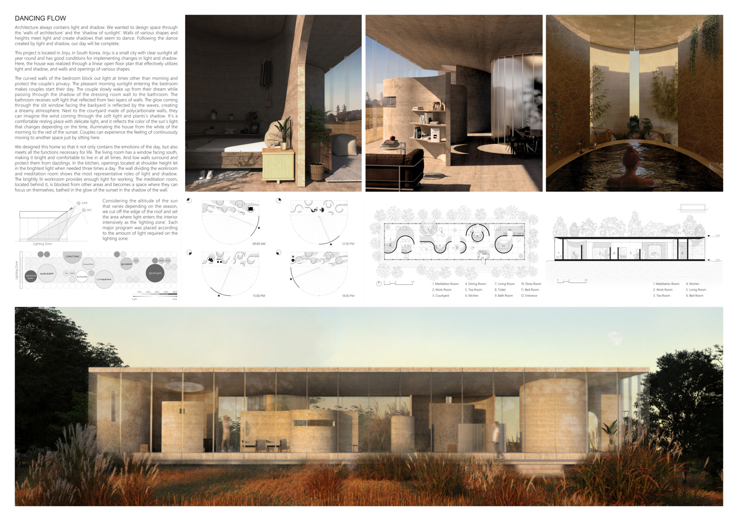
Dancing Flow

There are several reasons why participating in architecture competitions is valuable. First, architecture competitions provide a great opportunity to showcase creativity and test innovative ideas. They are appealing because they allow for experimenting with new design approaches and advancing innovative architectural techniques. Additionally, competitions serve as platforms to actualize projects and receive evaluations from experts. This feedback is essential for understanding how one's work would function in real-world environments and for making improvements. Lastly, architecture competitions offer networking opportunities. They connect participants with various professionals such as architects, designers, and interior decorators, providing opportunities for collaboration and enhancing professional expertise. Because of these reasons, architecture competitions are highly regarded and beneficial for architects and professionals in the field, which is why there is significant interest in participating in many competitions.
Read full interview South Korea
Jury feedback summary
"Dancing Flow" is located in Jinju, South Korea. Utilizing Jinju's abundant sunlight, the house features a linear open floor plan with varied walls and openings. The curved bedroom walls provide privacy while welcoming morning light, guiding the couple from the bedroom through shadowed dressing rooms to softly lit bathrooms. The courtyard, framed by polycarbonate walls, creates a restful ambiance with delicate, time-dependent lighting effects. Read more Functional spaces are designed with light considerations: the south-facing living room is bright yet shielded from glare, the kitchen optimally uses light at specific times, and the workroom and meditation room use light and shadow to create distinct atmospheres for productivity and introspection. The design harmonizes daily emotions with essential life functions.

Partition height and proximity to enclosure are controlled to create a dynamic variety of light and darkness throughout the day. The undulating walls, disconnected at times from the roof, give the home a feeling of living inside a functional sculpture.
Blake T. Smith / Buildner guest jury
BIG – Bjarke Ingels Group, United States

"Dancing Flow" showcases strong architectural expression through its free-form internal arrangement, and its external walls visually complemented the design, adding a pragmatic touch. The beautifully rendered proposal demonstrates a genuine desire to create something outstanding. I would love to live in this house and feel this would be a deserving winner.
Sarah Broadstock / Buildner guest jury
Architect at Studio Bark, United Kingdom

Beautiful lines and interplay of light and shadow. I really like the name of the project and how it tells a story as well (i.e. "contains the emotions of the day.") Great consideration of the positioning of the sun and it's emotional impact on the space.
Nikita Morell / Buildner guest jury
Founder of Architects WordShop, Australia

The project demonstrates a poetic design intent by emphasizing the dynamic interaction of light and shadow through architectural elements, particularly in Jinju, South Korea, where the consistent sunlight is well-utilized. The innovative use of curved walls and the "lighting zone" concept showcases creativity and sustainability, optimizing natural light and energy efficiency. While the narrative is engaging and the design functional, clearer explanations of sustainable features would enhance the project's impact, making it a strong yet improvable submission.
Ophélie Herranz / Buildner guest jury
Director, Nomos Architects , Spain

A relatively pragmatic scheme that places curvilinear objects within a field. The presentation could have benefitted from a greater emphasis on how light and resulting shadows on the curved surfaces could change over the course of the day.
Robert Hutchison / Buildner guest jury
Robert Hutchison Architecture, United States

Here I liked the design's linear spatial arrangement and the contrast between its regular grid and rational elements alongside more organic forms. This approach allows for diverse spatial arrangements, not limited to only irregular organic layouts seen elsewhere. The overall arching form as a simple box is complemented by varying heights, and I can imagine the introduction of different finishes/textures and possibly a different organic "hand" to add playfulness and uniqueness. Clear distinction between intimate and exposed spaces enables users to engage with their surroundings without feeling too confined.
Roxanne Kaye / Buildner guest jury
SAOTA, South Africa

The layout is very beautiful, and the logic is clear. However, spaces such as the living room and kitchen are crammed in favor of overly generous circulation space. A few simple radii adjustments would solve those concerns.
Blake T. Smith / Buildner guest jury
BIG – Bjarke Ingels Group, United States
Buildner's commentary, recommendations and techniques review
Order your review here
The project is defined by beautifully produced renderings and clear linework that is complex with details yet which communicate ideas simply and impactfully. The lengthy text would benefit from being divided into distinct themes for better readability. Unlike a news article, which presents information concisely, this submission reads more like a book, making it a bit harder and more complicated to navigate. Read more Bold keywords and subtitles would help, as woul additional annotations on the diagrams and visuals to clarify materiality, design concepts, and specific spaces. These improvements would make the presentation more accessible and appear more thoroughly analyzed and complete.
-
9/10 Linework

-
10/10 Quality of drawings

-
9/10 Balance of color

-
9/10 Layout

-
9/10 Hierarchy

-
6/10 Annotation

-
6/10 Text

-
8/10 Clarity of story

-
9/10 Clarity of diagrams

-
9/10 Quality of overall presentation

Enter an open architecture competition now
2nd Prize Winner +
Buildner Student Award
Buildner Student Award
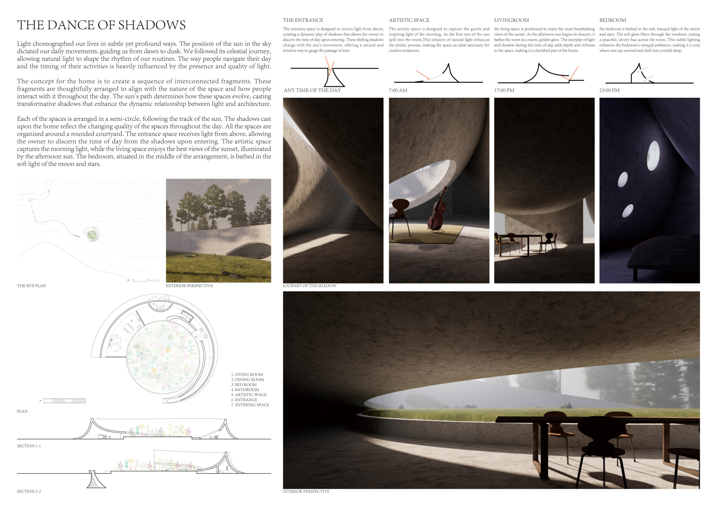
The Dance Of Shadows

As an architecture student, I believe that the design opportunities we encounter in school are limited. Architectural competitions, however, push me forward, helping me explore what design can be like under extreme conditions. Additionally, the impact of natural light on architecture is a theme I have always wanted to explore further.
Read full interviewJury feedback summary
"Dance of Shadows" harnesses natural light to shape the daily rhythms of its occupants. The design aligns spaces with the sun's path, creating dynamic, interconnected fragments that evolve with the changing light. Organized around a rounded courtyard, the home features an entrance illuminated from above, where shadows indicate the time of day. The artistic space captures the gentle morning light, fostering creativity. Read more The living room is positioned to bask in the warm, golden glow of the sunset, enhancing its ambiance. The bedroom, centrally located, is bathed in the tranquil light of the moon and stars, providing a serene environment for rest. This thoughtful arrangement highlights the profound relationship between light, shadow, and architecture, enhancing the daily experience of its residents.

The careful attention to light qualities throughout the day and the affect on the individual rooms is very sensitive, the form binds them all together elegantly.
Daniel Toole / Buildner guest jury
Founder and Principal, Daniel Toole Architecture, United States

This stood out for its incredibly strong architectural expression. I was looking for proposals which allowed the quality and path of light to shape the inhabitants' lifestyle. Additionally, I looked for designs that offered flexibility without compromising architectural integrity. This entry ticked all those boxes. The quality and warmth of the internal living spaces could have been developed further to ensure that this would be an enjoyable home to live in. The influence of Ryue Nishizawa was evident, and well adapted to the brief.
Sarah Broadstock / Buildner guest jury
Architect at Studio Bark, United Kingdom

Of the numerous entries that explore circular plans, this one seems to be the most promising. The scheme appears to be more about the quality of changing light on curved surfaces than the quality of shadows.
Robert Hutchison / Buildner guest jury
Robert Hutchison Architecture, United States

The singular spiral gesture is a beautiful and simple move that works in conjunction with the solar path to create a diversity of experience. Light and shadow are invited into the home in poetic and thoughtful manners based on program and orientation, clearly illustrated by the diagrams. The interior spaces as rendered are architecturally stunning. However, the plan feels a bit tight and unresolved.
Blake T. Smith / Buildner guest jury
BIG – Bjarke Ingels Group, United States
Buildner's commentary, recommendations and techniques review
Order your review here
The project showcases excellent visuals and simple linework and diagrams, it remains highly conceptual and would benefit from additional details to express it as a constructable proposition. The absence of human figures detracts from understanding scale and spatial experience. The text would be clearer if reduced and more targeted to align directly with corresponding drawings and visuals. Read more The images would benefit from slightly more variation to describe different spaces, with different funiture settings to communicate use - for instance, how does a kitchen work in a home like this?
-
8/10 Linework

-
9/10 Quality of drawings

-
9/10 Balance of color

-
9/10 Layout

-
9/10 Hierarchy

-
7/10 Annotation

-
7/10 Text

-
8/10 Clarity of story

-
8/10 Clarity of diagrams

-
9/10 Quality of overall presentation

3rd Prize Winner
Shamash - The Shade Of The Sun

We see architecture competitions as an opportunity to push the limits of our thinking and test our strengths in every aspect of working as a group.
Read full interviewJury feedback summary

I appreciate how this design incorporates microclimates and diverse viewpoints, seamlessly blending with its natural surroundings. It doesn't just prioritize internal facing views but actively engages with its environment, capturing various perspectives and embracing the changing natural light throughout the day. Within its private setting, it skillfully creates internalized views that enhance and extend the user's experience.
Roxanne Kaye / Buildner guest jury
SAOTA, South Africa

The project communicates a poetic design intent, emphasizing synchronization between the sun's path and the flow of life through concentric circles and a maze-like structure inspired by Mesopotamian architecture. The design's aesthetics and innovation are noteworthy, with a unique blend of historical and modern principles creating a visually striking interplay of light and shadow. While the project shows thoughtful consideration of form and context, clearer explanations of functionality, more site-specific details, and additional sustainable features would enhance its impact, making it a strong yet improvable submission.
Ophélie Herranz / Buildner guest jury
Director, Nomos Architects , Spain

It's good that the project has clear bright areas and dark areas. If the author made more contrast, it would be perfect.
Thongchai Chansamak / Buildner guest jury
Sher Maker, Thailand

I love the story behind this project. It fits beautifully into the surrounding environment.
Nikita Morell / Buildner guest jury
Founder of Architects WordShop, Australia

The oasis in the desert is a compelling site selection to experience the benefit of full access to the sun and sky, this particular circular scheme uses the changing source of light carefully.
Daniel Toole / Buildner guest jury
Founder and Principal, Daniel Toole Architecture, United States

This home allows maximum light by wrapping the courtyard around the exterior and orienting the openings outward. A perimeter wall frames the courtyard and creates privacy for all the open spaces. Rotated walls spanning from inside to out are a clever device serving to divide the spaces and disrupt the radial grid of the home. They are washed with light and shadow illuminating the interior while drawing one's eyes to the nature outside. The interior spaces are generously and rationally laid out with custom enhancements such as a very large and luxurious pool, bath and sunken living room.
Blake T. Smith / Buildner guest jury
BIG – Bjarke Ingels Group, United States
Buildner's commentary, recommendations and techniques review
Order your review here
The project design intent is clear and takes advantage of high-quality drawings to communicate the concept. While the hierarchy and variation of perspective/scale in the renderings is excellent, the use of so many renderings of similar quality is nonetheless rather repetetive. The author would benefit from more varied drawing types. Read more The imagery would also communicate additional information if key concepts, materials, space labels or other annotataion related to design intent were included as an additional 'layer' of information. Such details are critical for a jury to really understand this project as an architectural solution. How are the walls constructed? The roof? What climate-friendly solutions are embedded in the architecture? While this may also be included in texts, the most clear representation for reviewers is through corresponding text with images.
-
8/10 Linework

-
9/10 Quality of drawings

-
9/10 Balance of color

-
8/10 Layout

-
8/10 Hierarchy

-
6/10 Annotation

-
7/10 Text

-
8/10 Clarity of story

-
9/10 Clarity of diagrams

-
8/10 Quality of overall presentation

Buildner Sustainability Award
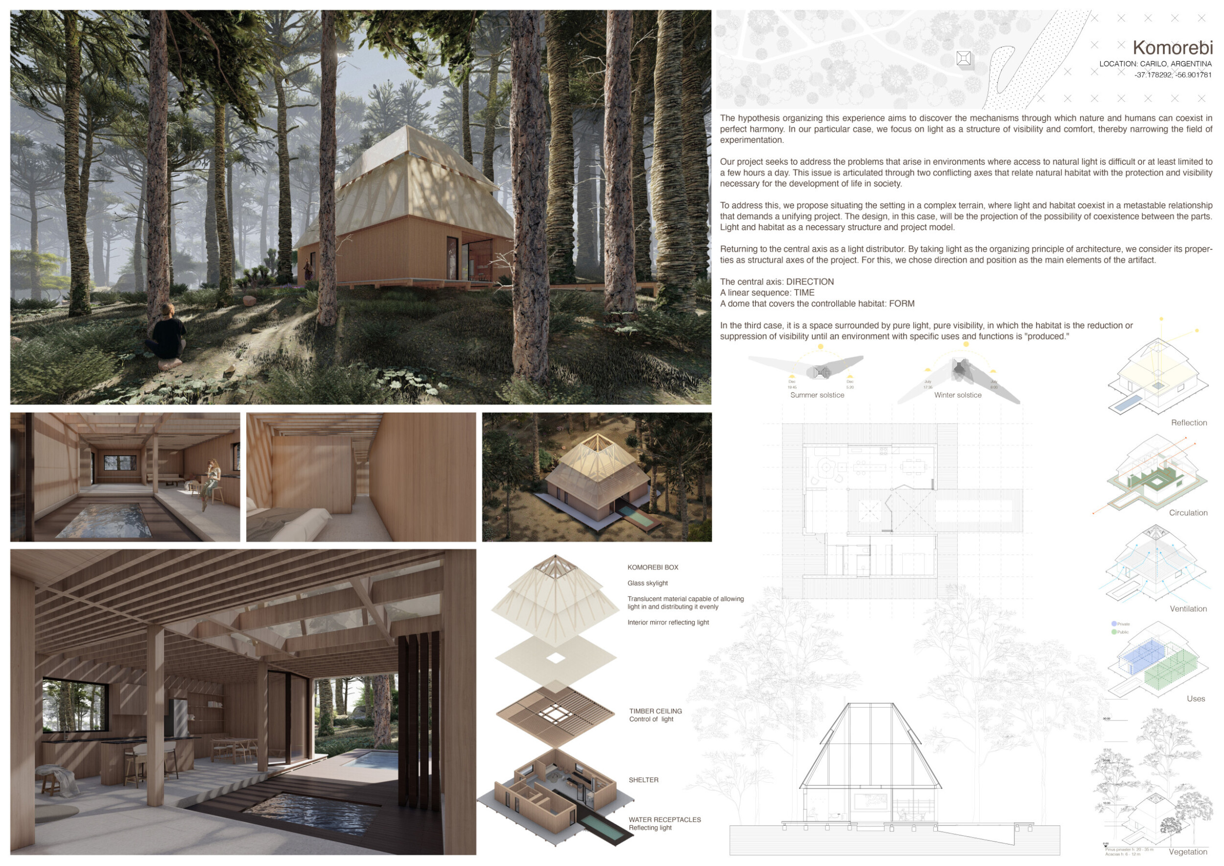
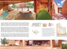
Komorebi House
What motivated us to participate in this competition was the proposal: connecting with light as a material of visibility and knowledge. Light-based design questions the design process, inverting the idea of habitat, intimacy, and protection, and challenging the choice of materials and the scope of the technical aspects of elements.
Read full interviewJury feedback summary
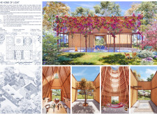
This project explores the coexistence of nature and humans by focusing on light as a structural element of visibility and comfort. It addresses challenges in environments with limited natural light, balancing natural habitat with the necessary protection and visibility for societal development. The design situates itself in complex terrain where light and habitat coexist in a metastable relationship, demanding a unifying approach. Read more Light is taken as the organizing principle, with direction and position as key elements. The central axis directs light, a linear sequence reflects time, and a dome covers the controllable habitat, forming a space surrounded by pure light. This habitat modulates visibility to create environments with specific uses and functions, demonstrating the potential for harmonious coexistence between light and habitat.

The project excels across all criteria, demonstrating exceptional communication of design intent by clearly outlining the central role of light as an organizing principle. The site selection showcases a profound understanding of complex terrains, where light and habitat coexist in a sophisticated and contextually responsive manner.
Ophélie Herranz / Buildner guest jury
Director, Nomos Architects , Spain

A clever but simple layer design from a single-structure support with different filtered daylight across the whole day. The plan is also rooted in the surrounding nature and knowhow.
Patcharada Inplang / Buildner guest jury
Sher Maker, Thailand

The design is aesthetically visually striking and innovative, with the use of light as a structural element creating a groundbreaking and pleasing form. The project also shows a strong commitment to sustainability, addressing challenges of limited natural light and optimizing light distribution to reduce environmental impact.
Ophélie Herranz / Buildner guest jury
Director, Nomos Architects , Spain
Buildner's commentary, recommendations and techniques review
Order your review here
Buildner has two primary suggestions for this submission. The first is related to the line drawings. It is recommended that the author test more varied use of line weights to provide hierarchy and balance to the section, plan and diagrammatic drawings. As submitted, these are all quite uniform and difficult to read, both at the scale of the page and when zoomed into a single drawing. The plan drawing in particular would benefit from darker 'cut' lines to more clearly describe the spaces. Read more The second recommendation is related to annotation. Neither the plan or section are labeled, nor are any of the renderings. As a result the project appears incomplete and unanalyzed. Simple annotation would allow jurors or readers to more clearly understand what they are reviewing without having to search for the information elsewhere.
-
7/10 Linework

-
7/10 Quality of drawings

-
8/10 Balance of color

-
8/10 Layout

-
9/10 Hierarchy

-
6/10 Annotation

-
7/10 Text

-
7/10 Clarity of story

-
8/10 Clarity of diagrams

-
7/10 Quality of overall presentation

Honorable mentions
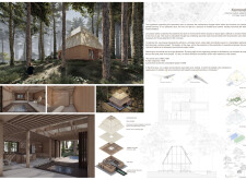
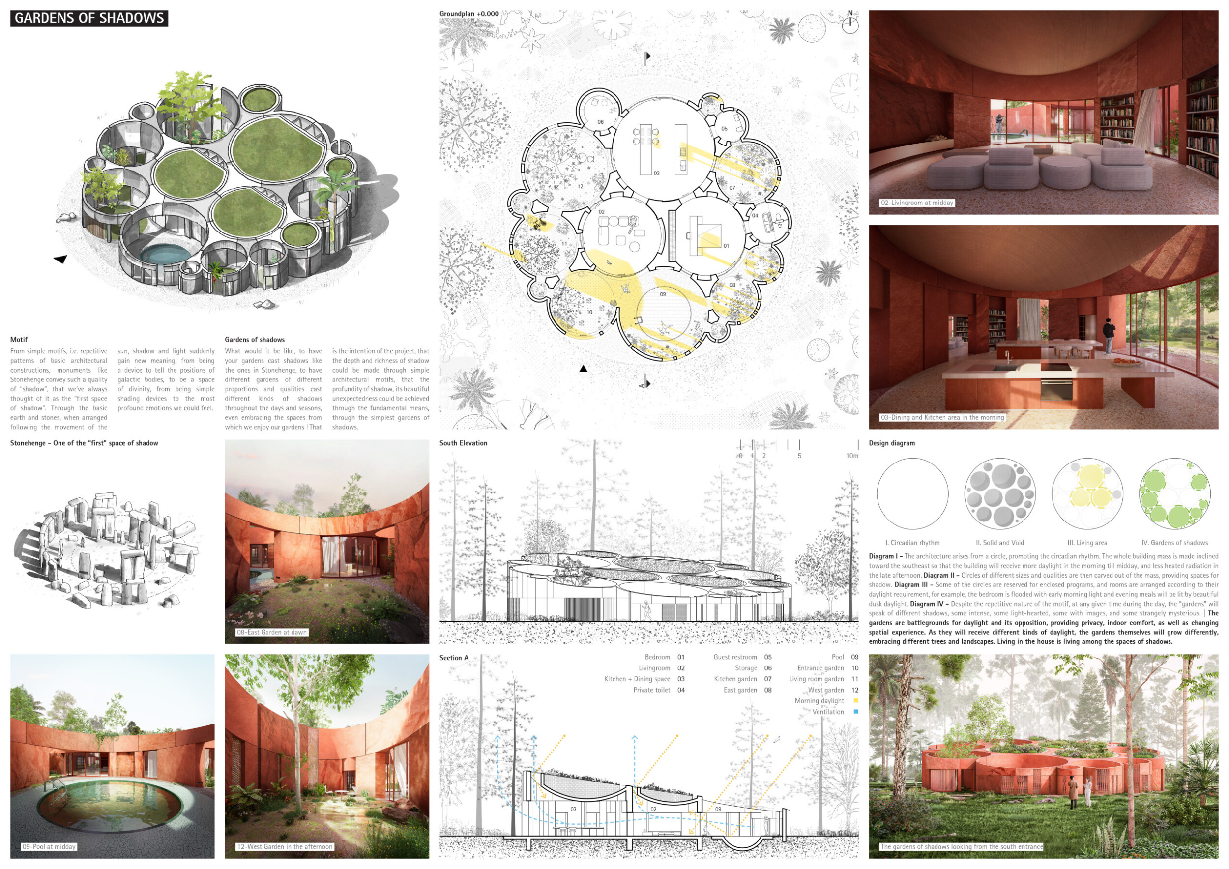
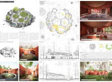
Gardens Of Shadows
Competitions provide an opportunity to explore and share innovative ideas. For instance, this competition allows me to investigate the concept of a "Stonehenge house" - an idea I've been curious about and eager to develop beyond just a personal project.
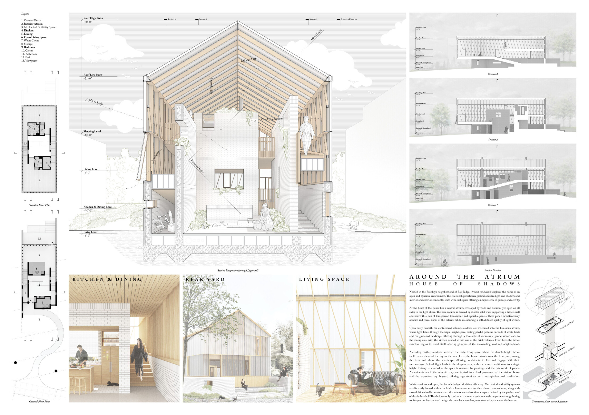
Read full interviewAround the Atrium

Participating in architectural competitions is a form of expression. It gives me the opportunity to explore and develop concepts that excite me while honing skills in design and representation. Especially as I dive deeper into professional practice, competitions can be a breath of fresh air that allows me to keep engaged with my inquisitive side.
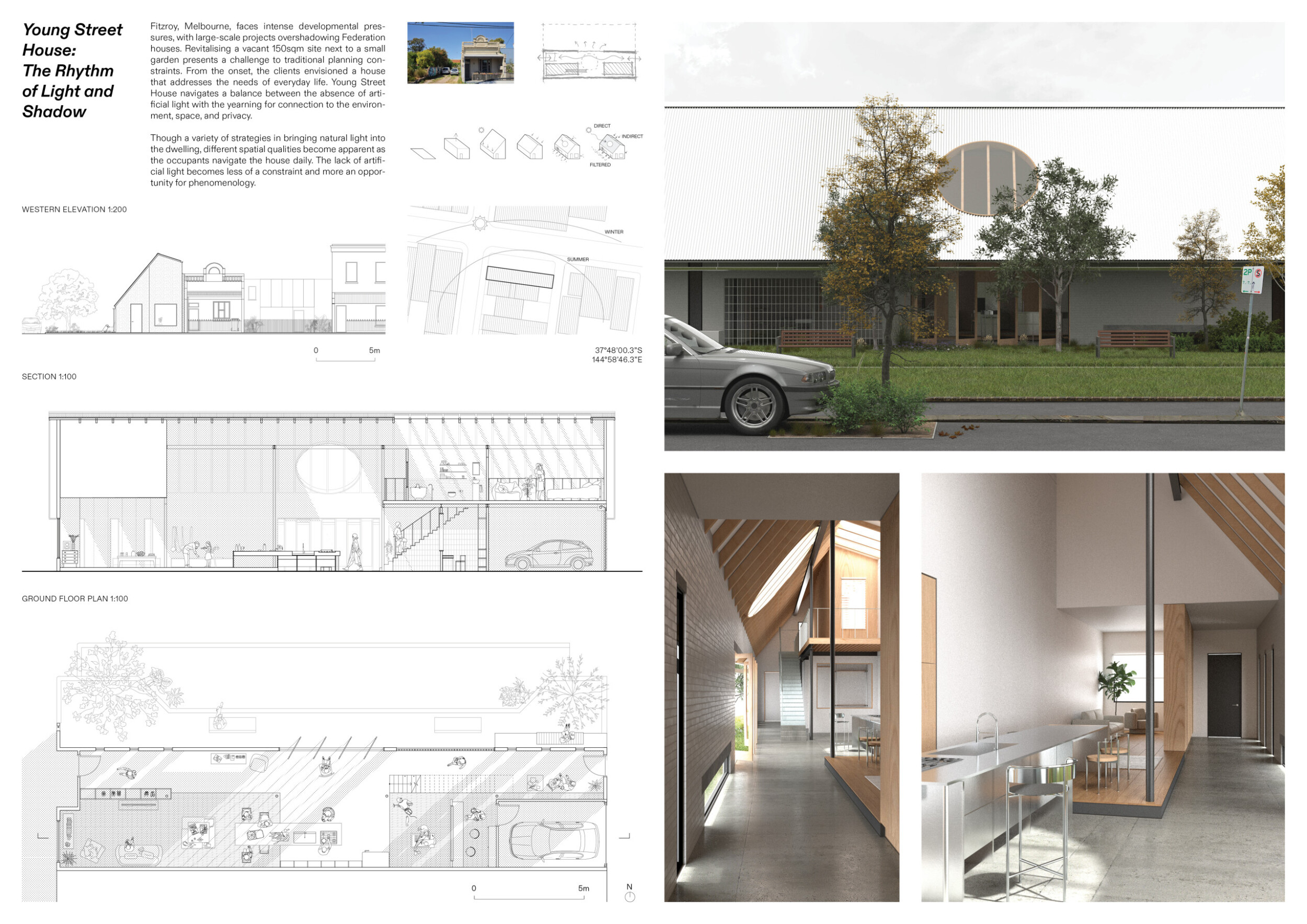
Read full interviewYoung Street House

Ironically, we take part in architecture competitions to create more opportunities for us to design. The majority of our time spent in practice requires us to deal with the pragmatic aspects of architecture. While that is fulfilling in its own way, competing allows us to be freer in our designs.
Read full interviewHome of Shadows
We firmly believe in the importance of exploring new frontiers in design and construction, which drives us to actively participate in various competitions. These competitions offer us a unique platform to experiment and develop innovative approaches that challenge traditional norms and enrich our architectural proposals.
Read full interview Mexico
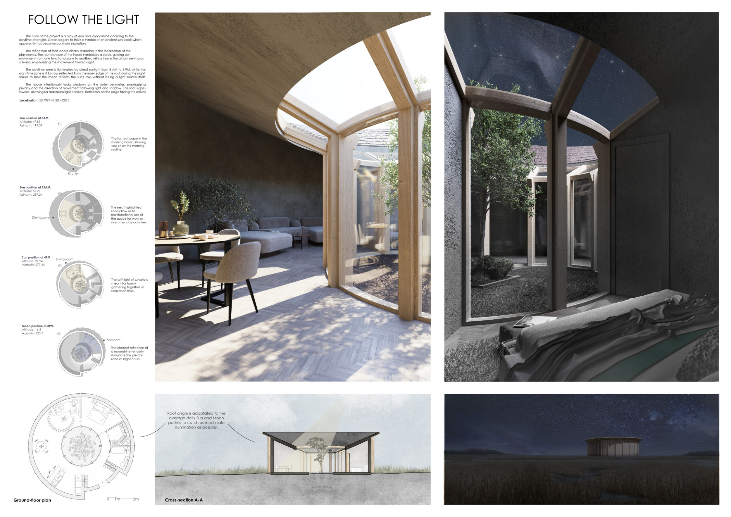
Follow the Light

We believe that participating in architectural competitions offers several key benefits. It allows us to gain new experience and practice teamwork, which are crucial for our professional development. Competitions also provide an opportunity to add innovative projects to our portfolios, showcasing our skills and creativity. Furthermore, we acquire valuable skills that will be useful in our future work and studies, making us more attractive to potential employers.
Read full interview Poland
Shortlisted projects
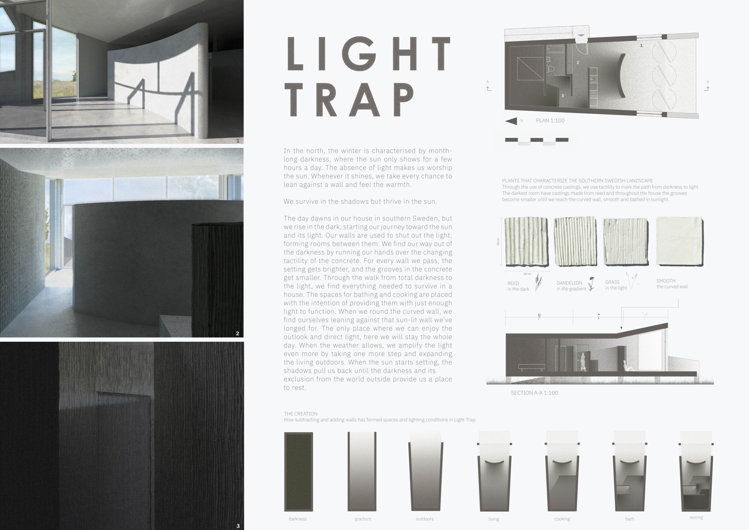
Light Trap
Faculty of Engineering, LTH , Lund University
+22 points Buildner University Rankings! Sweden
 Shamash - The Shade Of The Sun
Fakultet Tehničkih nauka u Novom Sadu
+72 points Buildner University Rankings! Serbia
 Garden Retreat
University of Novi Sad - Faculty of Technical Sciences
+22 points Buildner University Rankings! Serbia
 Follow the Light
Warsaw University of Technology , Politechnika Warszawska
+72 points Buildner University Rankings! Poland
 Introspection
Delft University of Technology, TU Delft , Technical University Delft
+22 points Buildner University Rankings! Netherlands
 HOUSE OF CURTAINS
TTK Univeraity of Applied Sciences
+22 points Buildner University Rankings! Estonia
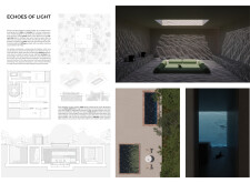
 ECHOES OF LIGHT
Polytechnic of Turin, Politecnico di Torino
+22 points Buildner University Rankings! Italy
Italy The Dance Of Shadows
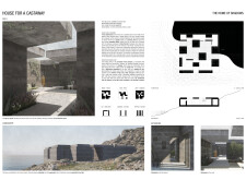
HOUSE FOR A CASTAWAY
Politecnico di Milano / Polytechnic University of Milan
+22 points Buildner University Rankings! Italy
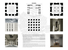
Italy Penombra
Politecnico di Milano / Polytechnic University of Milan
+22 points Buildner University Rankings! Italy
Italy Contrast
Ion Mincu University of Architecture and Urbanism - UAUIM
+22 points Buildner University Rankings! Romania
 SHIMMER
Hongik University
+22 points Buildner University Rankings! South Korea
 FOR READERS
Hongik University
+22 points Buildner University Rankings! South Korea
 House of Timber and Light
American University of Sharjah
+22 points Buildner University Rankings! United Arab Emirates
 THE MISTY HOUSE
SUNDIAL
Valencia Polytechnic University (Universitat Politècnica de València UPV)
+22 points Buildner University Rankings! Spain
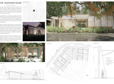
Spain The Diaphane House
The University of Sydney
+22 points Buildner University Rankings! Australia
Promoted projects
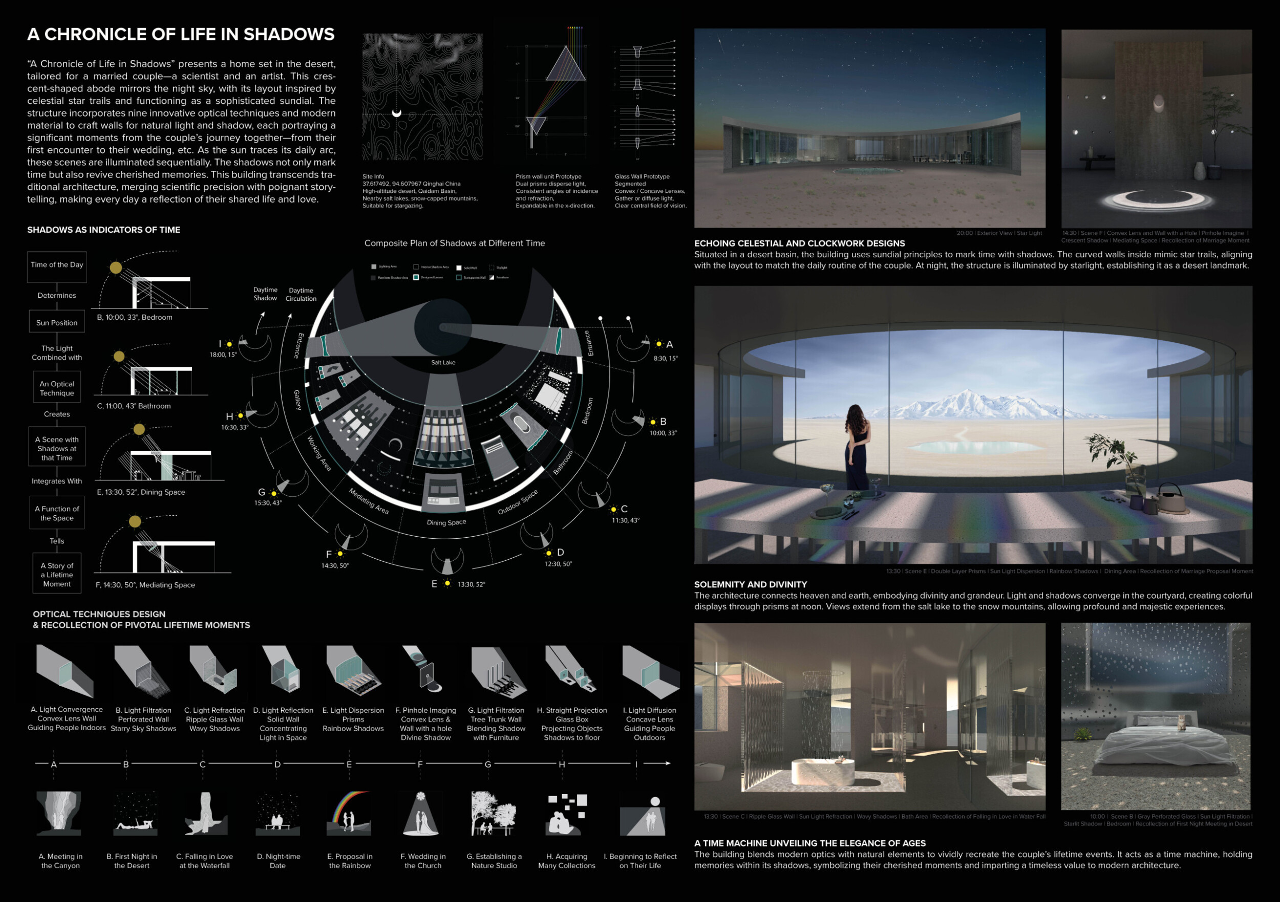
A Chronicle of Life in Shadows

 United States








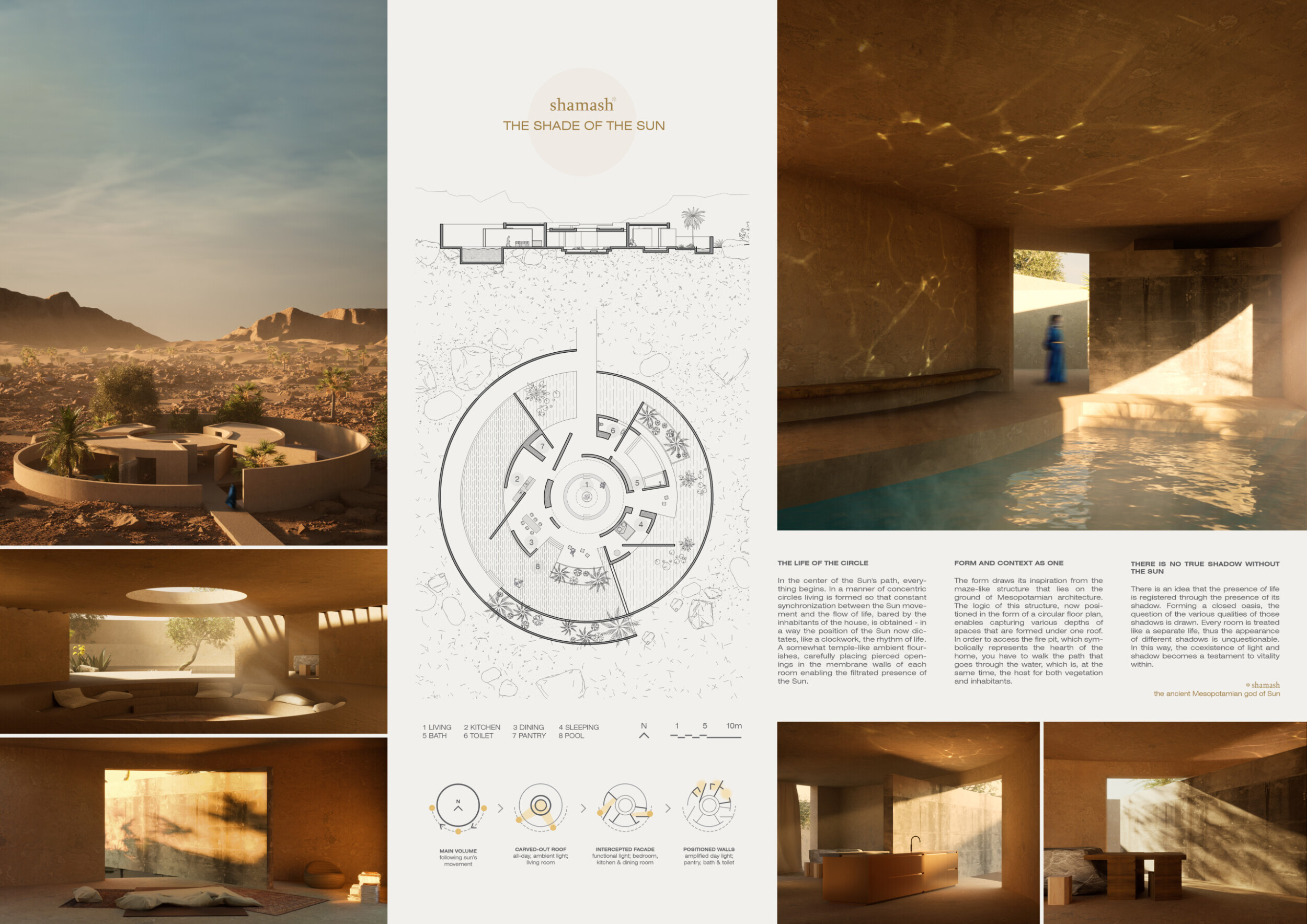



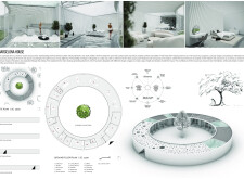





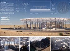


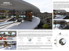



"The shade of the sun" centers around a home designed to synchronize with the Sun's path, creating a rhythmic living experience akin to clockwork. The house features concentric circles that mimic a temple-like atmosphere, with strategically pierced openings in the walls to filter sunlight. Inspired by Mesopotamian maze-like structures, the circular floor plan captures varying spatial depths under a single roof. Read more To reach the central fire pit, symbolizing the hearth, one must traverse a path through water, which sustains both vegetation and residents. Emphasizing the interplay of light and shadow, each room is treated as an individual entity, resulting in diverse shadows that highlight the vitality of life within the enclosed oasis.