Buildner is a global leader in organizing architecture competitions of all scales — from furniture, cottages, and guesthouses to full city rebranding. With prize budgets ranging from €5,000 to €500,000, Buildner brings proven global experience to every competition.
Launch a competitionLaunch a competition
Introduction
Buildner is excited to announce the results of its Tokyo Urban Meditation Cabins Competition!
For this event Buildner tasked participants with submitting designs for a meditation cabin prototype that could be replicated and placed in various locations around Tokyo. The cabins should serve as a small public sanctuary where people can take a break from the noise of urban life. Participants were asked to explore how architecture can function as a therapeutic tool and to design a small tranquil space in the otherwise stressful environment of the dense and chaotic city.
Buildner worked with a regional and international jury to evaluate submissions and select award winners. The jury included: Greg Corso of Syracuse NY-based SPORTS Collaborative; Dan Dorocic is a member of Berlin-based design & architecture collective ON/OFF; Astrid Klein and Mark Dytham are founders of Tokyo-based Klein Dytham architecture (KDa); Lydia Kallipoliti is the principal of ANAcycle thinktank, an Assistant Professor at the Cooper Union in New York and the Head Curator of the 2022 Tallinn Architecture Biennale; Rituparna Simlai is Principal of Studio Arth LLC, based in Miami; Suzuko Yamada is founder of Suzuko Yamada Architects; and Takeshi Yamamura is a Japanese architect and founder of Tokyo-based YSLA YamamuraSanzLaviña Architects.
The proposals were evaluated for their ingenuity and ability to function as a temporary urban escape. Juror Astrid Klein noted: “In this competition the meditation cabin has taken on so many different meanings and variations in shape or form, that it is clear we all meditate in unique ways.”
Buildner and its jury panel would like to thank each of the participants and teams from around the globe who submitted proposals for this event.
We sincerely thank our jury panel
for their time and expertise
Suzuko Yamada
founder of Suzuko Yamada Architects
Japan

Takeshi Yamamura
founder of YSLA YamamuraSanzLaviña Architects
Japan

Rituparna Simlai
Principal of Studio Arth LLC
USA

Mark Dytham
founder of Klein Dytham architecture (KDa)
Japan

Astrid Klein
founder of Klein Dytham architecture (KDa)
Japan

James Delaney
Chairman of the Block by Block Foundation
USA

Nancy Beka
architectural designer and co-director of Studio Edwards
Australia

Dan Dorocic
designer ON/OFF
Germany

Greg Corso
Designer, SPORTS Collaborative
USA

Lydia Kallipoliti
Tallin Architecture Biennale, ANAcycle thinktank
USA

1st Prize Winner +
Buildner Student Award
Buildner Student Award
Shinrin-Yoku

It would take a good psychologist to know. Something magical and fascinating happens during architectural competitions. Just think of two people who have never met, do not speak the same language, live in different places, at different times, and despite this they communicate with each other. We feel this powerful fascination and when we have something to say, we cannot resist the temptation to be part of it.
Read full interviewJury feedback summary
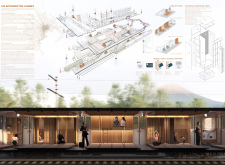
Shinrin-Yoku is a proposal for a narrow, semi-circular reflective form that is accessed along its long axis through a small side opening. Its namesake uses a Japanese term for ‘baths in the forest’ and the project is designed as a protective shell containing an immersive natural interior space where one can spend a few moments to escape the city.
Buildner's commentary, recommendations and techniques review
Order your review here
The presentation makes use of three vertical columns of information, naturally placing the text on the upper lefthand corner so that it is read first, like the order of a book. A series of small diagrams accurately describe the ease to which the project could be deployed as a modular temporary construction. The images are beautiful and convincing, however the presentation itself is dark and somber, focused on moments of nightime, and the city in the rain.
2nd Prize Winner
Tranquillizing the Void

We participate in architecture competitions to be able to test out our ideas and our will to create. Additionally, it provides us with a platform for not only exploration but also growth and put us in a critical condition. In academia, or even in practice, the brief and the learning outcomes are already set out prior. With architecture competitions, we can pick and choose what sort of briefs interests us. This can spark the creativity that we inherently possess and push it further.
Read full interview United Kingdom
Jury feedback summary
Tranquilizing the Void makes use of the urban voids that are ubiquitous in Tokyo, a byproduct of the city’s constant flux of demolition and reconstruction. The cabin design draws from the typical Japanese lantern, a modest timber structure assembled using Japanese joinery and dressed in a waterproof fabric. By using timber, such a temporary space could be constructed in even tight and hard-to-access spaces.
Buildner's commentary, recommendations and techniques review
Order your review here
This submission is, simply put, excellent. Its use of highly sophisticated rendered and line drawn imagery is advanced, and its supporting diagrams as well as historical and urban analyses go above and beyond to present a ‘total’ project - a difficult task, given this is a single-sheet entry. There are two recommendations to be made. The first is regarding the use of annotation. The project would benefit from annotation overlaid both on the line drawings as well as the rendered imagery.
3rd Prize Winner
A Riot of Calmness


I was interested in the topic itself.
Read full interview China
China
Jury feedback summary
A Riot of Calmness is a proposal for a flexible structure of vertical elements, resembling a bamboo forest, within which is planned a linear path for pedestrians. Like bamboo, the elements bend to various degrees according to the depth of their ‘roots’ or foundations. Transparent industrial plastic pipe is used here in lieu of natural bamboo, to create a sort of man-made nature in tune with the urban environment.
Buildner's commentary, recommendations and techniques review
Order your review here
The presentation is advanced, technically speaking, and focuses on a mix of full-scale and detailed imagery and drawings. The materiality of the render / model is excellent for describing the feel and spatial experience of the project, making this submission stand out from its competitors. The enlarged connection details are also excellent for communicating the project’s realistic constructability and deployability in any setting.
Buildner Sustainability Award
Chiaroscuro

Competitions are opportunities to develop other ways of doing things and to reflect on subjects that differ from the demands of traditional sponsors. For the agency, this has always made it possible to freely explore fields of ideas and to shape new concepts. It is also a way to make atypical references that complement the production of more conventional buildings. Even if the buildings are theoretical, the ideas are here and can be used in a real project in the future.
Read full interview France
Jury feedback summary
Chiaroscuro is a proposal for an intentionally darkened space, isolated, a space for the mind to rest from the onslaught of visual stimuli of the city. Its design draws both from the choir of a chapel and a tea room - two ‘sacred’ spaces for focus and silence. Flowers placed in a small daylit alcove places the focus of the space in the temporality of nature.
Buildner's commentary, recommendations and techniques review
Order your review here
The presentation is beautifully done, and is a prime example of the power of physical models and sketches to illustrate design intent, nuance, imperfection and constructability. It also proves the extent to which a select number of models can be utilized to produce several informative and visually aligned photographs. The hand sketch excellently describes the project’s insertion within an urban environment and expresses it as a well designed extension of urban or suburban Tokyo.
Honorable mentions
Shortlisted projects

