Buildner is a global leader in organizing architecture competitions of all scales — from furniture, cottages, and guesthouses to full city rebranding. With prize budgets ranging from €5,000 to €500,000, Buildner brings proven global experience to every competition.
Launch a competitionLaunch a competition
Introduction
Buildner is pleased to announce the results of its second annual Architect’s Chair Competition, which received excellent ideas from around the globe.
As this competition series gains traction and interest, Buildner is also excited to announce the publication of its first book on the topic, highlighting key ideas and outstanding projects from its past edition:
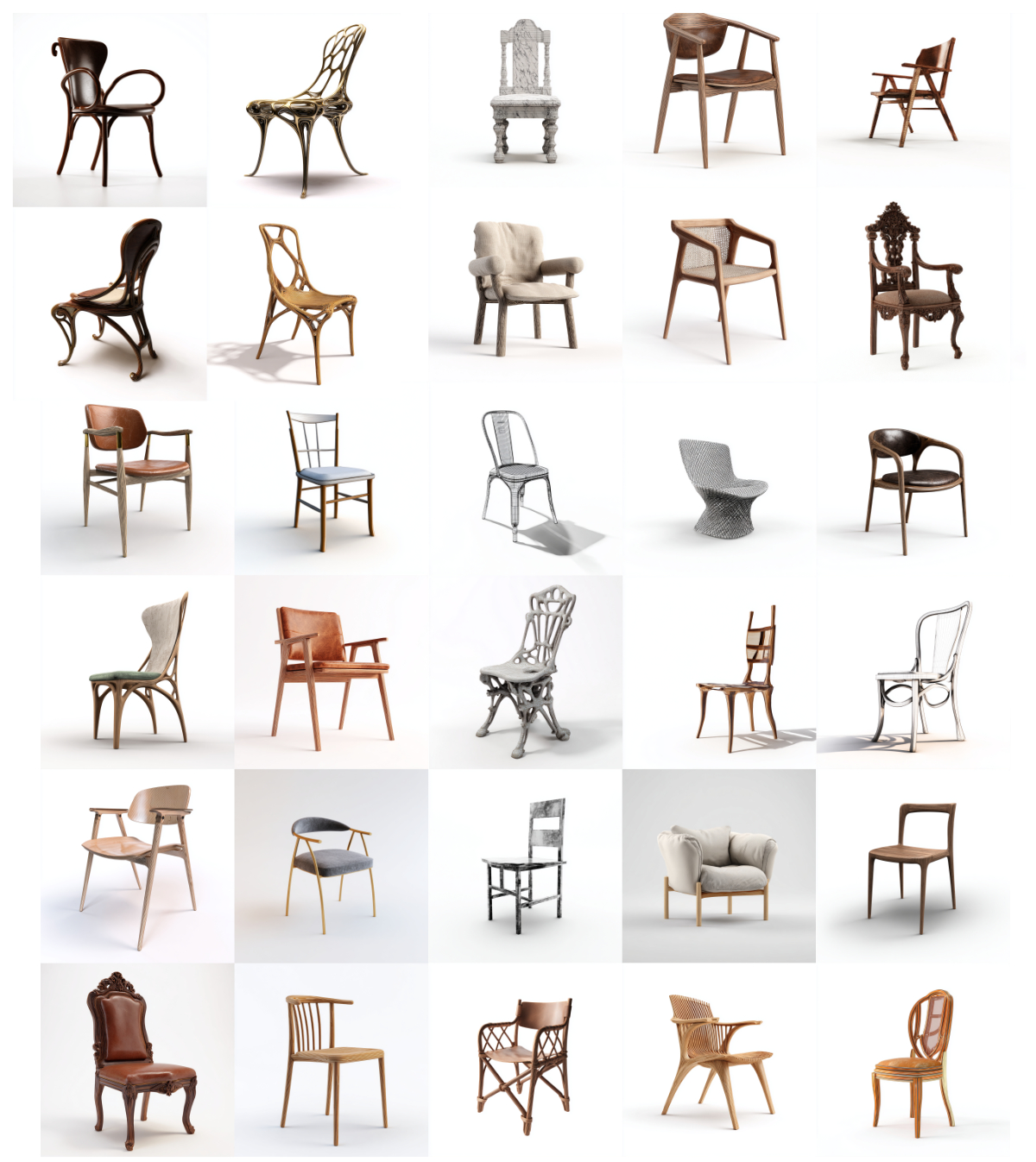
Chair design exemplifies the interdisciplinary nature of architecture, showcasing architects’ ability to adapt skills and sensibilities across scales and contexts, blurring the lines between architecture, design, and art. This versatility empowers architects to explore new ideas and challenge conventional notions of chair aesthetics, materials, and technology.
The Architect’s Chair Competition is an annual international design competition that invites architects and designers worldwide to submit designs for a signature chair. Following in the footsteps of iconic figures like Charles and Ray Eames, Ludwig Mies van der Rohe, Marcel Breuer, and Arne Jacobsen, participants are tasked with creating custom chairs that reflect their unique design philosophies and visions.
Buildner worked with an outstanding team of jurors representing the fields of architecture, product design, and furniture design: Philippe Starck, the globally renowned French industrial designer and architect; Boris Berlin, a designer and partner of Copenhagen-based Boris Berlin Design; Anne Brandhøj, a partner at the furniture design studio Bly Studio who also works with wood sculptures under her own name; Sarah Hossli, a product designer based in Lucerne, Switzerland; Flora Lee, a US-based associate partner at MAD Architects; Lorenz Noelle, a product designer based in Switzerland; Alexander Lervik, one of Sweden’s most well-known designers; Natalia Sanz Laviña and Takeshi Yamamura, cofounders of Tokyo-based YSLA YamamuraSanzLaviña Architects; and Harrison Stallan, an architect with the Rotterdam-based firm OMA.
Buildner and its jury team evaluated the submissions based on functionality and comfort, aesthetics and signature style, materiality, craftsmanship and construction, and versatility.
Buildner and its jurors would like to thank the participants for submitting their work and congratulate the winners for their excellent designs, which are hallmarks of precision, craftsmanship, and innovation.
We sincerely thank our jury panel
for their time and expertise
Philippe Starck
Creator
France

Boris Berlin
Founder and Partner at Boris Berlin Design
Denmark

Anne Brandhøj
designer at Bly Studio, Anne Brandhøj
Denmark

Sarah Hossli
Product designer
Switzerland

Flora Lee
Associate Partner, MAD Architects
USA

Alexander Lervik
Designer
Sweden

Lorenz Noelle
Product designer
Germany

Natalia Sanz Laviña
YSLA YamamuraSanzLaviña Architects
Japan

Harrison Stallan
OMA
Netherlands

Takeshi Yamamura
founder of YSLA YamamuraSanzLaviña Architects
Japan

Enter the next competition edition
1st Prize Winner +
Buildner Student Award
Buildner Student Award
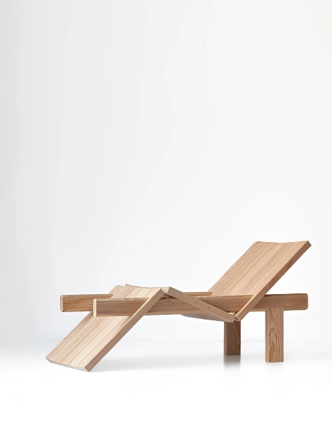
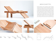
Brochette
Jury feedback summary
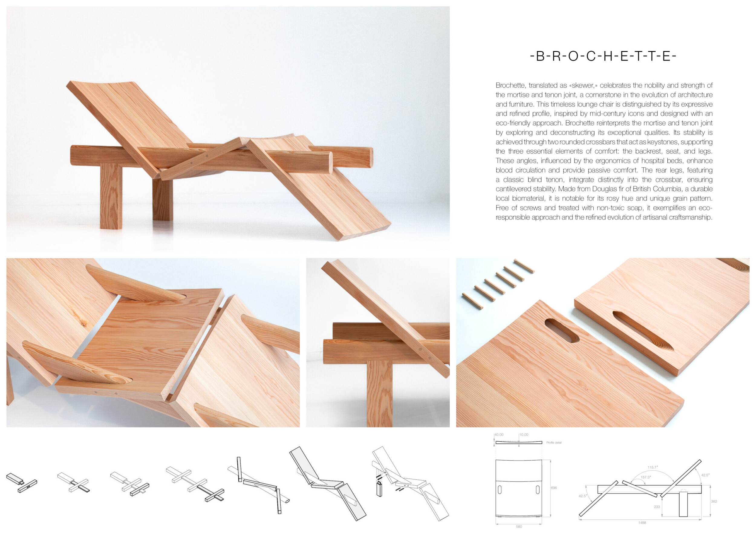
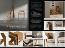
Brochette, meaning "skewer," honors the strength and elegance of the mortise and tenon joint, a key element in architecture and furniture design. This lounge chair, inspired by mid-century icons, combines an eco-friendly approach with a refined silhouette. Brochette reinterprets the mortise and tenon joint, achieving stability through two rounded crossbars that support the backrest, seat, and legs. Read more The chair's ergonomic angles, inspired by hospital beds, promote circulation and passive comfort. Rear legs with a classic blind tenon integrate seamlessly into the crossbar, ensuring stability. Made from durable, locally sourced Douglas fir from British Columbia, known for its rosy hue and unique grain, Brochette is free of screws and treated with non-toxic soap, reflecting a commitment to sustainability and craftsmanship.

BRAVO. Of course, the choice of solid wood consumes a little too much nature, but this project has the intuition to replace mass with intelligence, tension, balance and even a touch of humor. It is original thinking that stands out of trends, and therefore right and durable. It is a surprise that summons the imagination. Bravo.
Philippe Starck / Buildner guest jury
Creator, France

The design is beautifully crafted, and cleverly assembled.
Flora Lee / Buildner guest jury
Associate Partner, MAD Architects, USA

This lounger combines craftsmanship, simplicity and comfort. At first glance, the shape may seem unusual - until one understands the reason: the construction. This happens quickly thanks to the visible details of the wooden joints. Classic wooden joints have been well researched and translated in a modern way. The unusual scaling and alignment is very appealing.
Sarah Hossli / Buildner guest jury
Product designer, Switzerland

An expressive, clear, well thought and original construction. It might be unpleasant for the seated person to be locked between the two bars, preventing sideways movement, especially when raising from the chair.
Boris Berlin / Buildner guest jury
Founder and Partner at Boris Berlin Design, Denmark

The Brochette lounge chair exemplifies elegant and thoughtful design, paying homage to the mortise and tenon joint. Its structure focuses on comfort and eco-friendliness, featuring carefully chosen materials known for durability and unique grain patterns. The chair's simplicity—using no screws and relying solely on interlocking wooden elements—demonstrates a refined approach to sustainable craftsmanship. However, while the design excels in structural stability and aesthetic appeal, it could benefit from further exploration of user comfort in diverse environments, especially given its rigid, angular form. It would be ideal if the backrest and seating position were adjustable.
Anne Brandhøj / Buildner guest jury
designer at Bly Studio, Anne Brandhøj, Denmark

A unique piece of furniture composed of a series of components tied together with a "skewer," showcasing a creative and fun approach. This innovative method adds a playful element to the design. However, its actual use and functionality may be limited. The pinch points around the leg areas and the cavity for the seat could pose practical challenges. While the design is imaginative and engaging, addressing these functional issues would improve its usability and overall appeal.
Harrison Stallan / Buildner guest jury
OMA, Netherlands

We are surrounded by products we don’t know much about. Brochette gives us the opportunity to understand the tectonics behind the chair, being them surprisingly pedagogic, intuitive and simple, which is the most difficult to achieve in design. It is important to understand the design of objects so that we can ultimately build an emotional connection. The stronger such a connection, the longer the product can be used and the more sustainable it is. I would simply ask the designer to work on the details of the chair to improve the comfort of the user.
Natalia Sanz Laviña / Buildner guest jury
YSLA YamamuraSanzLaviña Architects, Japan

Besides the research on joints, ergonomics were also examined and findings taken into account. In addition, a local biomaterial, Douglas, was chosen. Thanks to the wood joints, no additional material is necessary what shows the sustainable approach. The lounger impresses with its research in all areas and its monumental, unexpected character. I would love to test it.
Sarah Hossli / Buildner guest jury
Product designer, Switzerland
Buildner's commentary, recommendations and techniques review
Order your review here
The presentation effectively communicates a simple idea, with the title’s use of dashes enhancing clarity. The photos accurately depict the chair's construction and materiality. Including a human figure would help readers grasp the scale and ergonomics of the chair. Annotations directly on the visuals would further clarify materiality and construction methods. Read more While the text is concise and clear, it is contained in a single block, making it challenging to quickly grasp the key ideas; breaking it into sections with subtitles or bold text would improve the text's hierarchy and, consequently, the overall presentation.
-
9/10 Linework

-
9/10 Quality of drawings

-
7/10 Balance of color

-
8/10 Layout

-
8/10 Hierarchy

-
5/10 Annotation

-
6/10 Text

-
8/10 Clarity of story

-
9/10 Clarity of diagrams

-
8/10 Quality of overall presentation

Enter an open architecture competition now
2nd Prize Winner
Rattan Splice Chair
I think competitions of this nature can give you the opportunity to think outside the constraints of the industry, to develop concepts that inspire or with surprising outcomes that could even motivate change in the industry.
Read full interviewJury feedback summary
The Rattan Splice Chair reimagines traditional rattan furniture, moving beyond its association with exotic, outdoor settings. The result is a modern chair with a simplified aesthetic, achieved by splicing joints together to form a stronger geometric structure, inspired by plant stems. Rattan was introduced to Europe in the 18th century by the Dutch East India Company, becoming a symbol of wealth and status. Read more Its exotic aesthetic has resurfaced periodically, and its flexible nature led to structural challenges, often requiring additional supports and concealed joinery. This project addresses these issues by adopting techniques from the wooden furniture industry. Precision-machined splice joints ensure structural stability and a refined, timeless appearance. Complementing this is a seat and backrest made from mycelium leather, enhancing both comfort and sustainability.

A praiseworthy reinterpretation of the rattan tradition. The "naked" version with solely rattan skin on the seat is primarily beautiful. However, I believe the version with leather seat and back is necessary for achieving the seating comfort.
Boris Berlin / Buildner guest jury
Founder and Partner at Boris Berlin Design, Denmark

The RATTAN SPLICE CHAIR demonstrates a high level of understanding of the human senses, craftsmanship and material properties. Thanks to the use of rattan or Mycel leather in combination with the gently curved rods, the chair is very light and yet offers a high level of comfort. The details, such as the joints, the skilful use of wickerwork or Mycel leather, are beautifully crafted and give the chair a unique, friendly aesthetic.
Lorenz Noelle / Buildner guest jury
Product designer, Germany

The Rattan Splice Chair effectively reinterprets traditional rattan furniture with a modern twist, showcasing a clean, geometric structure that aligns with contemporary design sensibilities. The use of mycelium leather highlights a commendable commitment to sustainability. However, while the aesthetic appeal is clear, the proposal could benefit from further exploration of ergonomic considerations, particularly how the spliced structure impacts comfort during extended use. Additionally, the reliance on automated techniques might distance the design from the handcrafted essence that often defines rattan furniture's unique character. The support between the legs is differently necessary, but I wonder why it is missing on the prototype?
Anne Brandhøj / Buildner guest jury
designer at Bly Studio, Anne Brandhøj, Denmark

One sees a timeless, calm, simple and elegant chair. The background to rattan furniture has been well researched, existing knowledge taken on board and turned into something new. The chair distances itself from conventional rattan furniture by means of the visually simple connections. I wonder whether the effort involved in the various CNC-milled connections matches the output. To judge this, it would be necessary to take a closer look at the production processes. However, the design language is very friendly and the chair looks stable and trustful.
Sarah Hossli / Buildner guest jury
Product designer, Switzerland
Buildner's commentary, recommendations and techniques review
Order your review here
-
7/10 Linework

-
9/10 Quality of drawings

-
8/10 Balance of color

-
9/10 Layout

-
9/10 Hierarchy

-
5/10 Annotation

-
7/10 Text

-
9/10 Clarity of story

-
9/10 Clarity of diagrams

-
8/10 Quality of overall presentation

3rd Prize Winner
PONTUM Chair
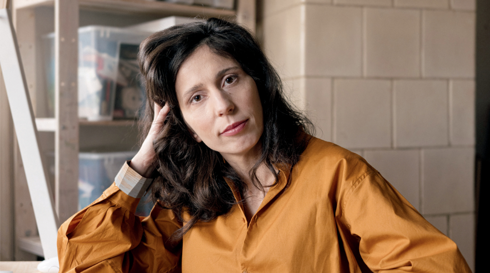
This competition was recommended to me by a colleague, the faculty leader at the university where I teach. I enjoy participating in competitions where I receive feedback on my work from professional experts. I believe participating allows us to challenge our creative boundaries and gain valuable exposure for our work. Competitions also provide an opportunity to connect with other designers and architects, expanding our design thinking and engaging in broader discussions in the field of architecture and design.
Read full interviewJury feedback summary
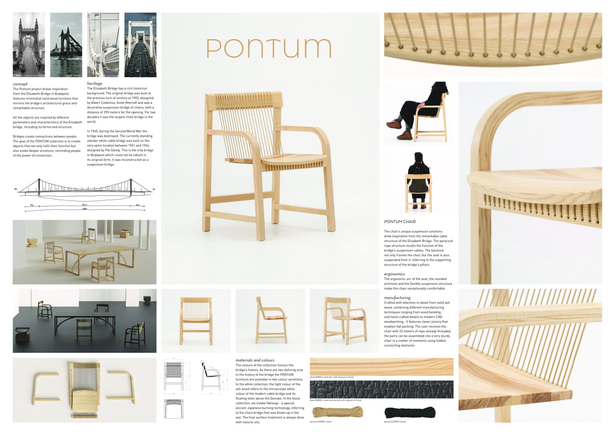
The Pontum project is inspired by the Elisabeth Bridge in Budapest, with minimalist solid wood furniture that echoes the bridge's elegance and structure. Each piece reflects the bridge's design, symbolizing connection. The collection offers two color options: white ash wood, representing the modern bridge, and black, using Yakisugi, an ancient Japanese burning technique, as a tribute to the original structure destroyed in WWII. Read more The chair draws from the bridge’s cable design, with paracord ropes mimicking suspension cables. Its backrest supports a suspended seat, ensuring comfort through an ergonomic arc, rounded armrests, and flexible suspension. Crafted from solid ash wood, the chair blends traditional wood bending with modern CNC techniques. Flat-packed for easy assembly, it includes 22 meters of pre-threaded rope, creating a sturdy and elegant structure.

The Pontum Chair impresses with its elegant design inspired by bridge engineering, skillfully merging structural aesthetics with functional furniture. However, while the suspension detail is visually striking, the practicality and comfort of this unique seating solution might be questioned over extended use. The concept’s strong connection to the Elisabeth Bridge is compelling, but it might benefit from further exploration of ergonomic features. The design's focus on form over function could limit its appeal in a competition that prioritizes innovative ergonomic solutions alongside aesthetic value.
Anne Brandhøj / Buildner guest jury
designer at Bly Studio, Anne Brandhøj, Denmark

The bridge construction is interesting and beautiful.
Alexander Lervik / Buildner guest jury
Designer, Sweden

The idea of this chair is worth it testing and confronting with real use.
Boris Berlin / Buildner guest jury
Founder and Partner at Boris Berlin Design, Denmark

Intriguing concept and narrative, which has translated into a beautifully crafted chair.
Flora Lee / Buildner guest jury
Associate Partner, MAD Architects, USA

The inspiration of the architecture of a bridge is well explained and clearly visible. The bridge is a strong symbol, which could be transferred into the chair design. The play with tension is visible and perceptible (at least I imagine so). But I wonder whether the direction of the wood grain on the seat makes sense - even if the surface is held in place by the cord, a large weight is placed in the direction of the grain so it might break over time.
Sarah Hossli / Buildner guest jury
Product designer, Switzerland

Very intelligent use of materials and their properties and a good example of how transversal knowledge can be used to create brilliant designs. Excellent packaging and user involvement. This is absolutely the kind of furniture I would love to assemble myself; woven wood is something I’m looking forward to! One critique: I do not think it was necessary to focus the presentation on the Elizabeth Bridge.
Natalia Sanz Laviña / Buildner guest jury
YSLA YamamuraSanzLaviña Architects, Japan

Raw materials and an environmentally friendly surface treatment are used. As a result, the chair can be easily dismantled into its single components (if necessary). The chair is made of durable, high-quality materials. The product also impresses with its flatpack option and simple assembly. The chair is very inviting and has a monumental character - just like the inspirational image of the bridge.
Sarah Hossli / Buildner guest jury
Product designer, Switzerland
Buildner's commentary, recommendations and techniques review
Order your review here
The presentation effectively delivers a rich and varied level of detail, despite being limited to a single board. There are numerous images, more than in most presentations, but the author skillfully balances these with white space for clarity. The reference photographs of bridges in the top left are intriguing but slightly overwhelming; selecting a single image would be more effective. The photos highlighting the detailed joints are excellent. Read more However, the line drawings depicting the chair in plan and elevation are too small to be useful and lack hierarchy in line weights. It's recommended that the author increase the size of these drawings and refine the line work. The use of a human figure in dark clothing, contrasting against the light-colored chair and background, is particularly smart and adds interest to the presentation.
-
6/10 Linework

-
8/10 Quality of drawings

-
8/10 Balance of color

-
8/10 Layout

-
7/10 Hierarchy

-
5/10 Annotation

-
6/10 Text

-
9/10 Clarity of story

-
8/10 Clarity of diagrams

-
8/10 Quality of overall presentation

Buildner Sustainability Award
Split Chair

I participate in architecture competitions to challenge myself and broaden my exposure to architectural discourse and design briefs outside of my work context.
Read full interviewJury feedback summary
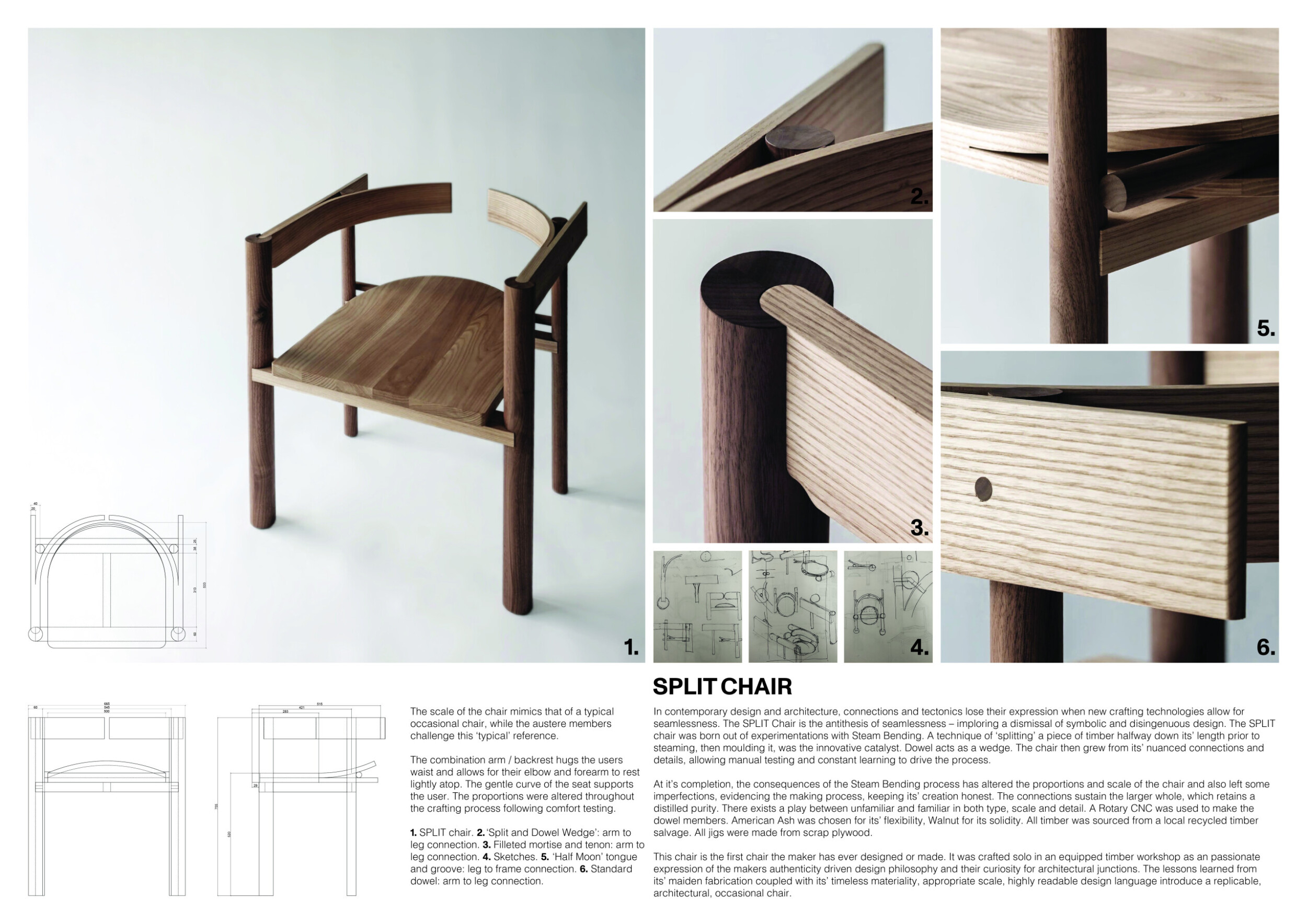
The Split Chair mirrors the scale of a typical occasional chair but challenges this reference with its austere design. The combined arm and backrest gently embrace the user's waist, allowing the elbow and forearm to rest comfortably. The seat's gentle curve supports the user, with its proportions adjusted through comfort testing. In modern design, seamlessness often hides craftsmanship. The Split Chair, however, celebrates its honest construction. Read more Born from experiments in steam bending, the chair’s defining feature is its ‘split’ timber, molded after steaming. Dowel wedges hold the structure together, with proportions shaped by manual testing and constant learning. Crafted from locally sourced recycled American Ash and Walnut, the chair’s imperfections highlight its handmade process. Created by the maker as their first design, the chair reflects a passion for authentic, architectural craftsmanship. Its timeless design and readability make it highly replicable.

I love everything about this chair, the knowledge behind the technology, the respect for the craftsmanship, the sense of untimeliness, the designer's courage to challenge it and the intrigue that this split backrest creates in a fun and unexpected way. It’s the kind of piece of furniture you will treasure because you can feel its soul. I can imagine passing this chair down through generations, is there anything more sustainable than that?
Natalia Sanz Laviña / Buildner guest jury
YSLA YamamuraSanzLaviña Architects, Japan

The concept of 'split' is well translated into the overall design as well as the craftmanship. It's beautiful and functional at the same time, and its attention to details is excellent.
Flora Lee / Buildner guest jury
Associate Partner, MAD Architects, USA

The idea behind the split-production of the chair is great. It is understandable how the concept came about through curiosity about architectural contexts. The development process seems very honest and personal. The open backrest is irritating at a first view because it is unusual. It would be exciting to feel the comfort. Is it more comfortable through the opening or does the opening leave pressure points next to the spine?
Sarah Hossli / Buildner guest jury
Product designer, Switzerland

The choice of wood types is well researched and justified. Regarding ergonomics: a seat angle of 0 degrees seems uncomfortable and the seat height of 52 cm is very high (it is usually 45-47 cm), which can lead to pressure points on the upper thigh. Over all, a nice chair with beautiful details, and very well crafted.
Sarah Hossli / Buildner guest jury
Product designer, Switzerland

The Split Chair showcases an intricate balance between contemporary design and traditional woodworking techniques, emphasizing the beauty and innovation that comes from steam bending wood. The chair challenges conventional design norms by splitting timber along its length before bending it, creating a seamless yet dynamic form. The dowel joints serve as both functional and aesthetic elements, enhancing the chair's structural integrity while adding a refined detail.
Anne Brandhøj / Buildner guest jury
designer at Bly Studio, Anne Brandhøj, Denmark

The Split Chair, focuses on tectonic design and crafting through a unique method of splitting timber. This creative approach sets it apart as a distinct and innovative piece. The use of recycled timber highlights a strong commitment to the circular economy and sustainability. Additionally, the detailing and craftsmanship appear to be meticulously considered, contributing to the overall quality of the piece. Altogether, this entry presents a unique and well-crafted piece of furniture, demonstrating both creativity and environmental consciousness.
Harrison Stallan / Buildner guest jury
OMA, Netherlands

The Split Chair’s combination of form and function, coupled with the designer's hands-on approach, results in a piece that is both a testament to traditional craftsmanship and a modern interpretation of an occasional chair. This approach not only highlights the material's natural beauty but also demonstrates a thoughtful consideration of the user experience, making the Split Chair a notable piece in contemporary furniture design. A down side is that its intricate construction might limit accessibility for mass production and broader market appeal.
Anne Brandhøj / Buildner guest jury
designer at Bly Studio, Anne Brandhøj, Denmark
Buildner's commentary, recommendations and techniques review
Order your review here
The project effectively uses a clear primary image that immediately conveys the chair's proportions, materials, and detailing. Its aerial viewpoint and shadows add depth and character to the otherwise simple image. This main image is supported by excellent detailed photos that clearly showcase the craftsmanship and material joinery. However, the small sketches are illegible and so tiny on the page that they detract from the overall presentation rather than enhance it. Read more The text is overly lengthy and meandering, with a confusing hierarchy between the blocks on the right and left. It's recommended that the author either reduce the length of the supporting text or emphasize the more descriptive sections. Additionally, the photos would benefit from basic annotations to describe the joints, fixations, and materials directly on the visuals.
-
7/10 Linework

-
7/10 Quality of drawings

-
7/10 Balance of color

-
8/10 Layout

-
7/10 Hierarchy

-
6/10 Annotation

-
7/10 Text

-
8/10 Clarity of story

-
7/10 Clarity of diagrams

-
7/10 Quality of overall presentation

Honorable mentions
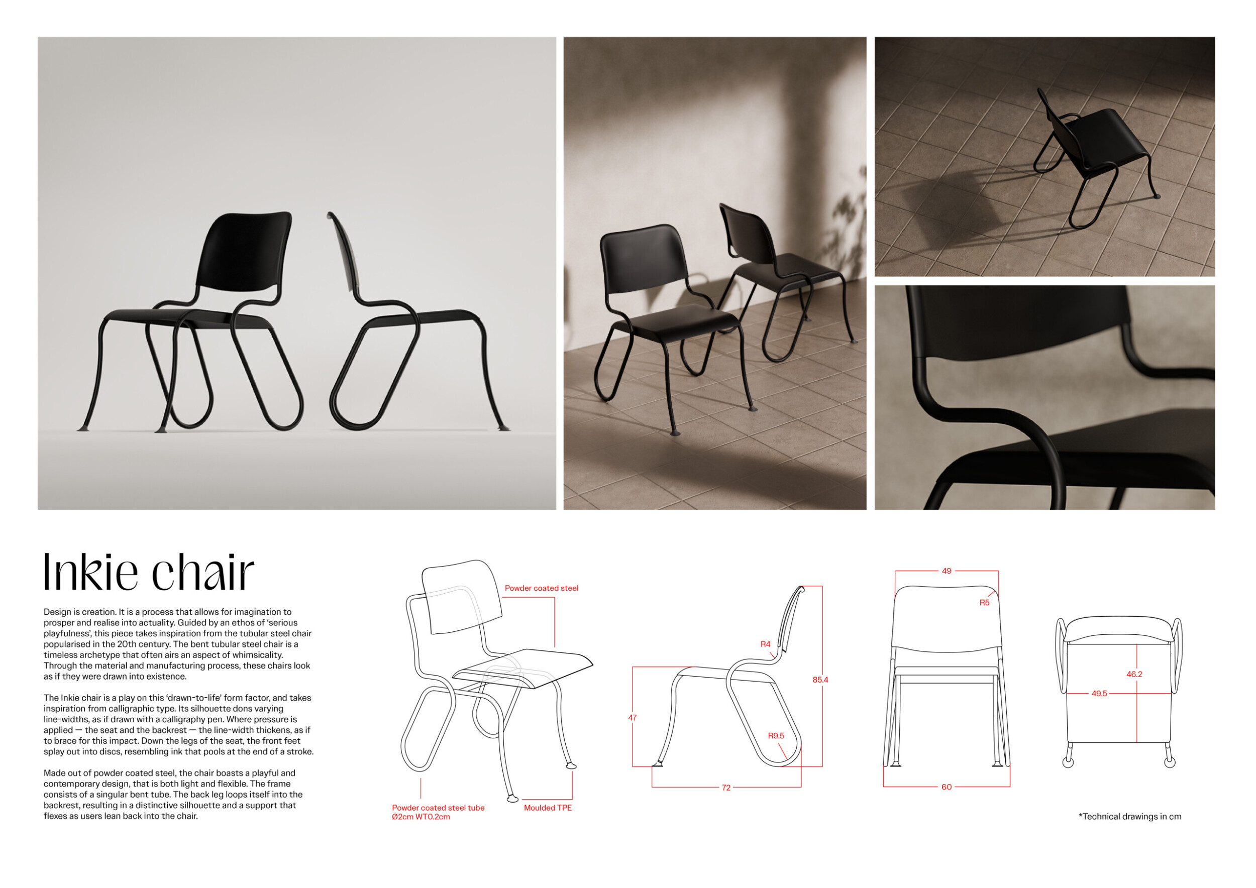
Inkie chair

To challenge myself, competitions provide space for learning, experimentation, and pushing boundaries. They inspire me and give me the freedom to be creative and do what I love.
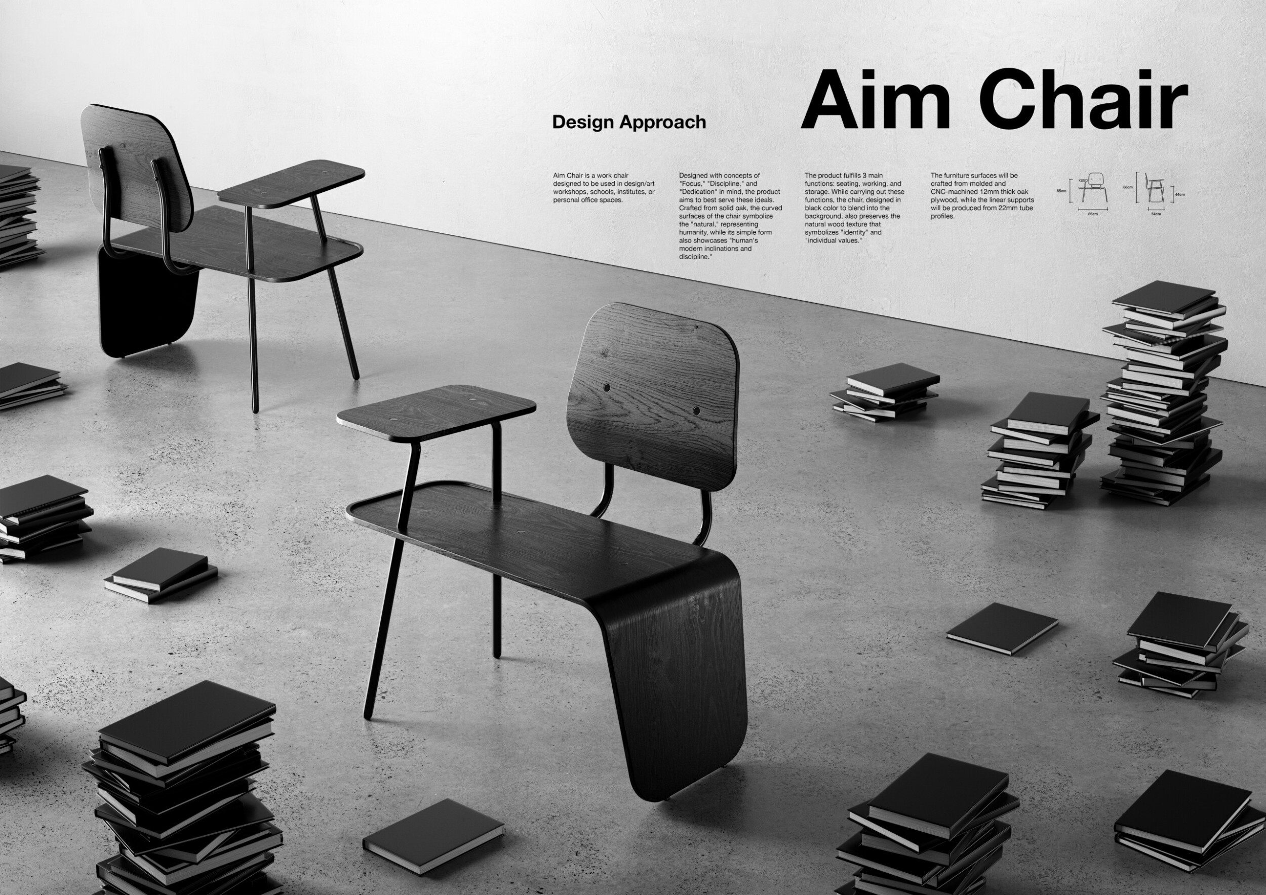
Read full interviewAim Chair
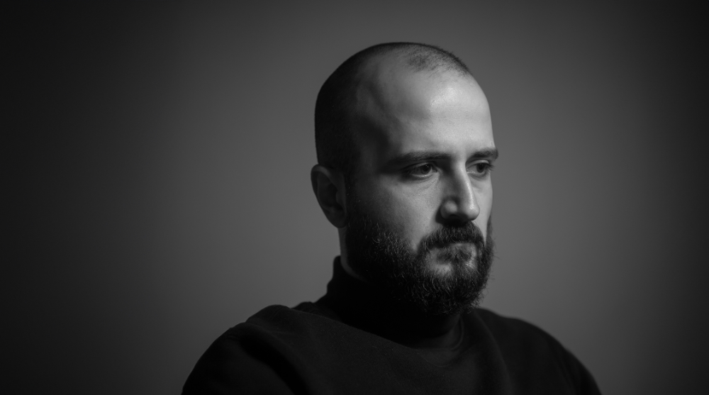
I think that my answer to this question would be something like, “to test myself and get feedback on whether I can do this job well by having my work evaluated by different professionals.” However, at this point in my life, I realize that I participate in competitions where I can find and contribute something of myself. The Architect's Chair competition is like a summary of my career. I received my design education in the field of Interior Architecture, then gained experience in furniture and product design, and advanced my career in that direction. Naturally, this competition gave me a challenging yet enjoyable opportunity to reflect on and express my identity and background through design. It was very enjoyable to try to answer the question, “What would it be like if I designed a signature piece of furniture?” And while I could have designed many unusual or striking products, the fact that I ended up designing something very calm, natural, stable, and focused on its purpose was made possible by some beautiful self-awareness, and I am very happy about this. What I loved most about the Architect's Chair competition was probably this function: it provided a platform where the designer could freely design without any restrictions, expressing themselves freely through their design.
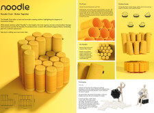
Read full interviewNoodle Chair

Though I'm a novice in architecture, as a designer, the allure of creating a building or structure is always present. Whenever I travel, I make it a point to visit incredible architectural landmarks. So, when I saw that one of my design heroes, Philippe Starck, was a judge for the Architecture Chair competition, I couldn't pass up the chance. I may not be great at buildings, but designing a chair for a legend like him was an opportunity I couldn’t let slip by.
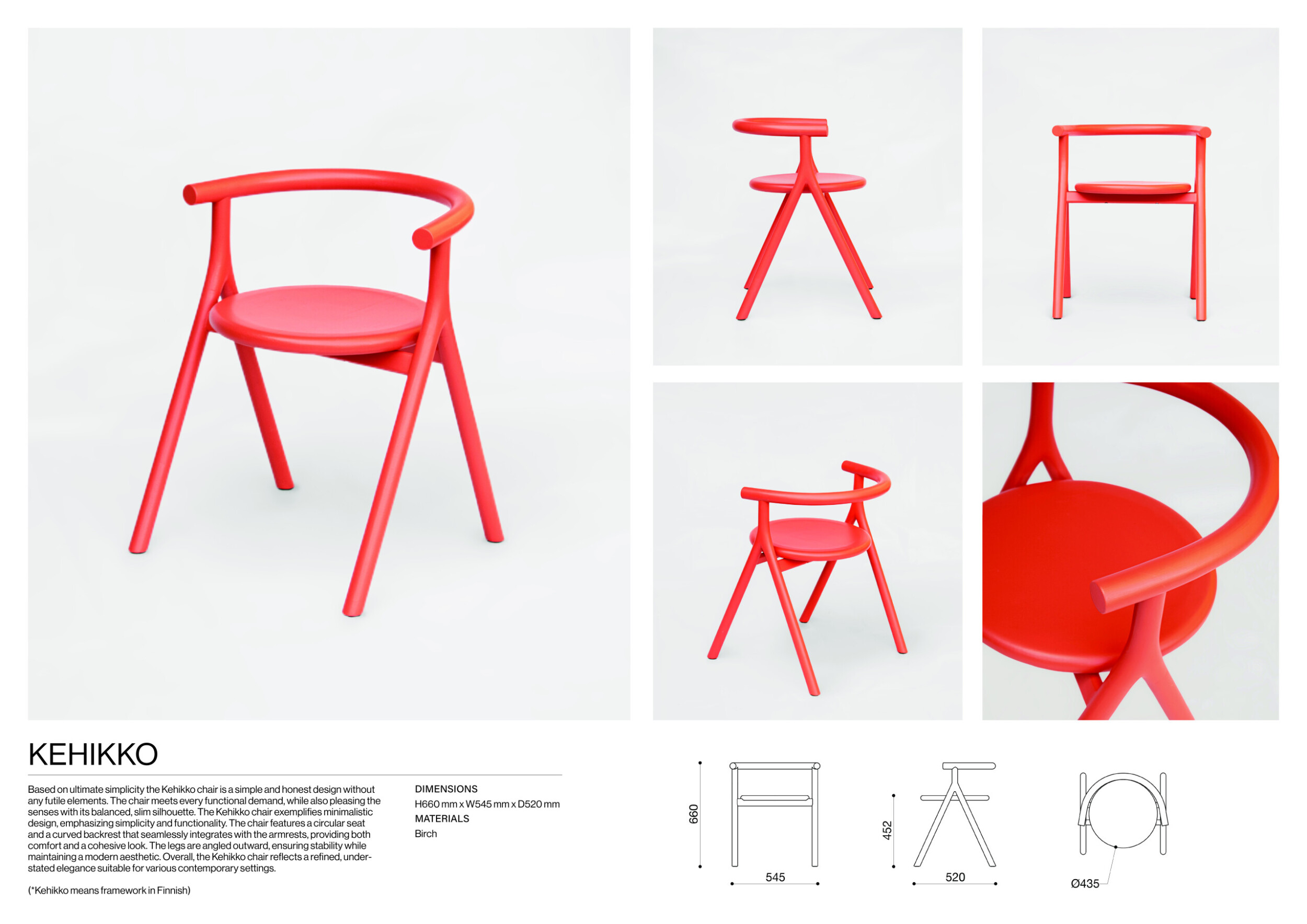
Read full interviewKehikko
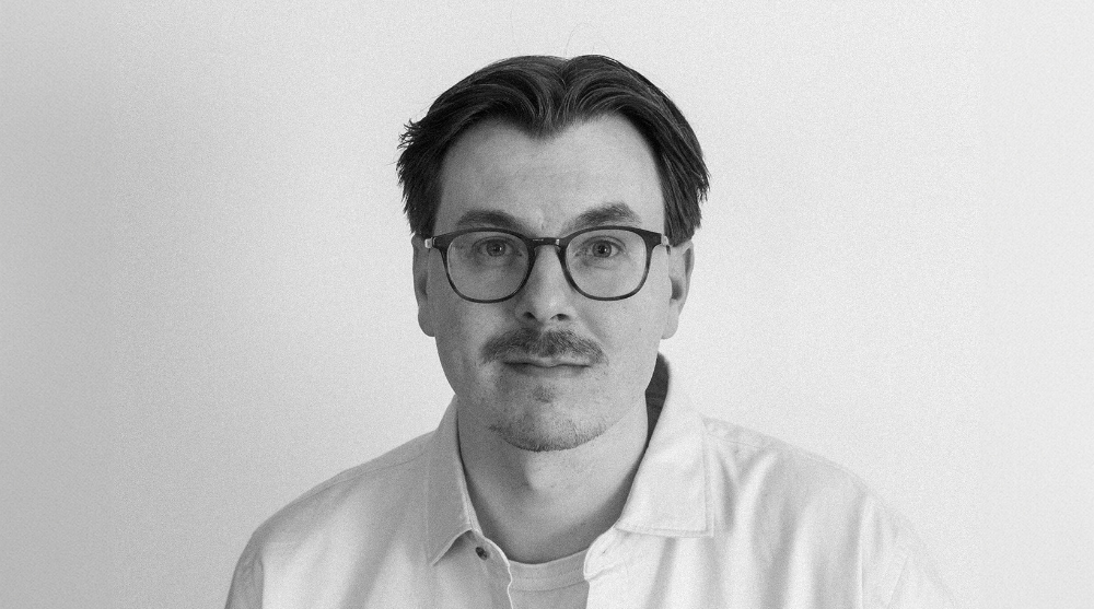
I participate in competitions for the creative freedom they offer, allowing me to explore ideas and experiment beyond the constraints of commercial work.
Read full interview Finland
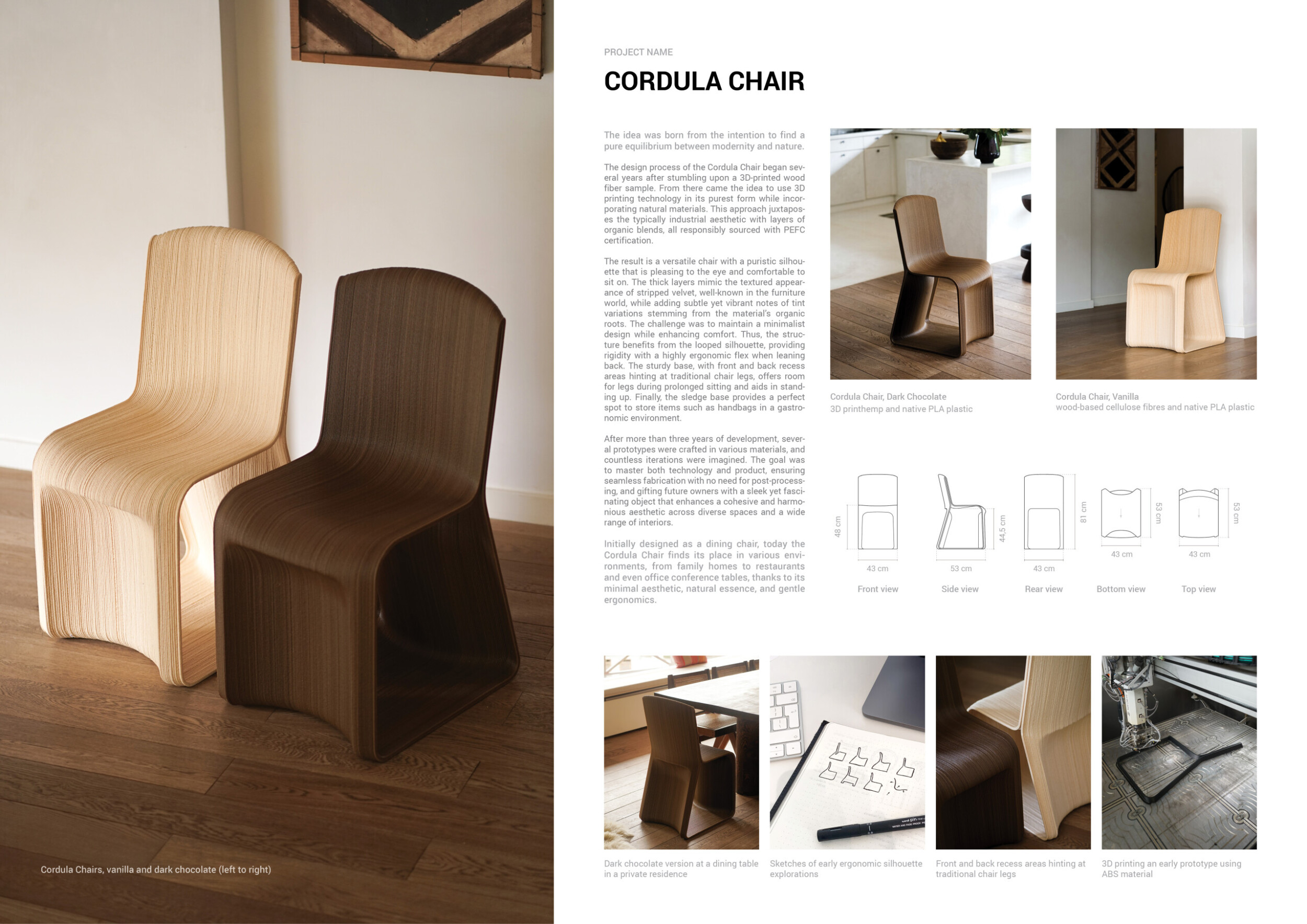
Cordula Chair

I participate in design competitions to ignite my creativity through new briefs and energize my work with fresh challenges. These opportunities push me to broaden my perspective, expand my sources of inspiration, and continuously drive innovation in my work.
Read full interviewShortlisted projects
La Chaise Tri-Par-Tie
Brochette
Université de Québec à Montréal
+172 points Buildner University Rankings! Canada
 archaiq
Mirame chair
University American College Skopje - UACS
+22 points Buildner University Rankings! Macedonia
 PAPERCLIP
Toronto Metropolitan University - TMU
+22 points Buildner University Rankings! Canada
 Aloop
Strato
University of Pennsylvania School of Design, Stuart Weitzman School of Design
+22 points Buildner University Rankings! United States
 MATERIA LUCE
ENSA , École Nationale Supérieure d'Architecture de Paris-Belleville
+22 points Buildner University Rankings! Switzerland
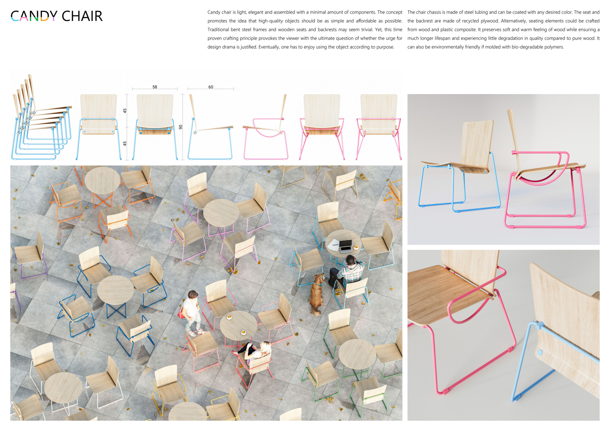
Promoted projects
Sputnik

 Sweden








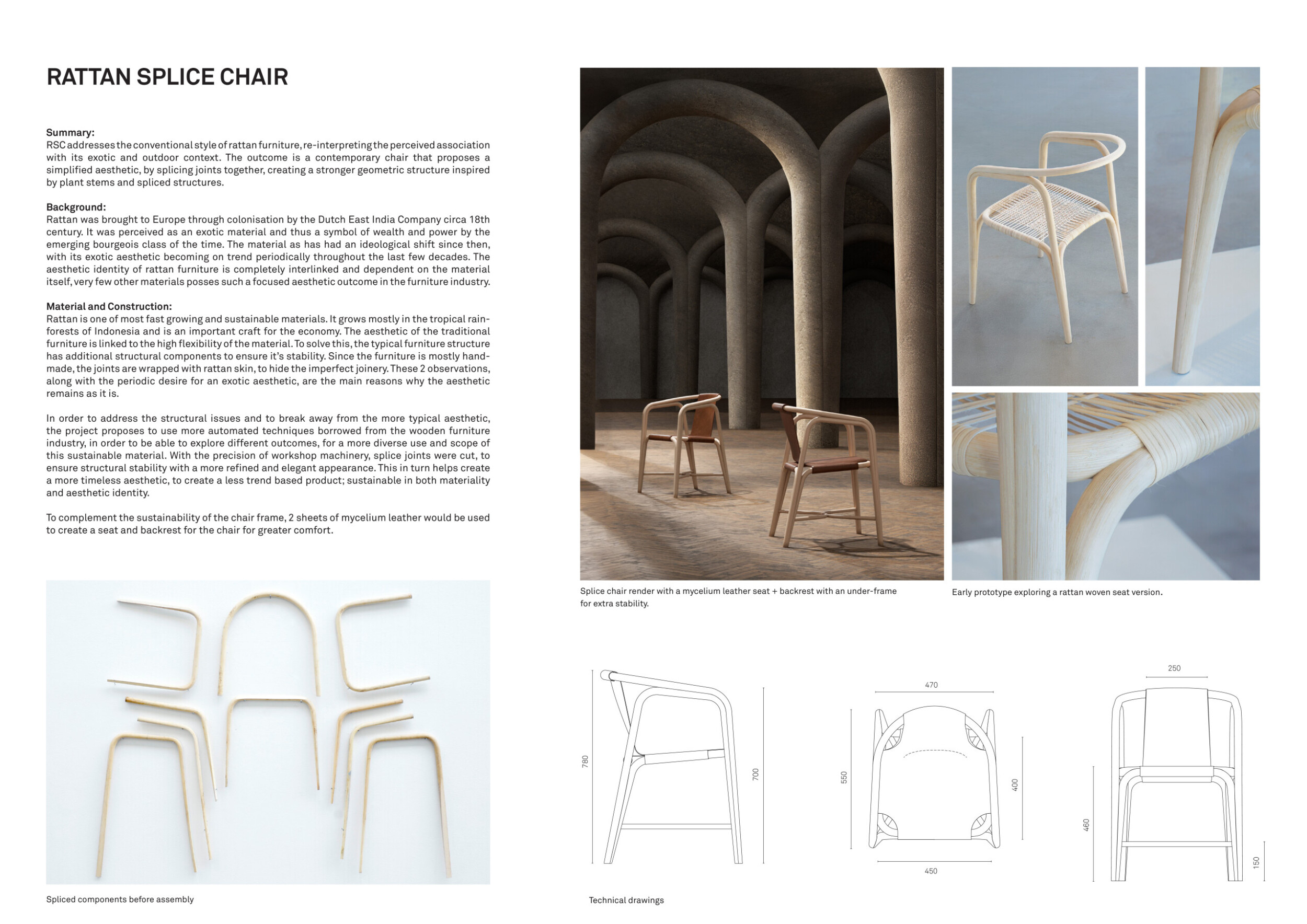



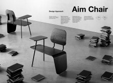

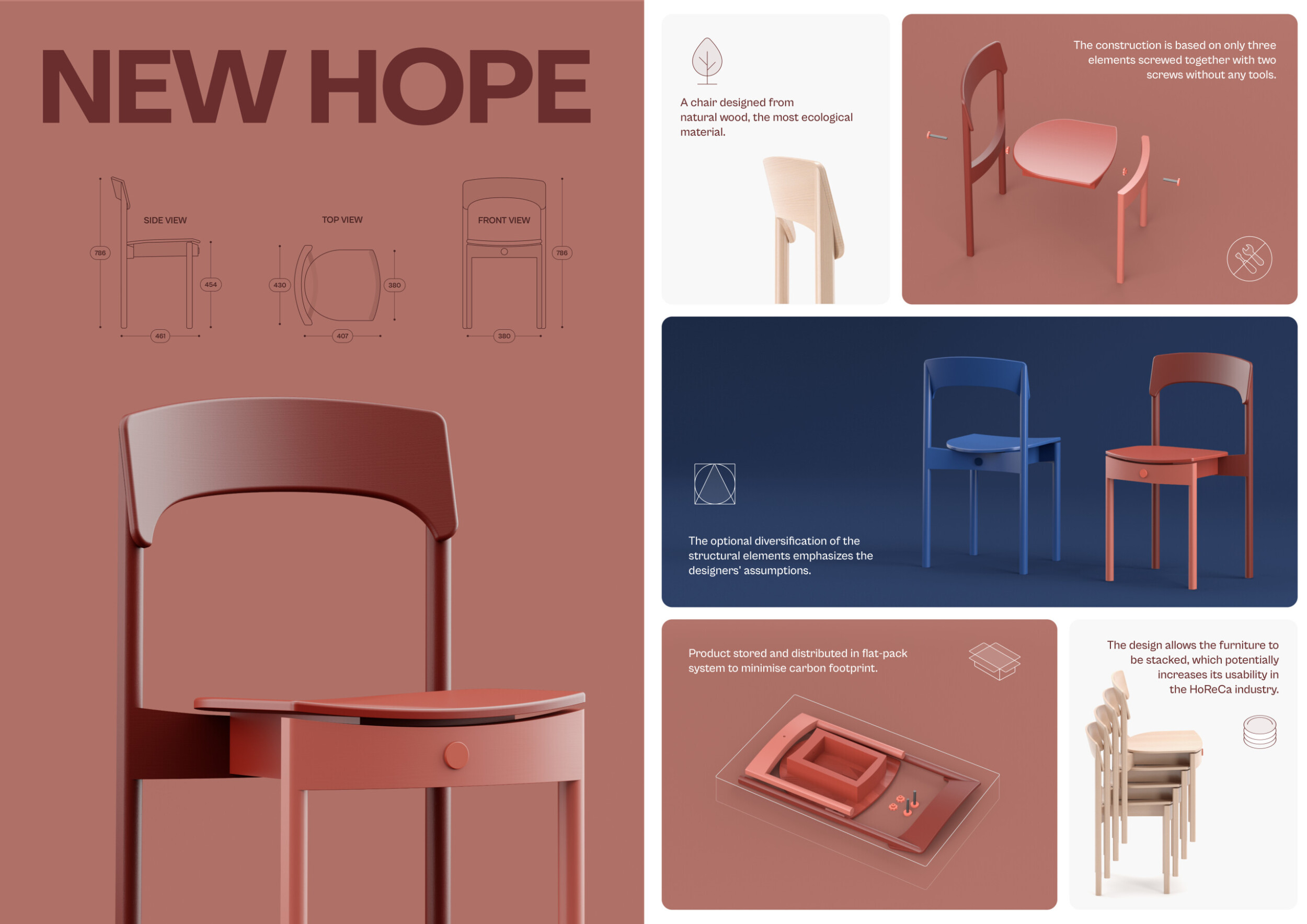

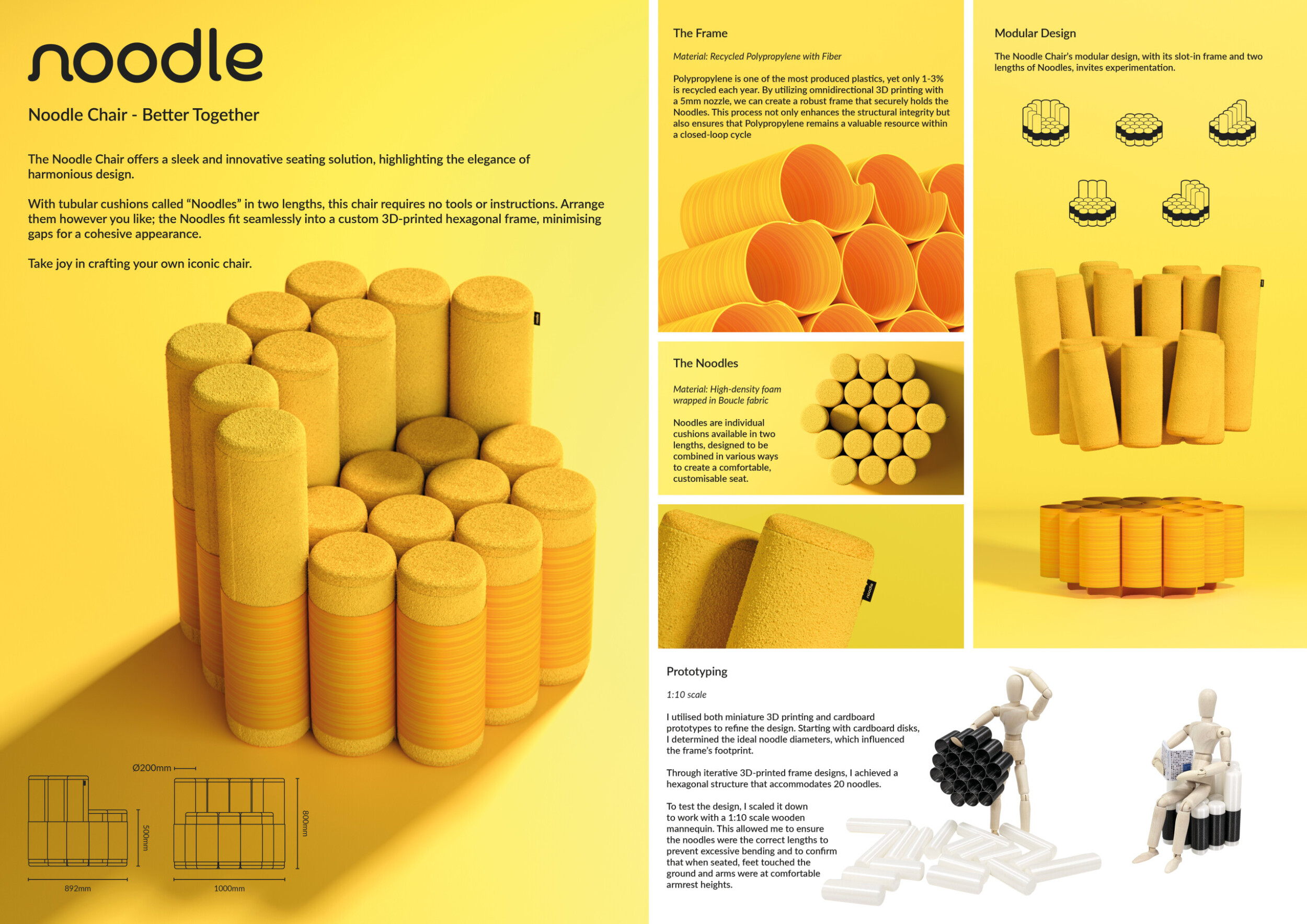

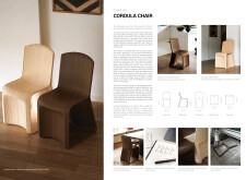

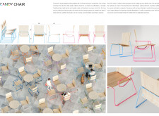

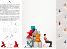
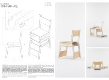

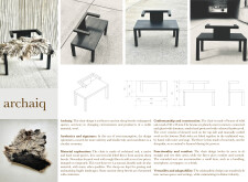
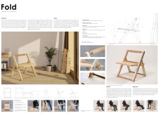
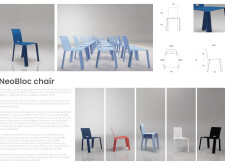

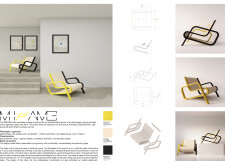
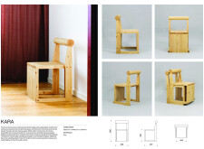

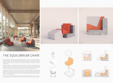
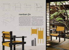

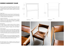
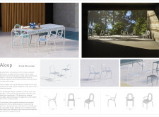
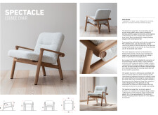
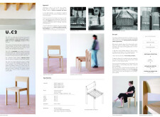
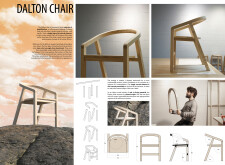
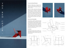
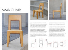
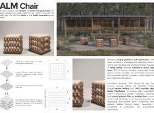

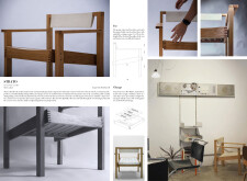
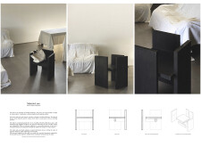
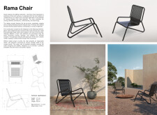
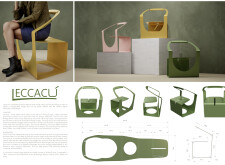

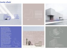
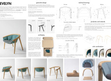


The project panel stands out with a large, dark primary image, balanced by lighter visuals around it. This composition cleverly draws attention to both the chair and the space it’s designed for, giving the presentation an architectural quality. Read more The text is quite lengthy and would benefit from being more concise, with key ideas highlighted using bold text. Adding annotations to the visuals would further enhance the presentation. The image in the bottom left, which details the individual components of the chair, is excellent, clearly illustrating the project's fabrication, packing, and assembly process for the reader.