Buildner is a global leader in organizing architecture competitions of all scales — from furniture, cottages, and guesthouses to full city rebranding. With prize budgets ranging from €5,000 to €500,000, Buildner brings proven global experience to every competition.
Launch a competitionLaunch a competition
Introduction
Buildner is pleased to announce the results of its Iceland Movie Pavilion International Competition!
The Iceland Movie Pavilion competition sought designs for a movie pavilion in the Grjótagjá cave region located near Lake Mývatn in northern Iceland. It was asked that proposals reflect the essence of Icelandic cinema, its distinctive character and unique history, with the central focus being a small movie theater capable of hosting up to 50 visitors. The pavilion is envisioned to be a place to introduce visitors to Icelandic cinema, as well as one to offer fans a place to gather and share a passion for film.
Buildner worked with an international jury to evaluate the entries and select winning proposals: Pip Cheshire is the Director of Cheshire Architects, based in Auckland, New Zealand; Ricardo Gomes is partner of Lisbon-based KWY.studio; Borghildur Indriðadóttir is an artist that lives and works in Reykjavík, Iceland; Pablo Larroulet is a Chilean architect and founder of LARROU ARQ - Pablo Larroulet Arquitectura; Mark Smyth and Sigrún Sumarliðadóttir are co-founders of Studio Bua, an architectural practice with offices in London and Oslo; Hans Jakob Wagner is a research associate and doctoral candidate at the Institute for Computational Design and Construction, University of Stuttgart; and Hanna Dís Whitehead is an artist who produces work through her studio Studio Hanna Whitehead out of Southeast Iceland.
Buildner and its jury panel would like to thank each of the participants and teams from around the globe who submitted proposals for this event.
1st Prize Winner +
Client Favorite
Client Favorite
Jury feedback summary
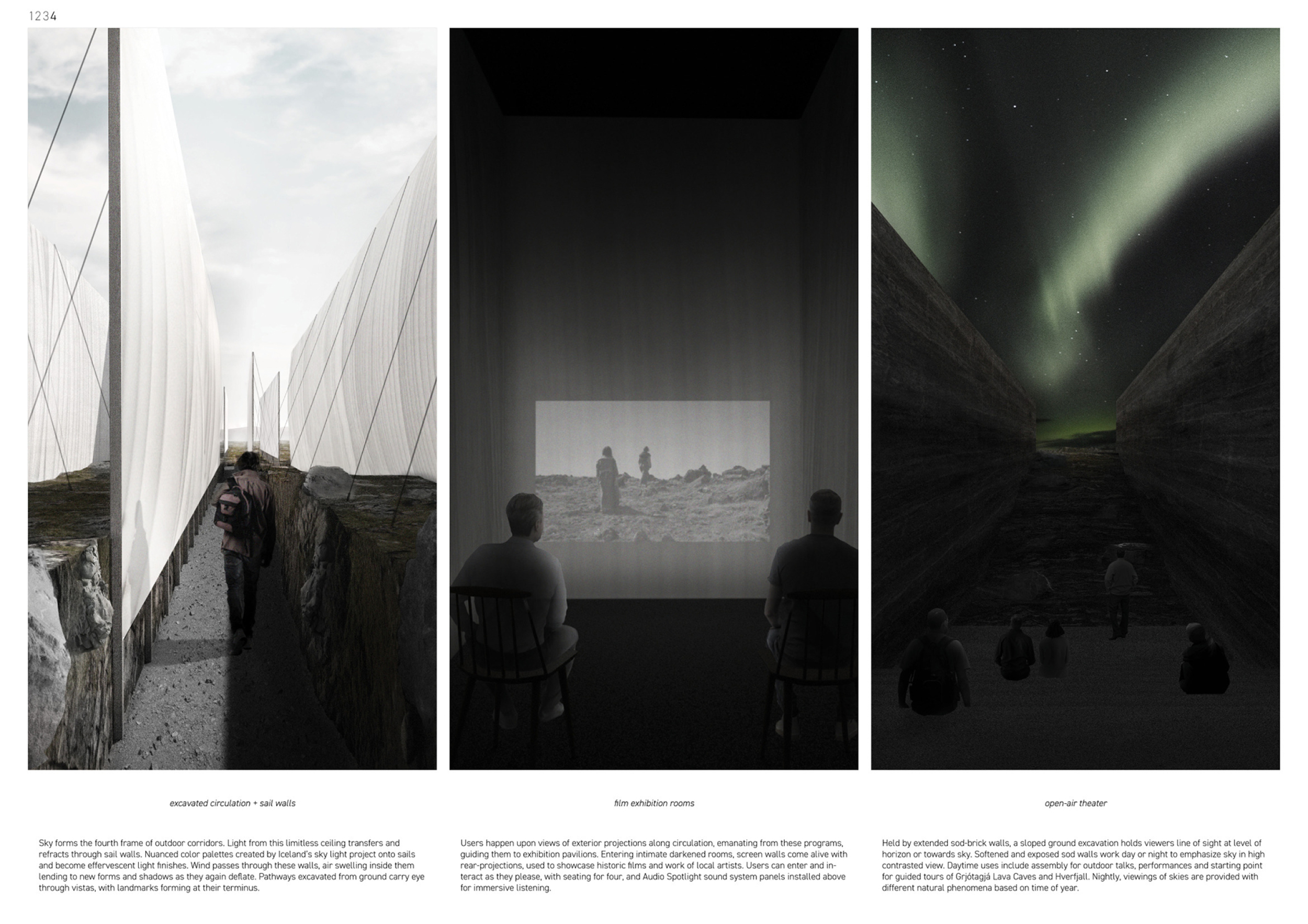
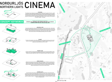
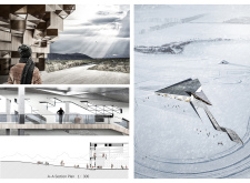
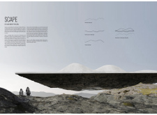
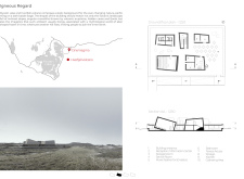
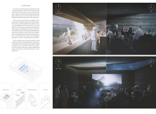
Slow Sails is a veritable monument to earth and sky, a series of outdoor open-air corridors formed by fiberglass ‘sails’ to frame views of the landscape and sky above. The effervescent, reflective finishes of the sails are designed to change with variations in daylight, weather and season. Amidst the striated corridors created by these vertical walls are hidden ‘solid’ screening rooms and other enclosed spaces built of insulated wood stud and sod brick. Read more Slow Field provokes users to engage with film via varied cinematic experiences that are both indoor and open air, using reverse and standard projections onto walls within the intimacy of enclosed rooms as well as on the surfaces of the exterior sails, thereby merging the cinematic experience with the natural landscape and site.

The idea is very strong - a lightweight structure like an installation of layered moving sails - creates a special experience within the scarce and astonishing landscape.
Ricardo Gomes / Buildner guest jury
Partner, KWY.studio, Portugal

A poetic yet immersive proposal. The sketches are alive as well as the overall solution that conveys a fresh and unexpected interpretation and answer to the tectonic and cinematic existence.
Borghildur Indriðadóttir / Buildner guest jury
Teiknistofan Óðinstorgi, Iceland

An expertly designed proposal. The project involves the visitors into a tectonic rift of spatial screens that could make the pavilion stand by itself even without an additional function as a movie theater. The building is, however, not ideally connected to the cinematic program experience and the support of such.
Hans Jakob Wagner / Buildner guest jury
Research associate and doctoral candidate at the Institute for Computational Design and Construction, University of Stuttgart, Germany
Buildner's commentary, recommendations and techniques review
Order your review here
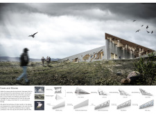
The presentation sheets, like the project itself, are subtle and minimalist in design. The layout makes use of a clever striated organization that allows for both horizontal and vertical full-span images to engage the reader as the project might engage the visitor: undoubtedly horizontal at a global level while vertical within the smaller-scale framed corridors. Read more While the submission is primarily black and white by design the reader seeks to understand the project’s assumed variability: what is the experience under a bright blue sky? The sunset? Cinema is, often, an experience of vivid color, and while the design reveals itself as a muted white backdrop to the animation of projected screenings, the designer should not feel limited by this. Competitions entries all, ultimately, also need to inspire. The project would benefit from more concise text and a larger font. While the text on the final page describes well the variation of experiences, the introductory text on the first sheet is lengthy for a competition proposal. It is possible to be both poetic and brief! Finally, it is recommended that the author further develop the sail detail, which is the primary project constructive detail but which is not represented clearly here. Can the thin sail really stand, structurally speaking, against the harsh Icelandic winds?
-
9/10 Linework

-
10/10 Quality of drawings

-
8/10 Balance of color

-
10/10 Layout

-
10/10 Hierarchy

-
9/10 Annotation

-
8/10 Text

-
10/10 Clarity of story

-
10/10 Clarity of diagrams

-
9/10 Quality of overall presentation

Enter an open architecture competition now
2nd Prize Winner +
Buildner Student Award
Buildner Student Award
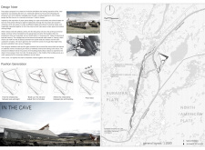
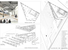
The Cave

It would take a good psychologist to know. Something magical and fascinating happens during architectural competitions. Just think of two people who have never met, do not speak the same language, live in different places, at different times, and despite this they communicate with each other We feel this powerful fascination and when we have something to say, we cannot resist the temptation to be part of it
Read full interview Italy
Italy
Jury feedback summary
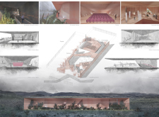
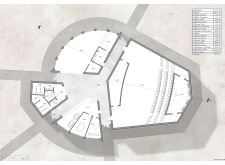
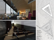
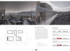
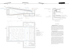
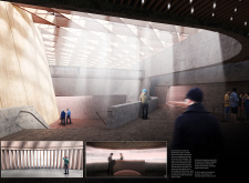
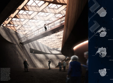
“Storytelling,” the author writes, “is an ancient ritual provoking thought, communicating wisdom, and warming the soul,” an activity that has remained more or less intact over centuries. The Cave, this project’s namesake, uses this most basic form of human shelter, as a “sacred temple” for storytelling, a project designed to enhance the rite of cinema. Its form is the manifestation of the merger between ancient cave and modern box-form cinema. Read more The result of these two forms inscribed on one another is an ellipsoid within a box, an experiment which yields two large spaces: one as a central event space and the other as a perimeter support space.

This is an interesting scheme that proposes and relies on a single idea, that of a constructed cave within a box. The cave's ability to be both open entry attracting visitors and enclosed theater is cunning but not without difficulties that are not yet resolved in the proposal; the building being shut to visitors during a film. The area outside the 'cave' and within the box could be extraordinary but is not well developed.
Pip Cheshire / Buildner guest jury
Director, Cheshire Architects, New Zealand

Simple and great, the composition responds perfectly to the concept, providing flexibility to the spaces and creating a unique experience between cinema and landscape.
Pablo Larroulet / Buildner guest jury
LARROU ARQ - Pablo Larroulet Arquitectura, Chile

A spatial and social experiment that clearly diverges from the typical cinematic theater setting. It convinces by renegotiating the physical and spatial experience for the collective sharing of stories and tales. The details and panelization need to be developed, but the technical depth is appropriate for a design concept. This project demonstrates a bold new interpretation of how novel and meaningful atmospheric spaces can be formed using timber construction.
Hans Jakob Wagner / Buildner guest jury
Research associate and doctoral candidate at the Institute for Computational Design and Construction, University of Stuttgart, Germany
Buildner's commentary, recommendations and techniques review
Order your review here
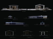
The submission has used an excellent, simple layout to emphasize large and convincing rendered perspectives, of which there are an appropriately selected number. The remaining white space is used for text and simple diagrams. As a whole the presentation is clean and communicative of the key ideas. The simplicity of the drawings do fall into the trap of being undeveloped. In particular the building plan and section represent walls and roofs as single black lines, all of a standard thickness. Read more The submission would benefit from an increased level of analysis and complexity in its detailing, to make it more thoroughly convincing as an architectural project. At a presentation level such complexity would also yield nuances in the design that would make the sheets more varied and interesting. As with many projects the text is rather long and winding and it is recommended that the author edit this to more precise statements.
-
9/10 Linework

-
10/10 Quality of drawings

-
10/10 Balance of color

-
10/10 Layout

-
10/10 Hierarchy

-
10/10 Annotation

-
8/10 Text

-
10/10 Clarity of story

-
10/10 Clarity of diagrams

-
10/10 Quality of overall presentation

3rd Prize Winner
Hidden Haven

It was an exciting experience and the opportunity to convey ideas through the prism of your worldview. We've got out of our comfort zone in a way, had valuable interactions with the newly formed team, and enjoyed fascinating research and analysis of new information – everything we hoped to get out of the competition and more.
Read full interview Ukraine
Jury feedback summary
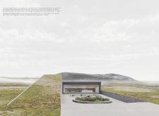
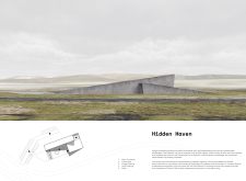
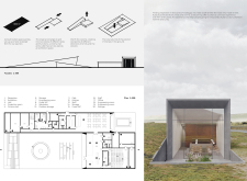
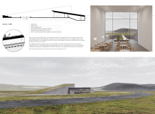
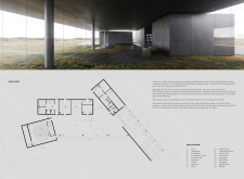
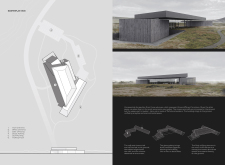
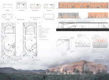
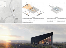
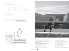
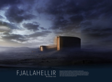
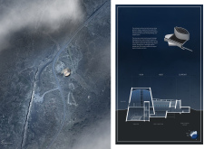
Hidden Haven draws from human isolation and loneliness and the search for comfort and warmth, a theme often present in film. The pavilion is designed as a safe shelter (similar to the nearby caves), a solid construction amidst a stark and harsh landscape, and above all a welcoming place for the sharing of common stories by filmmakers. The pavilion is split into two blocks of different sizes - one a cinema hall, the other a cafe and exhibition space. Read more The blocks are sunken within the earth and emerge from the landscape as if mountains, directed in opposing directions to offer views of the surrounding landscape.

The robust concrete forms emerging from the land are simple but effective markers of human occupation within the site though the imbalance of areas between back-of-house and the public areas suggest that maybe the sculptural program prevailed over a more rigorous analysis of the space required for the workings of the facility.
Pip Cheshire / Buildner guest jury
Director, Cheshire Architects, New Zealand

The two buildings work well together while creating an interesting friction. The emphasis on the height of the spaces is a well thought spatial experience that contrasts the strong presence of the horizon and horizontality of the vast surrounding landscape.
Ricardo Gomes / Buildner guest jury
Partner, KWY.studio, Portugal

A simple and poetic concept, good quality spaces, a well organized plan and worked-out details.
Sigrún Sumarliðadóttir / Buildner guest jury
Studio BUA, UK
Buildner's commentary, recommendations and techniques review
Order your review here
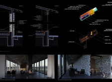
The presentation is well designed, using large perspective imagery mixed with clear drawings and diagrams, to produce a story that is convincing to a reader. The images primarily describe the exterior form of the building, and while there is one interior image, it seems that the most important interior spatial experience - that of the cinema hall - is missing. Read more For the juror this gives a sense that the project has not been fully developed, and it does not allow one to understand the whole project. Further, while there is one detail included to explain the layers of the roof buildup, the project neglects to enter into a detailed analysis of the building construction. This is arguably not necessary for a conceptual design competition, however such detail would also allow the author to more fully understand how the building meets the landscape, and should yield more interesting relationships between building and site. The plan and section drawings are very simplistic and would benefit from additional linework to describe the envelope. It would also be very beneficial in plan to understand where the interior spaces are sunken versus where they are above ground - as was done in section.
-
8/10 Linework

-
10/10 Quality of drawings

-
10/10 Balance of color

-
10/10 Layout

-
10/10 Hierarchy

-
9/10 Annotation

-
8/10 Text

-
10/10 Clarity of story

-
10/10 Clarity of diagrams

-
10/10 Quality of overall presentation

Buildner Sustainability Award
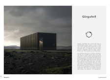
Gönguferð
We participate in competitions in order to work without too strict boundaries, but still within a given task and a set of goals. Competitions allow us to test and stretch rules to achieve a better solution in the context. It is also a dense amount of work to develop an idea and bring it to life. With competent juries evaluating proposals (preferably anonymous), an independent third party can approve of your professional skills. There is also obviously the possibility of winning a project and building it. Should a proposal not win, it can still be used as a reference. Most of all, it is fun.
Read full interview Norway
Jury feedback summary
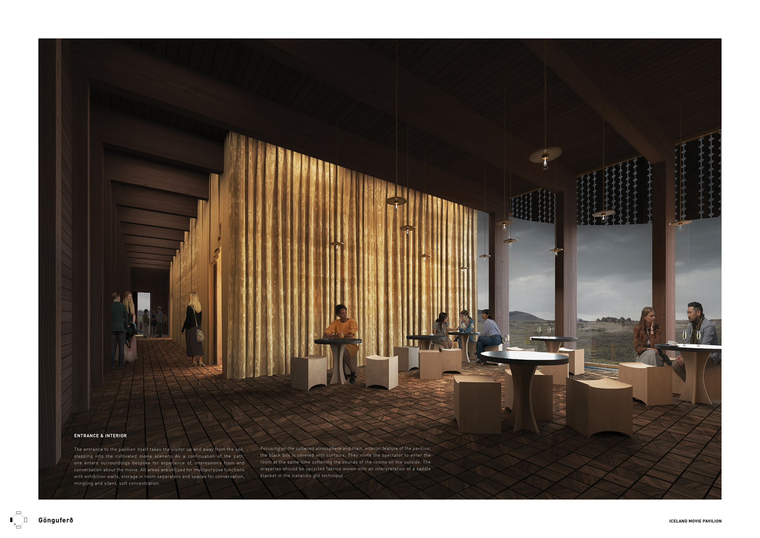
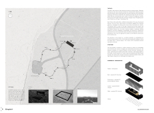
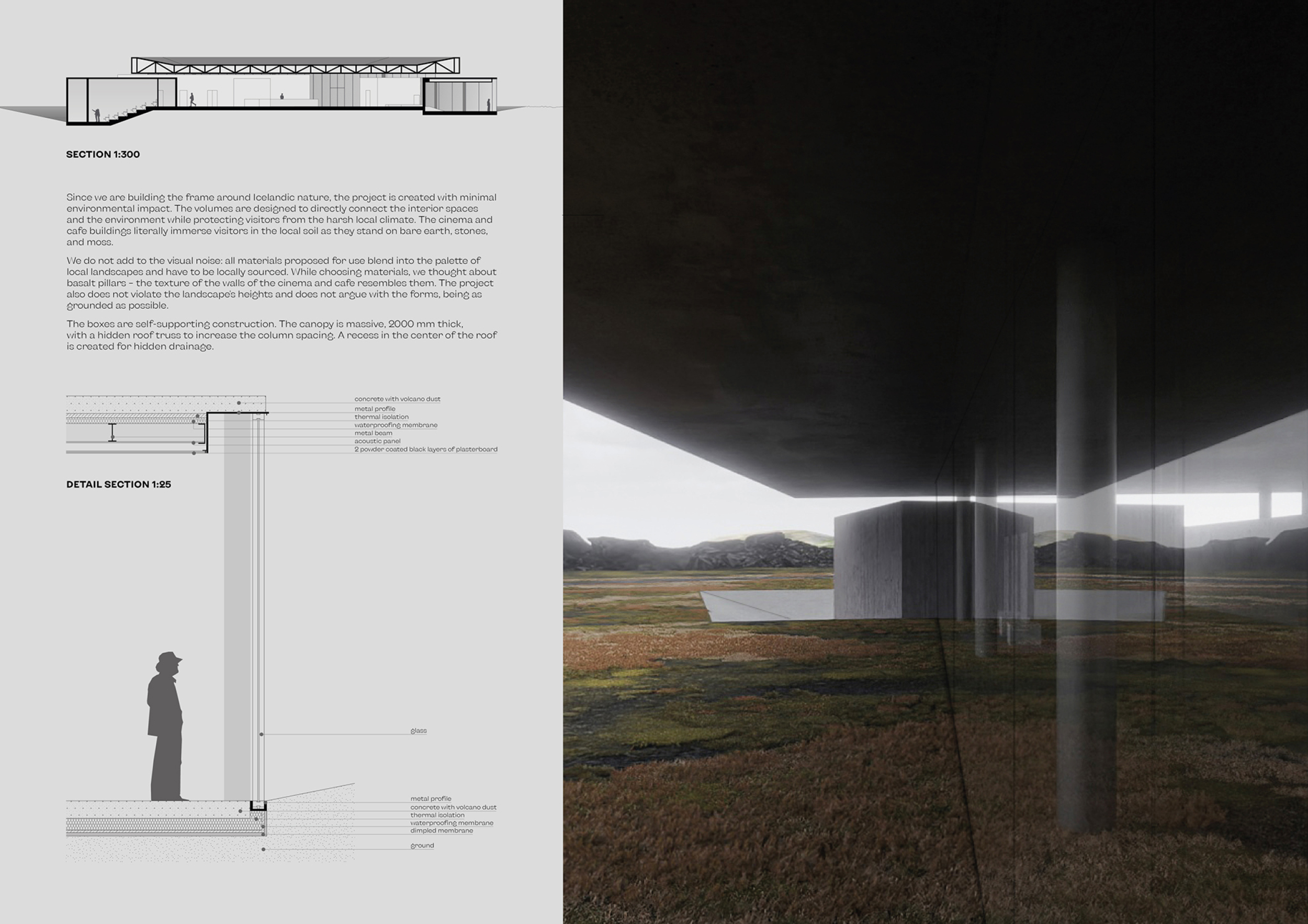
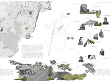
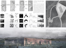
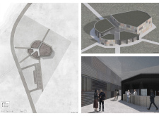
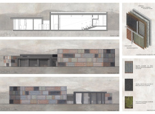
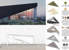
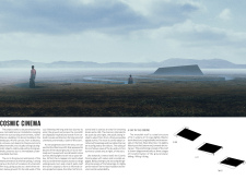
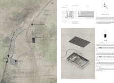
‘Gonguferd’ is a proposal for a pure block form clad in perforated timber panels, designed to minimize its impact on the site while still managing to perform as a vertical landmark amidst a horizontal landscape. The project places emphasis on a circular travel path from an existing parking lot through the site and to the pavilion, considering the building as fitting within an ensemble: a level of site analysis which many projects did not enter into. Read more As a result the project is not simply an isolated building but a series of observatory viewpoints that respect the unique surroundings as part of a ‘total’ experience. The facade is intelligently designed using natural materials to provide the building with an articulated surface.

Beautifully proportioned, with a real focus on sustainability. The reuse of secondary timber to produce CLT is an interesting concept.
Mark Smyth / Buildner guest jury
Studio Bua, Norway

Well researched material use and a commendable focus on sustainability. A good composition of the architecture and high quality graphics.
Sigrún Sumarliðadóttir / Buildner guest jury
Studio BUA, UK

The project really makes the journey start from the moment you step out of your car.
Hanna Dís Whitehead / Buildner guest jury
Studio Hanna Whitehead, Iceland
Buildner's commentary, recommendations and techniques review
Order your review here
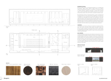
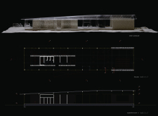
The author has successfully found a solution for taking advantage of a four-sheet presentation with large, clear images which guide hierarchy, balance and visual appeal. The site plan on the second sheet is especially strong and stands out from the many other presentations received. There are four recommendations to improve the presentation. Read more The first concerns the building plan and section on the third sheet - the author would benefit from more varied line weights to describe cut versus projection lines. As drawn there is no hierarchy among the lines making the drawings relatively difficult to read. The second point concerns the use of text - as with many presentations we recommend this be made as concise as possible. Given many submissions are received, a juror will only read such lengthy text in full if it is determined the submission is among the strongest and one which requires an especially detailed review. The third recommendation is to include a more detailed analysis and design of the timber envelope, which the project certainly lacks. The last point concerns the final rendering. The author would benefit from additional detail and a ‘crisper image’ To achieve this the author might consider lightening the image so it is not so somber.
-
9/10 Linework

-
9/10 Quality of drawings

-
9/10 Balance of color

-
10/10 Layout

-
10/10 Hierarchy

-
10/10 Annotation

-
9/10 Text

-
10/10 Clarity of story

-
10/10 Clarity of diagrams

-
9/10 Quality of overall presentation

Honorable mentions
Unearthed
Sinking Box
 South Korea
Iceland Movie Pavilion
 Spain
Spain
The Place
 United Kingdom
Grjótagjá Trail
Immersion

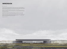
This is a new and exciting experience that differs from our usual workflow. Architects usually refer to participation in competitions as leaving their comfort zone. For us, in Ukraine in 2022, this competition was actually an opportunity to return to our comfort zone. A chance to practice our creativity and switch attention from the context of war we live in. Competitions are always a great way to expand your creative thinking, especially when there are additional unpredictable challenges.
Read full interview Ukraine
Shortlisted projects
Immersion
balbek bureau
 Ukraine
 The Cave
University of Camerino (UNICAM) , Unicam - Università di Camerino
+142 points Buildner University Rankings! Italy
Italy Grjótagjá Trail
Warsaw University of Technology , Politechnika Warszawska
+72 points Buildner University Rankings! Poland
 Hidden Haven
balbek bureau
 Ukraine
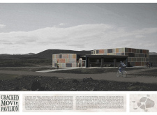
 Cracked Movie Pavilion
Warsaw University of Technology , Politechnika Warszawska
+22 points Buildner University Rankings! Poland
 Bíó Eldfjall
Skrymir
Retrospective of the Mundane
Georgia Institute of Technology
+22 points Buildner University Rankings! United States
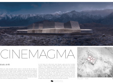
 CINEMAGMA
USP – Universidade de São Paulo
+22 points Buildner University Rankings! Brazil
 THROUGH THE LENS: THE ICELAND MOVIE PAVILLION
Architectural Association School of Architecture
+22 points Buildner University Rankings! United Kingdom
 ICELAND MOVIE PAVILION
Takenaka Corporation
 Japan
Japan Börn Náttúrunnar Movie Pavilion
The Unfounded Boundary
The Rift Pavilion
Polytechnic University of Catalonia, Universitat Politècnica de Catalunya
+22 points Buildner University Rankings! Spain
Spain 


