Buildner is a global leader in organizing architecture competitions of all scales — from furniture, cottages, and guesthouses to full city rebranding. With prize budgets ranging from €5,000 to €500,000, Buildner brings proven global experience to every competition.
Launch a competitionLaunch a competition
Introduction
Buildner is pleased to announce the results of the Greening the Industrial City competition.
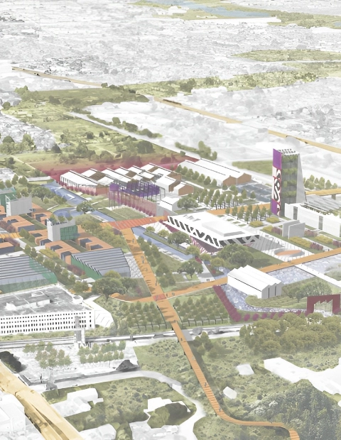
Participants are asked to submit a masterplan proposal for an industrial park that was built over a natural waterway. The jury sought proposals that cleverly exposed the natural beauty of the waterway underneath the industrial park, as well as those that addressed neighborhood concerns.
The top entries from the competition will be critiqued during an in-person jury event that followed a TEDxHouston Countdown event. The countdown is a series of TED talks focused on innovative solutions and thought leadership in addressing the effects of global warming. Selected competition entries will be displayed in the auditorium of the TEDxHouston Countdown speaker series.
Buildner worked with an excellent regional jury that consisted of: Amna Ansari is founding partner of UltraBarrio, an urban design and architecture practice with a central goal to shape cities to be more civic, sustainable, and generationally connected by design; Juan José Castellón, an Assistant Professor at the Department of Architecture at RICE University; Dalia Munenzon, who serves as the Boston associate for One Architecture & Urbanism, leading the firm’s projects in the greater Boston area; Marcus Martinez is a Partner at UltraBarrio where his experience in architecture and urbanism is dedicated to topics that foster resilient communities, repurposing infrastructure, and building types that relate to cycles of scarcity, surplus, and obsolescence; and Kirby Liu, a real estate developer focused on creative projects that have city wide impacts, who has led the development of POST Houston, the OMA-designed adaptive reuse of an abandoned post office in downtown Houston.
Buildner and its jurors congratulate the winning participants and thank all those that contributed to this ideas competition.
We sincerely thank our jury panel
for their time and expertise
Amna Ansari
UltraBarrio
USA

Juan José Castellón
RICE University in Houston
USA

Dalia Munenzon
One Architecture & Urbanism
USA

Marcus Martinez
UltraBarrio
USA

Kirby Liu
POST Houston
USA

1st Prize Winner
Life Spiral
As we said above, we’re happy to take up new challenges: new context, new problem-solution setting, and new continents:) Win is fun, getting known in the new markets is great for business, but the key is learning and getting stronger after every new case - the skills we later apply for our work with Customers.
Read full interviewJury feedback summary
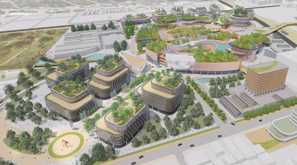
The jurors felt that this entry had the most sophisticated reading of the existing neighborhood context as well as a deep understanding of the neighborhood needs. The proposal was both a light touch and a radical reimagining of what is possible with adaptively reusing industrial structures. The jurors appreciated the inclusion of a “Memorial Wall” that connected to the adjacent historical cemetery for African Americans.
Buildner's commentary, recommendations and techniques review
Order your review here
The author has chosen to layout sheets beginning with a higher density of diagrams on opening sheets followed by larger rendered images on later sheets. Though it is generally balanced by pages, there does not seem to be an overarching organizational system applied to all pages, which is always recommended for consistency and ease of reading by the jury.
2nd Prize Winner
BAYOU AS: COMMUNITY

It’s a necessary exercise, both internally and externally of the profession, for designers to participate in an imaginative disciplinary dialogue. Having the possibility of a platform to share our ideas with others is also a great additional opportunity.
Read full interview United States
Jury feedback summary
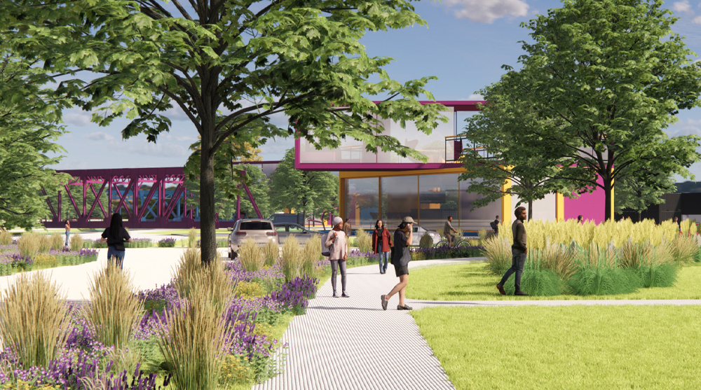
The jury commends Bayou As Community for its thoughtful representation techniques which suggested a degree of optimism about the potentiality of the site and architecture’s role in the built environment. The entry also showed a diversity of building types correlated to different types and scales of program which exhibited the designer’s understanding of both community needs and typology.
Buildner's commentary, recommendations and techniques review
Order your review here
The project has in particular pushed the boundaries to test and find a unique graphic method which is complemented by clear layout and annotation for ease of communication and to generate a strong immediate response from a reviewer. The project stands out among typical project submissions for its bold use of color, which is well balanced using a mix of pinks, greens and yellows.
3rd Prize Winner
Water, Land, and People

Competition is a good way for us to test our thoughts and skills. It allows us to think outside of the box and envision how an idea can take off and be visualized in a short time-frame.
Read full interview United States
Jury feedback summary
This entry had a minimalist approach to the site which was felt to be a refreshing counterpoint to concepts that maximized every square foot of the site with buildings. Instead, what remains is a vision for a vibrant woods area with multifunctional architecture that serves the community at a variety of scales.
Buildner's commentary, recommendations and techniques review
Order your review here
The layout of the four sheets is crystal clear for easy reading, with a primary image that spans the entire page in the horizontal, consisting of 75% of each sheet in the vertical. Below, spanning the base of each sheet, details and text provide additional supportive information. This layout provides simple reading, allowing jurors to easily find required text and descriptive diagrams that in conveying the concepts established in the larger and visually more important image above.
Honorable mentions
Shortlisted projects

