The rise of the startup, and the ever-growing popularity of independent and freelance working, has meant that the demand for co-working spaces has skyrocketed in major cities. A desk, a chair and a good internet connection is all that most freelancers need, but co-working spaces have evolved into a creative and innovative style of architecture all of its own.
Atrium co-working space, London
British designer Tom Dixon used his furniture and lighting to re-envision a co-working space in London’s trendy Camden area. Atrium was the third office to open in Interchange’s network of spaces based in the area, specifically targeted at freelancers, small businesses, start-ups and creatives.
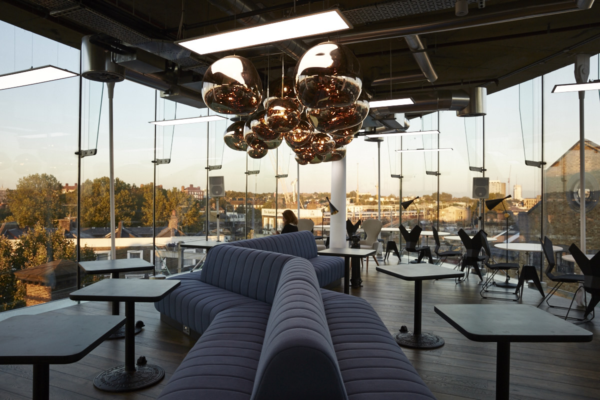
Tom Dixon’s interior makes the Interchange coworking space in Camden, London trendy and luxurious. Image source
Known for their high concept interiors, architectural design and large scale installations, Dixon’s Design Research Studio took their inspiration from social environments like hotels and clubs, as well as traditional office structures. The Atrium features a custom lighting installation that was crafted from laser-cut stainless steel tubes, appearing as a large geometric arrangement when viewed from one end of the space's foyer, but forming the “I” of the company’s logo when viewed from the other.
The infrastructure of the building was designed by architects Barr Gazeta, with the aim of enhancing communal productivity and interaction by incorporating a central spiralling walkway, covered terraces and vertical gardens.
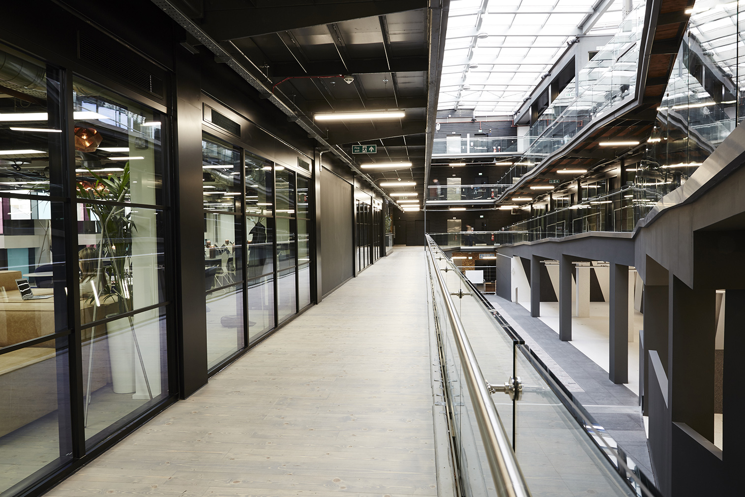
Dixon told Dezeen that the Camden Market location was a key attraction of the project, "Camden Market's prehistory as a hub for commerce, transport and technology since the industrial revolution appealed to us from a conceptual point of view, and it's more recent past as a place for radical music, fashion and retail makes it a great backdrop for the fast moving and impatient world of startups and tech companies.”
Google’s converted 19th-century battery factory, Madrid
London-based Jump Studios transformed a 19th-century battery factory in Madrid, into a vibrant co-working space for entrepreneurs and start-ups. Having been commissioned to design the first Google Campus in 2012, Jump Studios went on to create another modern space for the tech giant in Madrid, converting the industrial brick building into a location that would house some 7,000 workers and 50 resident start-ups.
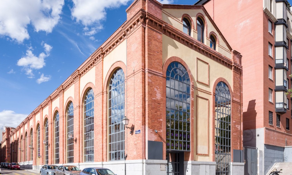
The new entrance fitted into the south-side of the building, leads the visitor through the campus communal cafe area that features lounge seating and booths distributed across two floors. A large triple-height auditorium dominates the north side of the campus, accommodating up to 200 people, and can be separated with a curtain in order to create a smaller, more intimate meeting area.
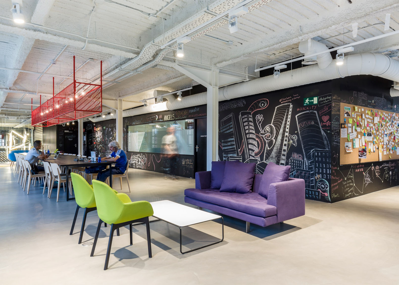
The interior was inspired by Spanish painters such as Picasso and Joaquin Sorolla y Bastida, and has plenty of natural light, making it a fantastic addition to Google’s community.
Coworkrs industrial building, Brooklyn
Located in an industrial neighbourhood of Brooklyn, the Coworkrs facility encompasses 47,000 square feet of space. The area is becoming increasingly gentrified, with new artist studios, restaurants and apartment buildings appearing frequently in recent years. The New-York-based firm Leeser Architecture was charged with reinventing the underused factory into a three-storey work-share facility that could accommodate creative professionals, non-profit organisations, tech startups and other freelancers.
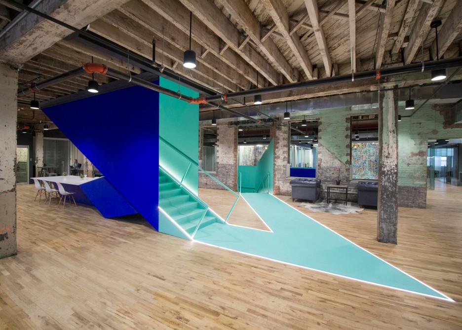
Coworkrs has numerous communal work zones and enclosed offices, as well as a lobby, kitchen and dining areas, conference rooms, a lounge, and a rooftop terrace, with over 500 desks in total. Their redesign saw the introduction of angular and brightly coloured stairwells and throughout the aging industrial building. Referencing origami, the sharp folds showcased bright colours, with blue on the exterior and teal on the interior.
"The bold metal feature folds into varying functional purposes, creating communal spaces within its dynamic form," said the firm.
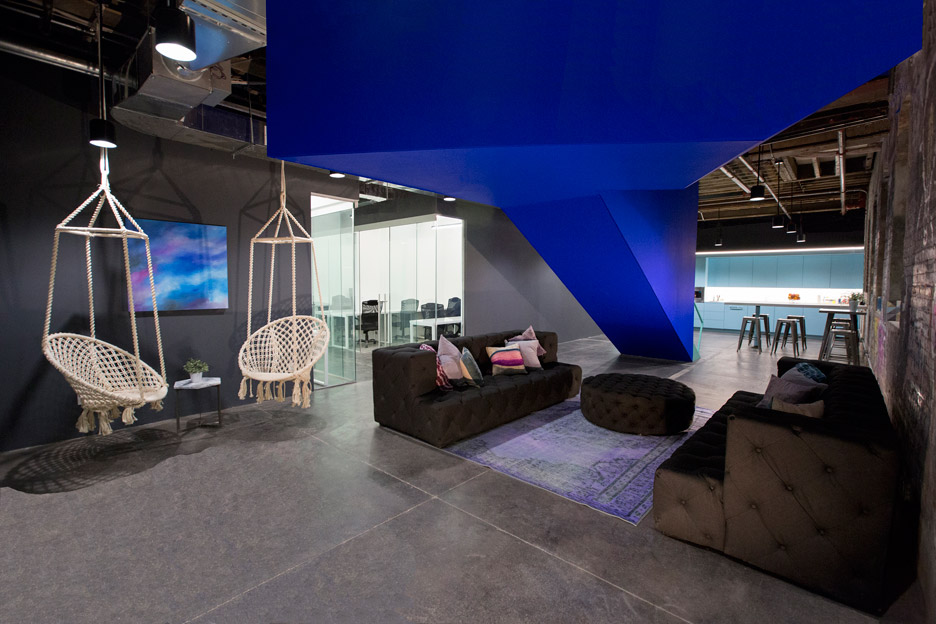
Communal areas and circulation routes were highlighted by embedded bands of light in the flooring, with recessed lighting incorporated into other areas such as cabinetry. The original concrete and wood flooring was maintained to help preserve the building’s industrial character, and fitted with contemporary and vintage furnishings, along with custom tables and artwork by New York-based artists.
"The design maintains the building's original 'rawness' with exposed joists, original brickwork and even graffiti," the firm said.
Inspired? Take part in one of our upcoming architecture competitions and push your creativity to its limit!
Top 3 Reasons Why You Should Enter Architecture Competitions
Curious about the value of architecture competitions? Discover the transformative power they can have on your career - from igniting creativity and turning designs into reality, to gaining international recognition.
Learn more

