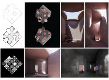
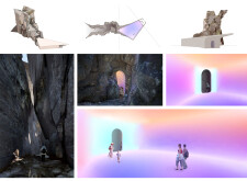
Buildner is a global leader in organizing architecture competitions of all scales — from furniture, cottages, and guesthouses to full city rebranding. With prize budgets ranging from €5,000 to €500,000, Buildner brings proven global experience to every competition.
Launch a competitionLaunch a competition
Introduction
Buildner is excited to announce the results for the fourth edition of its Museum of Emotions Competition!
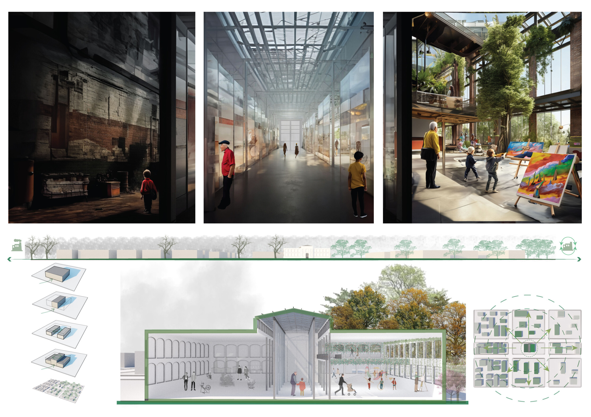
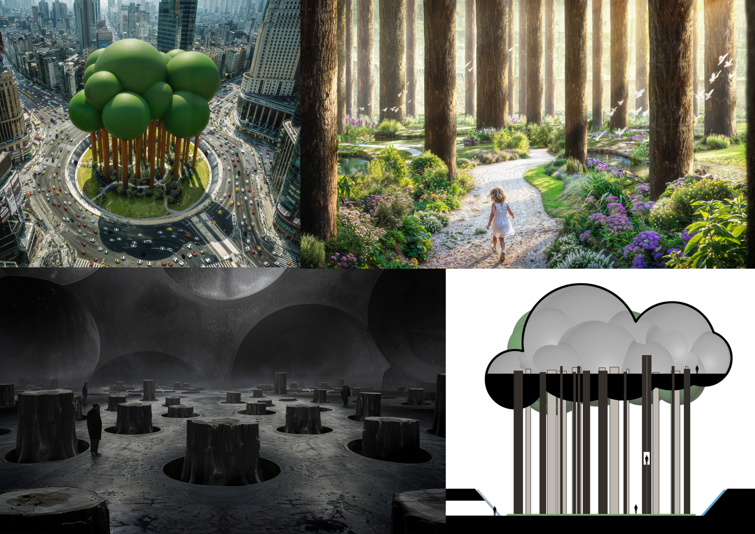
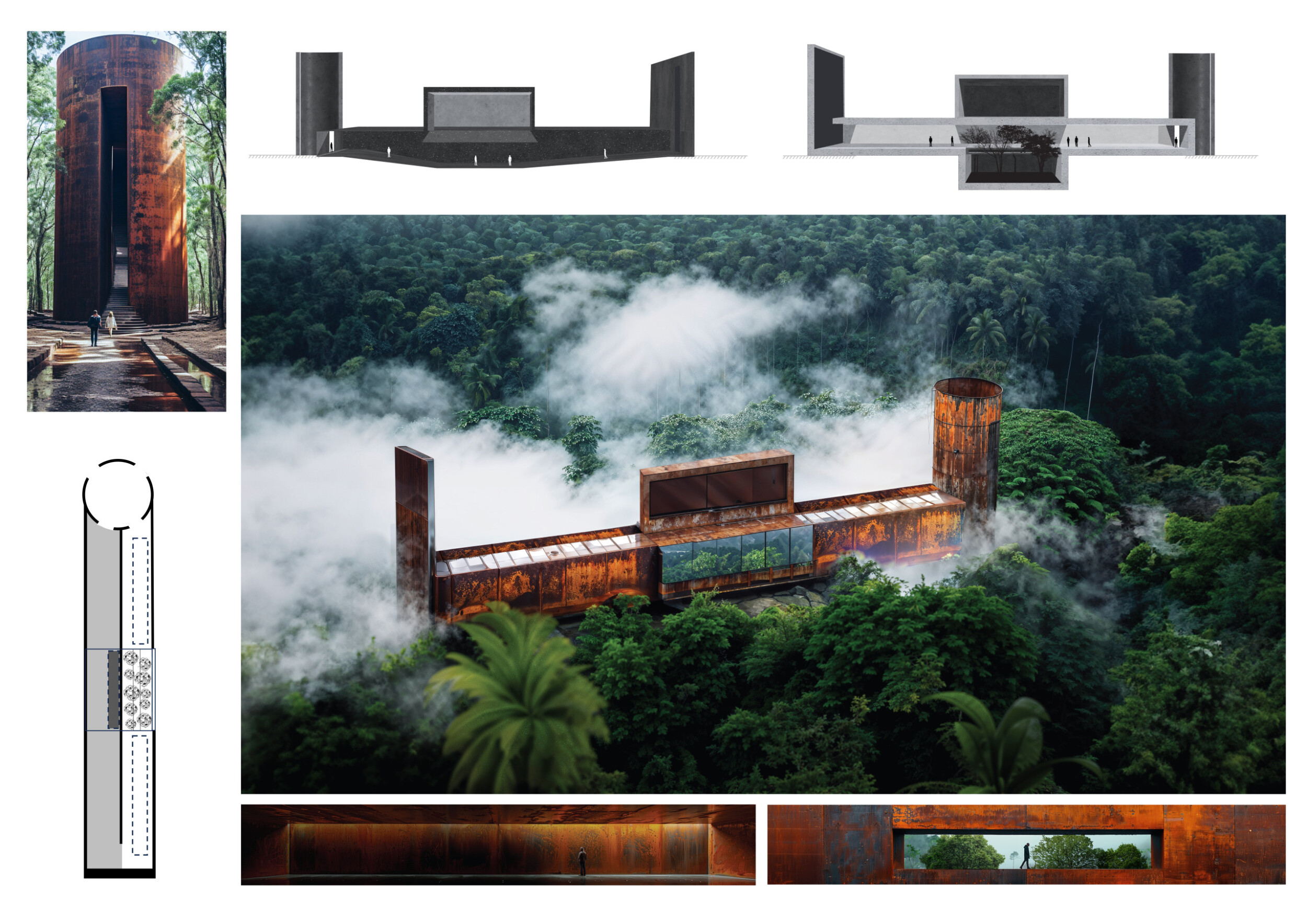
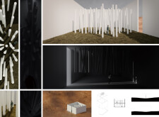
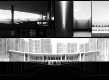
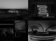
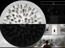
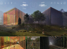
The event once again tasked participants with exploring the extent to which architecture can be used as a tool to evoke emotion. The brief called for the design of a museum comprising two exhibition halls: one designed to induce negative emotions; the other designed to induce positive emotions. Participants were free to choose any site, real or imaginary, as well as choose the scale of the project. The definition of ‘positive’ and ‘negative’ emotions was also up for interpretation: whether fear, anger, anxiety, love, happiness, how might a designer define or conceive a corresponding space?
The Museum of Emotions is one of Buildner's silent competitions, in which participants must communicate ideas using imagery void of text in any form: titles, captions, words rendered within visuals, even annotations related to scale or cardinal directions.
Buildner worked with a strong international jury panel to evaluate the received entries: Julien de Smedt is Founder of Brussels-based JDS Architects; Stephanie Deumer is a Canadian Visual Artist currently living and working in Los Angeles; Sonia Gagné is Partner at Montréal-based practice Provencher_Roy; Daniela Holt Voith is Founding Principal and Director of Design at Voith & Mactavish Architects; Lydia Kallipoliti is an architect, engineer, scholar and an Assistant Professor at the Cooper Union in New York and Principal of ANAcycle thinktank; James Krueger is Design Principal at HMC Architects’ in San Diego, California; Nuno Pimenta runs a transdisciplinary practice in Porto, with a portfolio that spans temporary architecture, installation, public art, exhibition design and performance; Italy-based architect Angelo Renna; and Lukas Rungger, Co-founder of NOA - architecture and interior design studio.
Buildner and its jury panel thank each participant for submitting to this event, which received outstanding entries from around the globe!
We sincerely thank our jury panel
for their time and expertise
Julien De Smedt
JDS Architects
Denmark

Stephanie Deumer
Visual Artist
USA

Sonia Gagné
Provencher_Roy
Canada

Daniela Holt Voith
principal and director of design, Voith & Mactavish Architects
United States

Lydia Kallipoliti
Tallin Architecture Biennale, ANAcycle thinktank
USA

James Krueger
Design Principal in HMC Architects
USA

Françoise N’Thépé
Françoise N'THEPE - Architecture & Design
France

Nuno Pimenta
NUNO PIMENTA
Portugal

Angelo Renna
Architect
Italy

Lukas Rungger
noa* network of architecture
Italy

Enter the next competition edition
1st Prize Winner +
Buildner Sustainability Award
Buildner Sustainability Award
Jury feedback summary
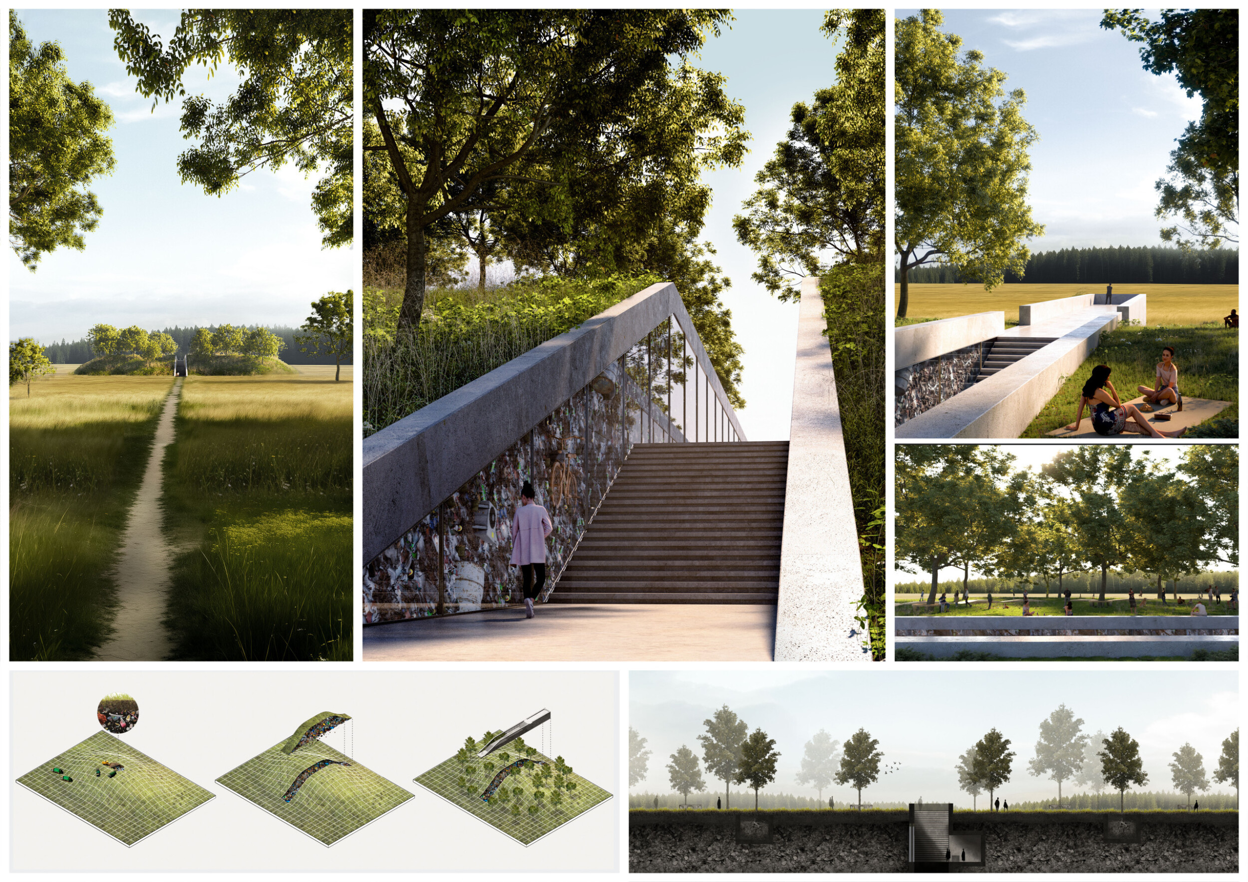
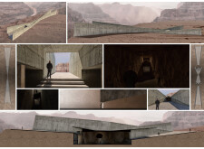
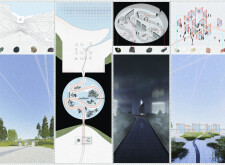
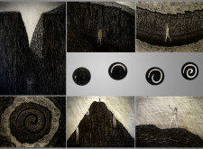
The proposal depicts a mounded garbage dumping ground within a field. A deep cut through the man-made grassy hill dramatically reveals the layers of trash that form it. The newly planted hillside appears as a sort of oasis from afar, set along a meandering hiking path. Only when one accesses the quasi-monument are the rather sickening aspects of the interior revealed. Read more The project is sophisticated in its delivery and the tension it creates between the idyllic exterior country scene and the interior experience. The project is powerful in its potential to be both immersive and educational.

This project proposes a hidden heap of trash to form a hillside with a cut to reveal its underbelly. Stairs lead down to a dark refuse enclosed room. This contrasts with a bucolic sunny scene on the surface. Beautifully rendered and carefully considered.
Daniela Holt Voith / Buildner guest jury
principal and director of design, Voith & Mactavish Architects , United States

The power of a line, minimally invasive, is exceptional in this project, which could have remained unnoticeable in lesser-able hands.
Lydia Kallipoliti / Buildner guest jury
Tallin Architecture Biennale, ANAcycle thinktank, USA

This proposal challenges conventional notions of waste disposal by envisioning landfills as dynamic and emotive public spaces. By transforming these overlooked sites into enjoyable hubs of activity and reflection, the project not only addresses the pressing issue of garbage disposal but also offers a compelling vision for the future of our urban landscapes.
Nuno Pimenta / Buildner guest jury
NUNO PIMENTA, Portugal
Buildner's commentary, recommendations and techniques review
Order your review here
The project is very successful in its hierarchy, its excellent use of color, and its advanced visuals which all clearly describe the scale of the visitor in relation to the form and scale of the site to clearly describe a unique and potent spatial experience. The use of greens and blues to depict nature stand in great contrast to the varied colors of trash to create a board that is striking. As a visual story, the more one looks, the more one can discover. Read more As an architectural proposition, however, there are many unanswered questions. Would glass really be used as the material to create a ‘window’ into the hillside? How does the structure work? What supports this window wall against lateral forces?
-
8/10 Linework

-
10/10 Quality of drawings

-
10/10 Balance of color

-
9/10 Layout

-
10/10 Hierarchy

-
N/A Annotation

-
N/A Text

-
9/10 Clarity of story

-
10/10 Clarity of diagrams

-
10/10 Quality of overall presentation

Enter an open architecture competition now
2nd Prize Winner +
Buildner Student Award
Buildner Student Award
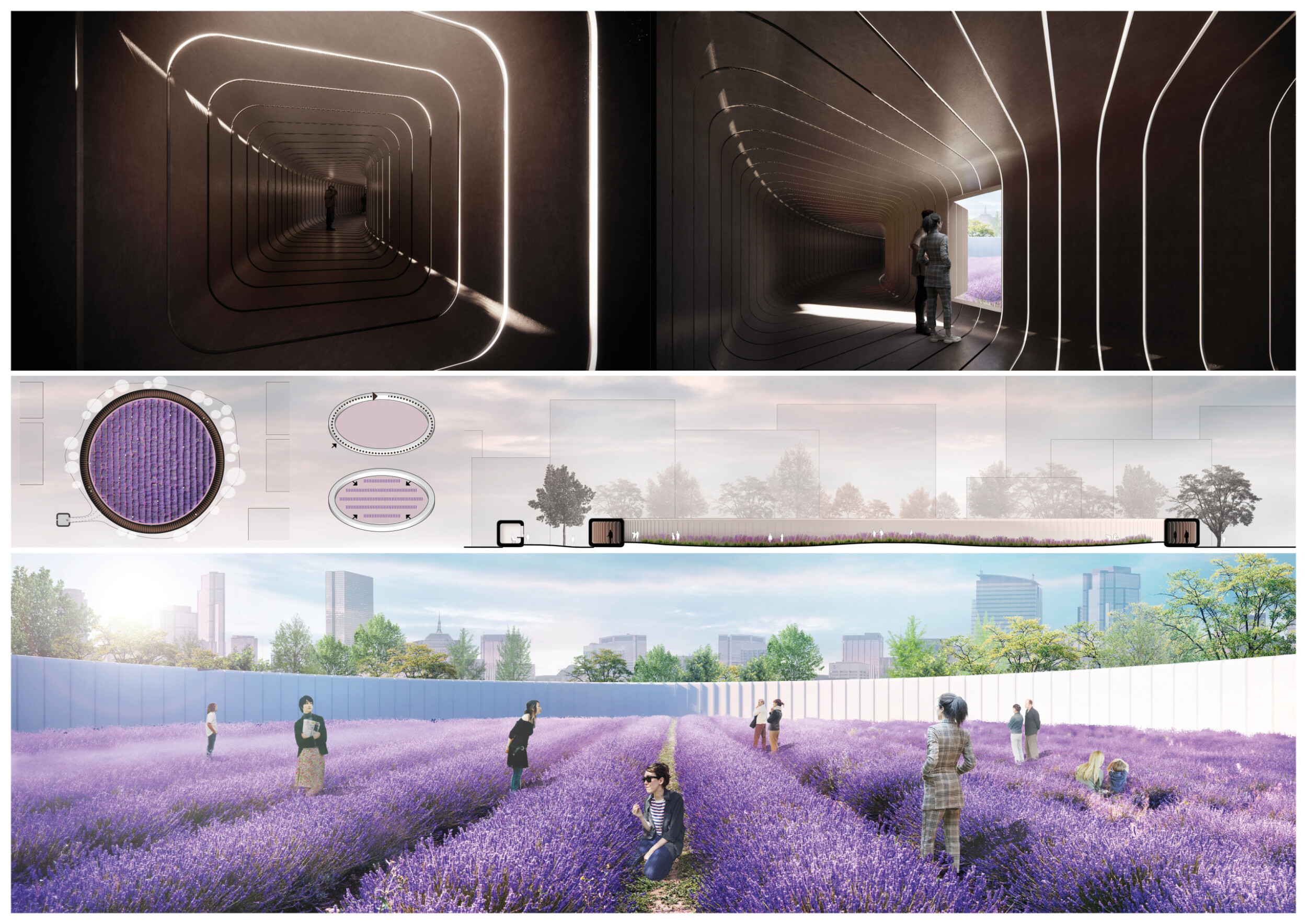
How do you affect others ?

The competition provides us with an opportunity to explore and challenge various topics, pushing us beyond our comfort zones to try different types, thus fostering a continuous learning process. In competitions, we are often faced with numerous requirements and constraints, similar to those encountered in future architectural practice. However, they are also more theoretical, which stimulates our imagination and creativity. This is particularly meaningful for us as students.
Read full interviewJury feedback summary
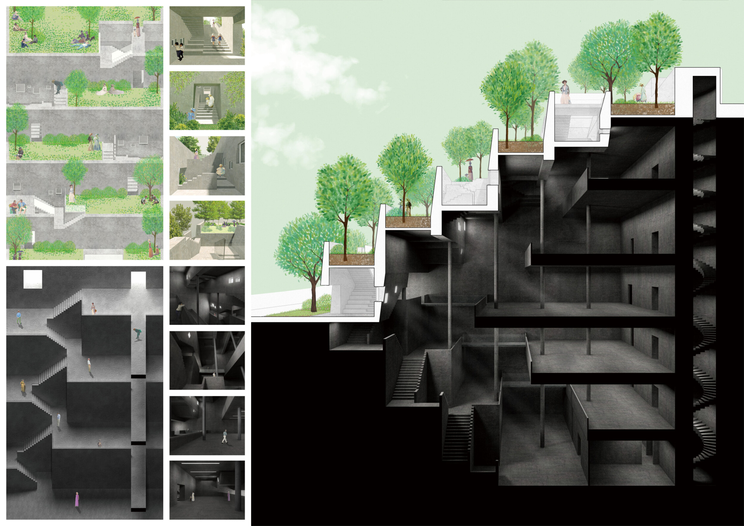
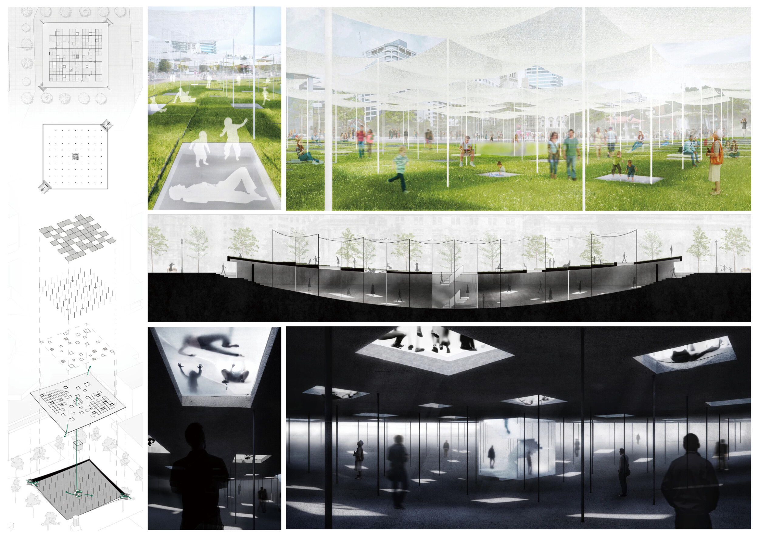
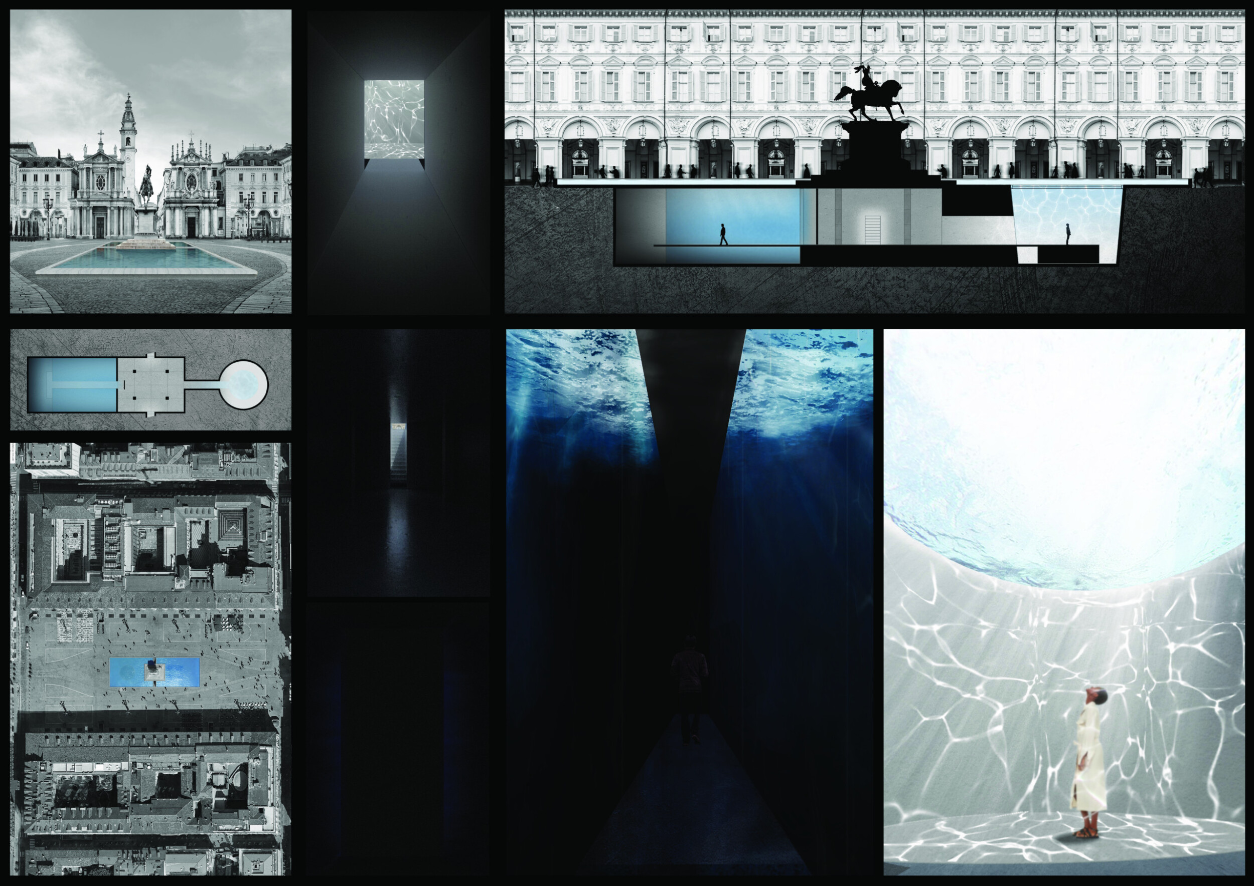
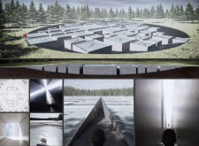
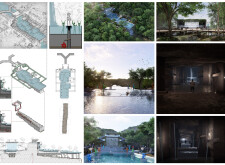
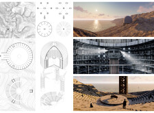
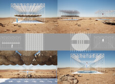
The project appears to be set within an urban park. Read more In section it depicts a vast, concave excavation within a grassy field, topped by two canopies: the first, a thin shell of concrete layered in grass and peppered with rectangular openings that allow the entrance of sunlight as well as views into and out from the cavernous subterranean; the second, a set of ethereal fabrics supported on thin vertical rods which filter the sunlight and create a covered park space. The project is reminiscent of a variety of well-known projects realized in particular by Japanese architects in recent years.

I appreciate the ethereal qualities of this very simple project and particularly the floating bodies that one sees from below as a kind of spectacle. The sensations here are evoked by lived experienced and not spectacular forms.
Lydia Kallipoliti / Buildner guest jury
Tallin Architecture Biennale, ANAcycle thinktank, USA

The visualizations are very clear and easy to comprehend. The project utilizes light in a novel way, whereby the shaded areas aboveground become lighted areas below ground. My only concern is that I don't know if the glass floors would be a comfortable place for relaxing, not only physically but also psychologically, knowing that you are being watched from below.
Stephanie Deumer / Buildner guest jury
Visual Artist, USA

This is the most successful submission for me, due to the amount of thought and care given to the diagram and quality of the rendered ideas.
James Krueger / Buildner guest jury
Design Principal in HMC Architects, USA
Buildner's commentary, recommendations and techniques review
Order your review here
The section and perspectives are outstanding in their ability to describe two wholly different spaces marked by contrasting conditions of illumination and sets of materials. One can almost feel the difference in temperature and texture above versus below the contrived ‘ground line’. Read more The section is very successful in its varied heavy and light black linework mixed with elements of color, and in its clever balance of horizontal and vertical elements; the complexity and clarity are to be applauded. But the architecture is to be questioned: to support grass, a reasonable thickness of soil buildup is necessary, as are realistic considerations of weight, slope and drainage. The vertical poles, too, while ambitious in their lightness and thinness, will certainly need tie backs and lateral supports.
-
10/10 Linework

-
10/10 Quality of drawings

-
9/10 Balance of color

-
9/10 Layout

-
10/10 Hierarchy

-
N/A Annotation

-
N/A Text

-
10/10 Clarity of story

-
10/10 Clarity of diagrams

-
10/10 Quality of overall presentation

3rd Prize Winner
Jury feedback summary
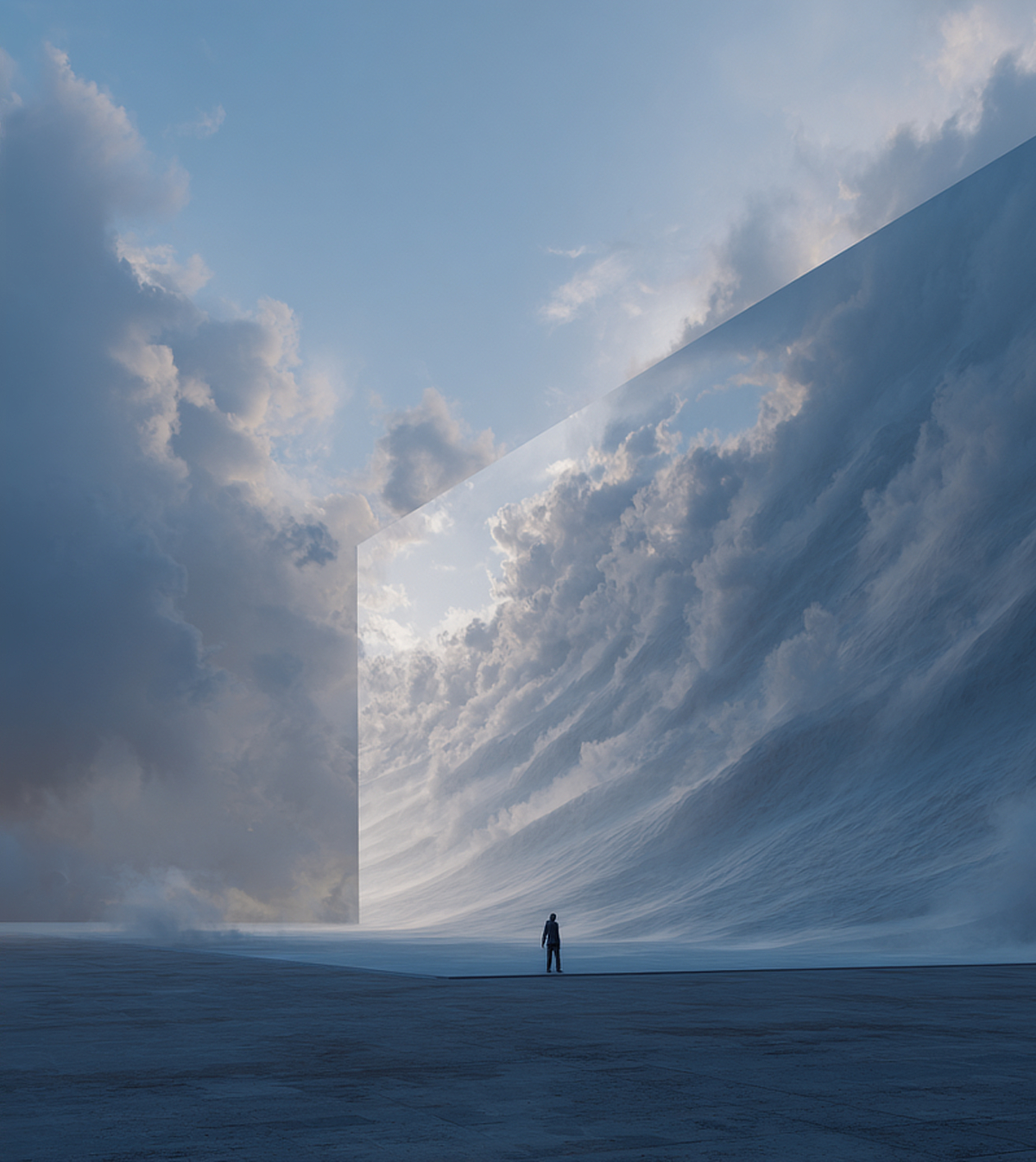
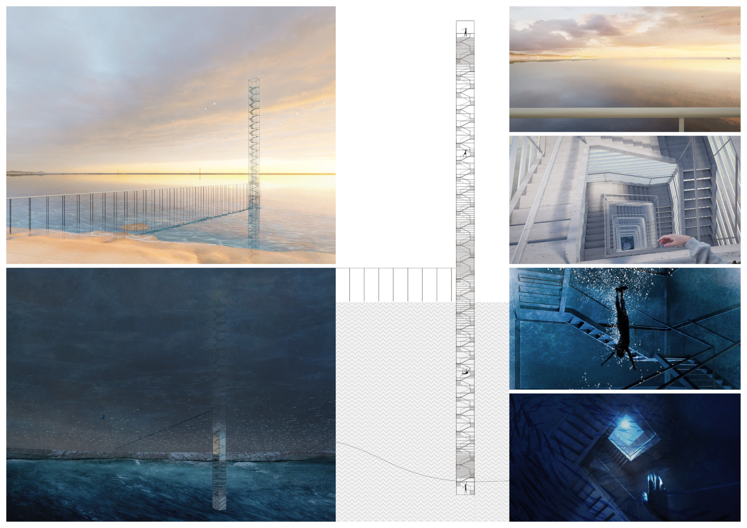
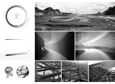
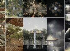
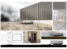
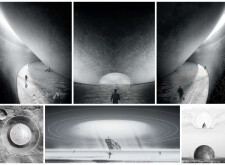
The proposal is for a form of tall Belvedere, stairway or tower constructed within a body of water and accessed via a lengthy raised walkway stretching linearly from a shoreline. The entire structure has a hairline thinness and the verticality of the stair is balanced by the horizontality of the walkway. One can imagine that such a crossing brings a visitor into a totally different, quiet and raw environment that contrasts with what one might find on the shore. Read more The tower is depicted to extend below the water nearly as far as it extends skyward. Here, while the stairs are totally unnecessary, a deep dive is required to experience the darkness and marine life below the water line. The experience depends on how deep or high one might be willing to venture.

A very intriguing concept: a vertical 'promenade of emotions' spanning underwater and sky experiences. It offers a fascinating exploration of human emotions and perspectives across diverse realms.
Angelo Renna / Buildner guest jury
Architect, Italy

The images are strong and convey emotion. But I would have liked to have seen more experiential images on the journey up the stairs to better understand that space, and would expect moments of positive experiences (maybe glimpses of the view) along the path culminating in the release and full view at the top.
James Krueger / Buildner guest jury
Design Principal in HMC Architects, USA
Buildner's commentary, recommendations and techniques review
Order your review here
The project does well to balance sky with water, and verticality with horizontality. The line-based section is interesting in its scale, however, it lacks the sort of depth and variation that would bring it more meaning and detail. The sheet, as a result, appears rather unfinished and leaves one wanting to understand more about the proposition. The author would benefit from additional consideration of structure and material. Read more The deck supports would need to extend to the sea floor, for one, and both this element and the tower are rather infeasible in their thinness. A visually slim and even dematerialized tower could certainly exist, but not without a serious foundation and robust seabed connection.
-
6/10 Linework

-
9/10 Quality of drawings

-
9/10 Balance of color

-
9/10 Layout

-
9/10 Hierarchy

-
N/A Annotation

-
N/A Text

-
8/10 Clarity of story

-
8/10 Clarity of diagrams

-
8/10 Quality of overall presentation

Honorable mentions
Everflow
 Italy
Italy
Time Refurbishment

Participating in architectural competitions offers an even playing field for people at different stages and exposures within the profession. When students and professionals are given the opportunity to compete together the experience can push the boundaries of knowledge and creativity. This expansion can challenge preexisting concepts and ultimately push the profession forward by sparking innovation and solving existing challenges in new ways. Additionally, networking with peers while tackling intriguing challenges also presents a splendid opportunity.
Read full interview United States
It's Up To You

Competitions provide opportunities to tackle innovative design challenges, fostering skill development and creativity, and exploring new ideas and design approaches that might not be encountered in everyday work.
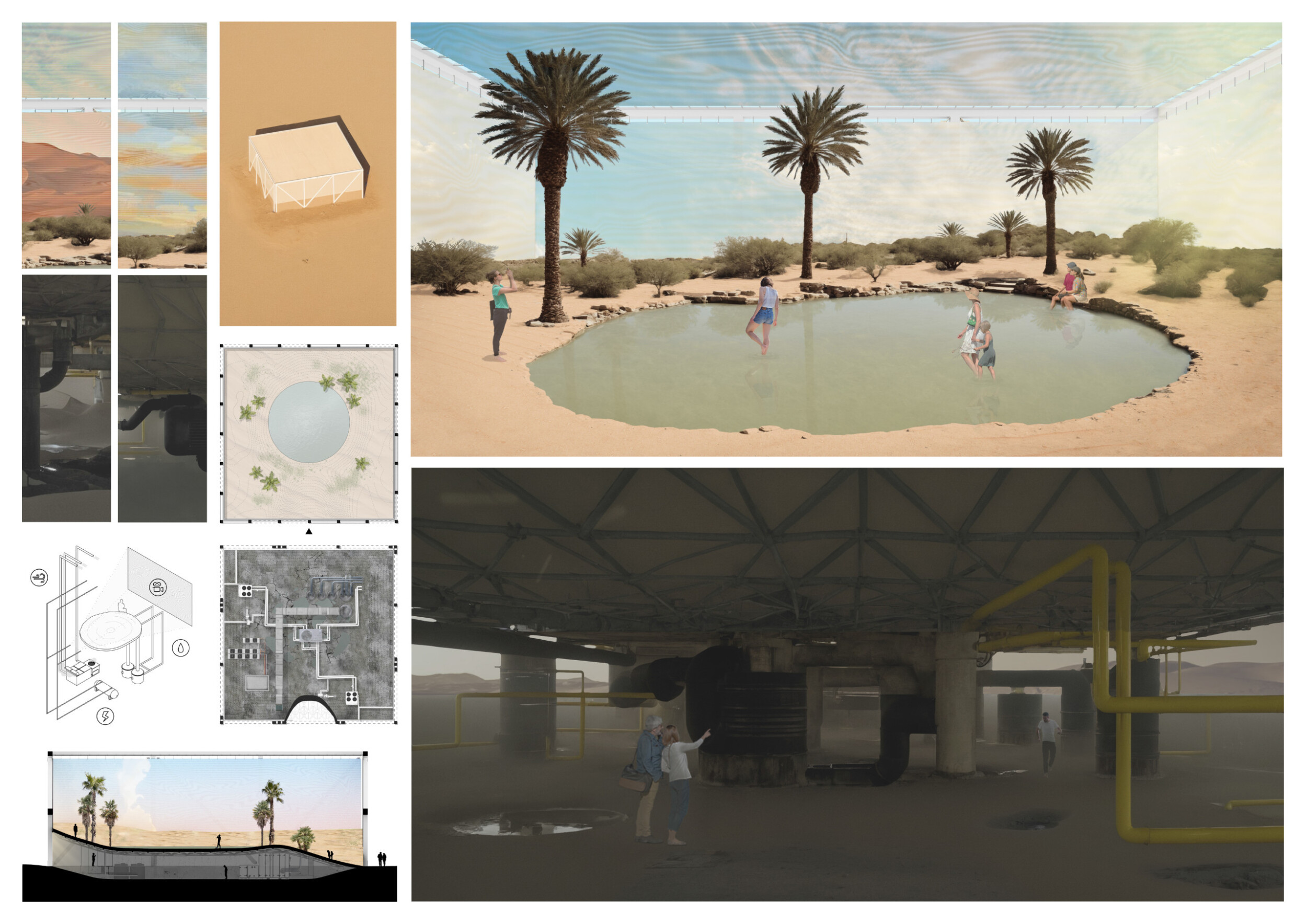
Read full interviewThe price of The Oasis
Participating in architecture competitions allows us to challenge ourselves and see our group dynamic with a project outside university. It is a way for us to test our abilities and explore our boundaries.
Read full interview Spain
Spain
Limbus 235

Taking part in architecture competions is a way for us to break the routine of our day to day job. It allows us to push design boundaries and take to the extreme concept ideas that stem from our unique approach to briefs and architecture visions.
Read full interviewSentinel of Emotions

Despite many years of graduation, this is the first competition I have participated in. The fascinating theme and the opportunity to express a project about emotions, without texts and captions, instigated me to invite my colleagues to join me and together we formed a vibrant and creative team of ideas.
Read full interviewShortlisted projects
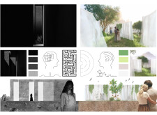
A/ENIGMA
The University of Nicosia, UNIC
+22 points Buildner University Rankings! Cyprus
 Impressions in Impressionism
How you'll take your emotions
Surrogacy
University of Waterloo
+22 points Buildner University Rankings! Canada
 7 BLIND MICE
The price of The Oasis
ETSAM: Escuela Técnica Superior de Arquitectura de Madrid (UPM)
+72 points Buildner University Rankings! Spain
Spain Ambivalence of Light
Dong-Eui University
+22 points Buildner University Rankings! South Korea
 Dissemblance
How do you affect others ?
Time Refurbishment
Everflow
Politecnico di Milano / Polytechnic University of Milan
+72 points Buildner University Rankings! Italy
Italy The Solace Shores
The Path of Life
Norwalk Community College
+22 points Buildner University Rankings! United States
 The allegory of liberty
ESSENCE OF ABSENCE
Faculty of Architecture (Facultad de Arquitectura UNAM)
+22 points Buildner University Rankings! Mexico
 Emotional Maze
Silesian University of Technology, Politechnika Śląska
+22 points Buildner University Rankings! Poland
 Inner Quest
The Adolfo Ibáñez University - Universidad Adolfo Ibáñez
+22 points Buildner University Rankings! Chile
Chile 