Buildner is a global leader in organizing architecture competitions of all scales — from furniture, cottages, and guesthouses to full city rebranding. With prize budgets ranging from €5,000 to €500,000, Buildner brings proven global experience to every competition.
Launch a competitionLaunch a competition
Introduction
The competition for an auditorium at the Riga International Convention Centre invites critical consideration of an all too often neglected urban function. The importance of this competition arises from its social and cultural circumstance: a reappraisal of the convention center, a somewhat problematic though ubiquitous paradigm in its current form, besmirching the fabric of many contemporary cities.
A product of global corporatism and commercialism from the last century, kinfolk include convention facilities, civic and convention centers worldwide. Poised as an architectural competition, the prompt optimistically recalls and aspires to the architectural heritage of this program’s archeology, conjuring perhaps in principle the Greek agora or Roman fora, and more resolutely, early manifestations of the global industrial revolution, the monumentality and polity of long span structures and exposition halls of the great world fairs from the late 19th and early 20th centuries.
The competition demands a well considered alternative to sprawling multi-block exhibition structures of the last quarter century, precedented by car parks and urban reclusion.
While submissions to the competition varied, successful proposals demonstrated shared characteristics and vision, effectively engaging and integrating disparate elements of both program and site, reinvesting an estranged program in the urban landscape. Selected projects establish a compelling argument to redefine and reestablish the public and civic facility of the contemporary typology for an exhibition center.
1st Prize Winner
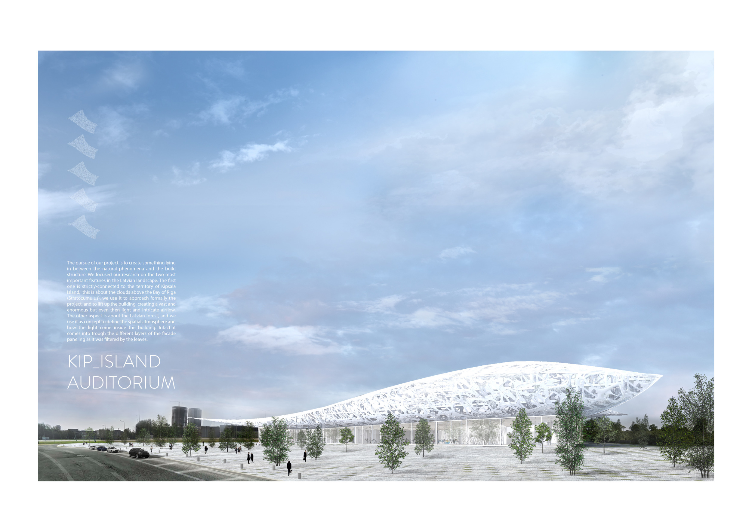
The Urban Lighthouse
We enjoy participating in Architectural Competitions as we see them as a healthy, refreshing way of putting our ideas out in the open, and a constant stimulus to move forward from from what we have already accomplished within our realm.
Read full interviewJury feedback summary
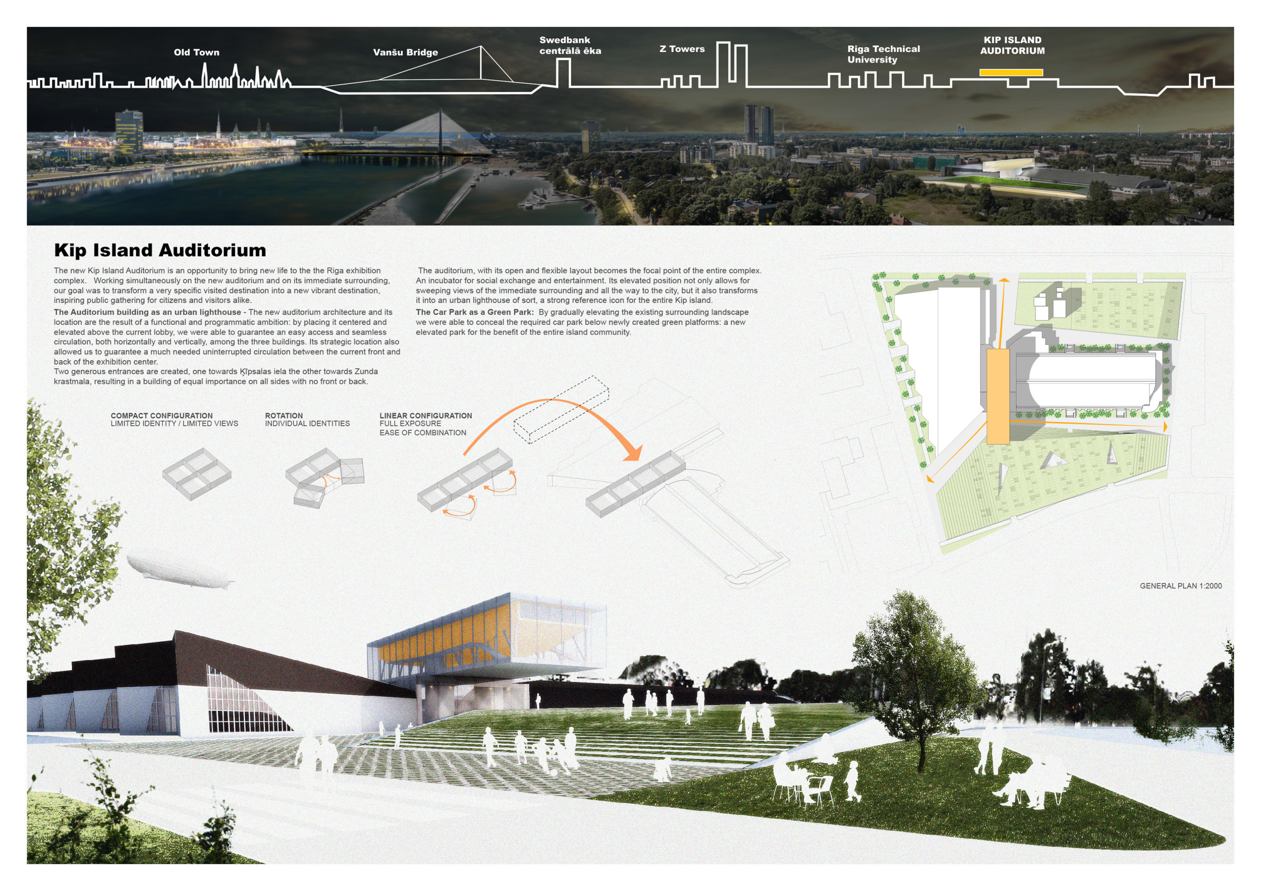
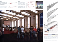
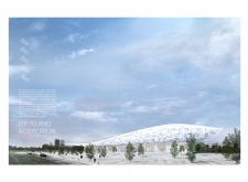
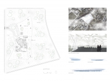
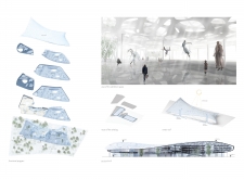
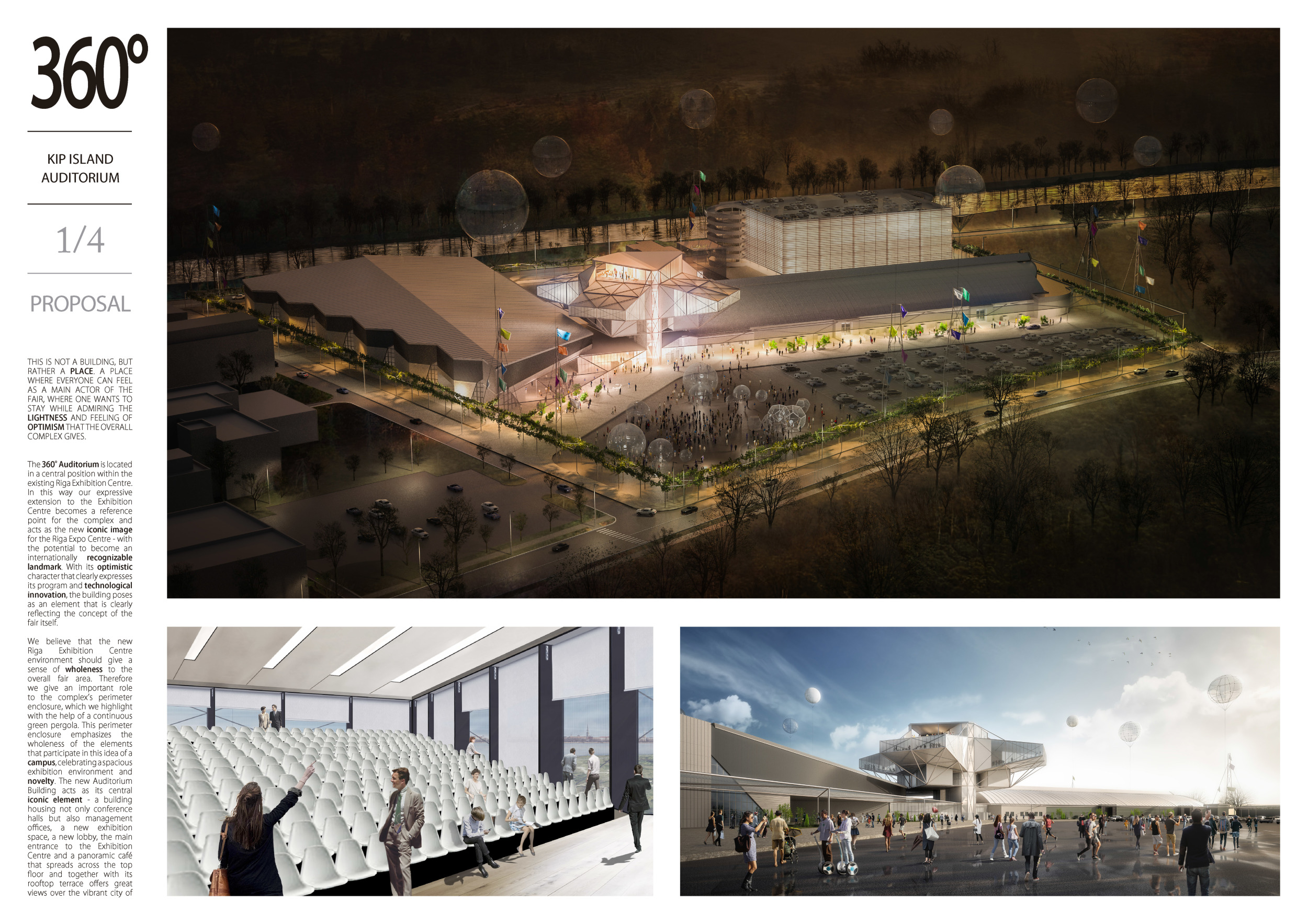
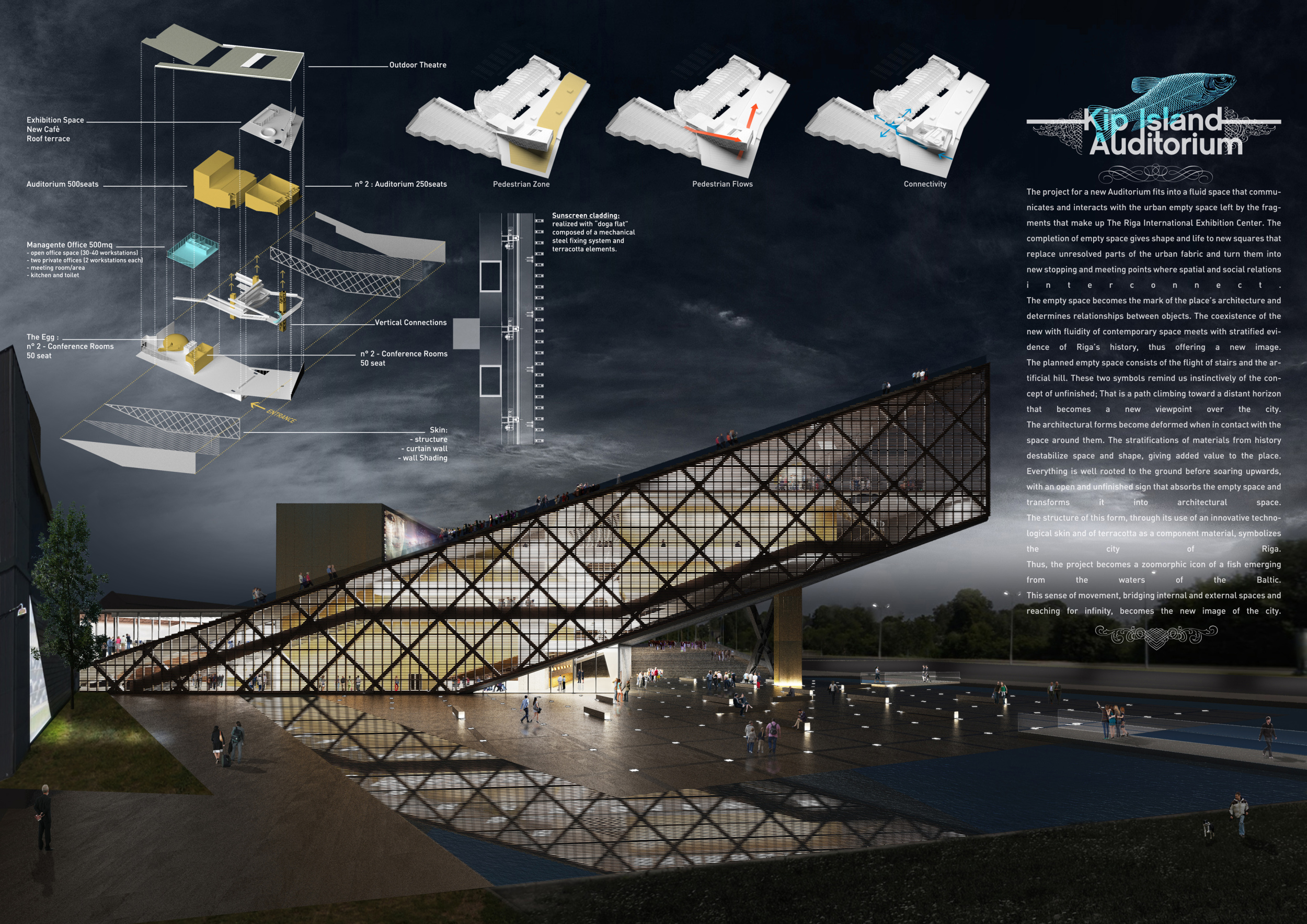
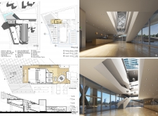
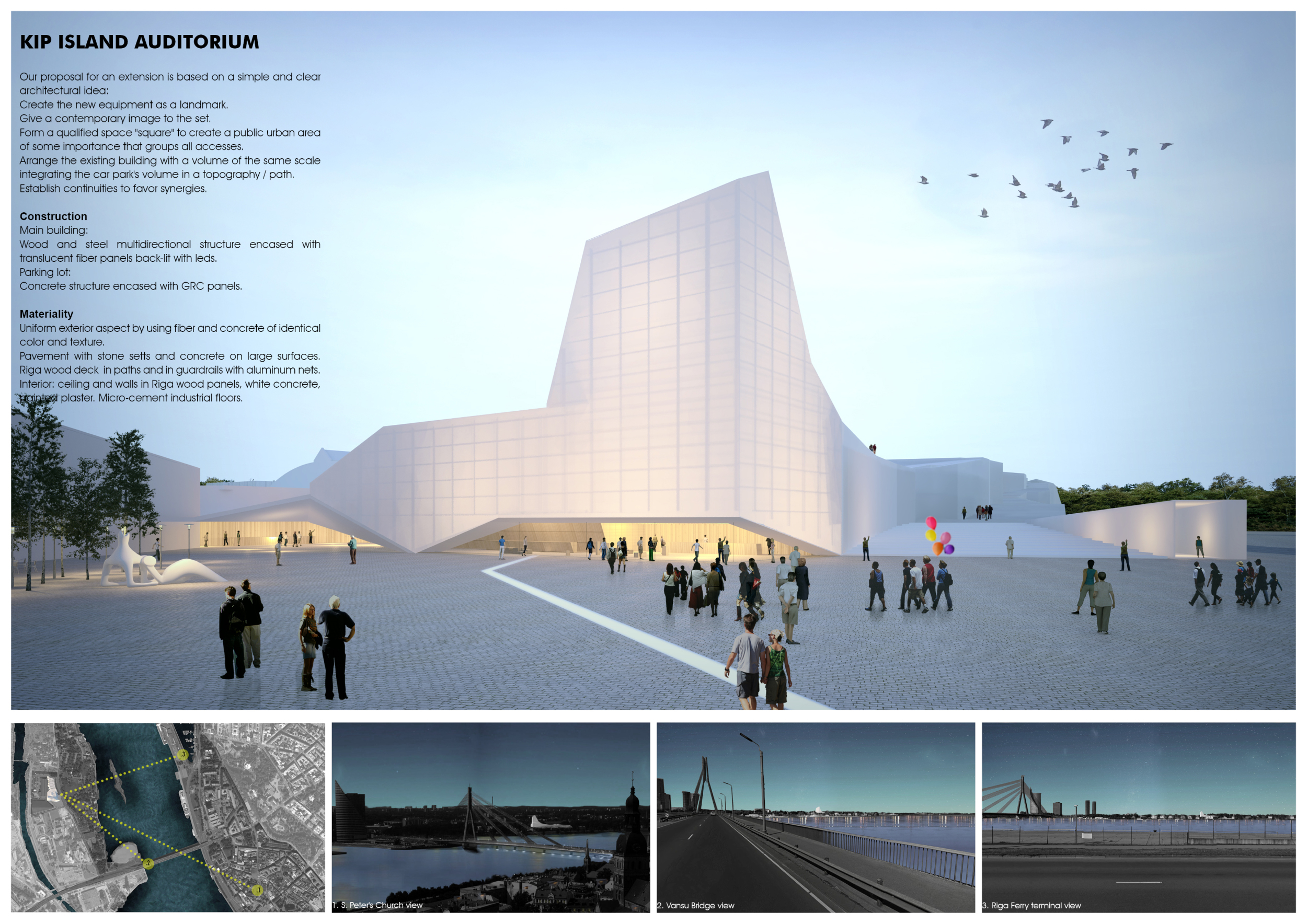
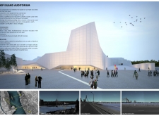
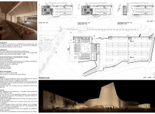
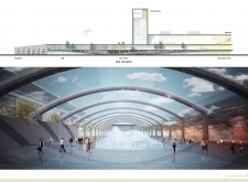
The first place entry for the Kip Island Auditorium was chosen for its proposal to completely entangle city and stage, creating a performance space radically deconstructing the separation between proscenium and audience. The project centerpiece is an elevated theatre space, cantilevered as a truss over the site, creating an iconic figure in the city.
2nd Prize Winner +
BB STUDENT AWARD +
BB GREEN AWARD
BB STUDENT AWARD +
BB GREEN AWARD
Kip Island Auditorium

The way we see it, these competitions are a great way to try new things out. Their informal nature allows us to experiment with the way we design, work and collaborate. They also provide a platform to broadcast our ideas to a bigger audience.
Read full interviewJury feedback summary
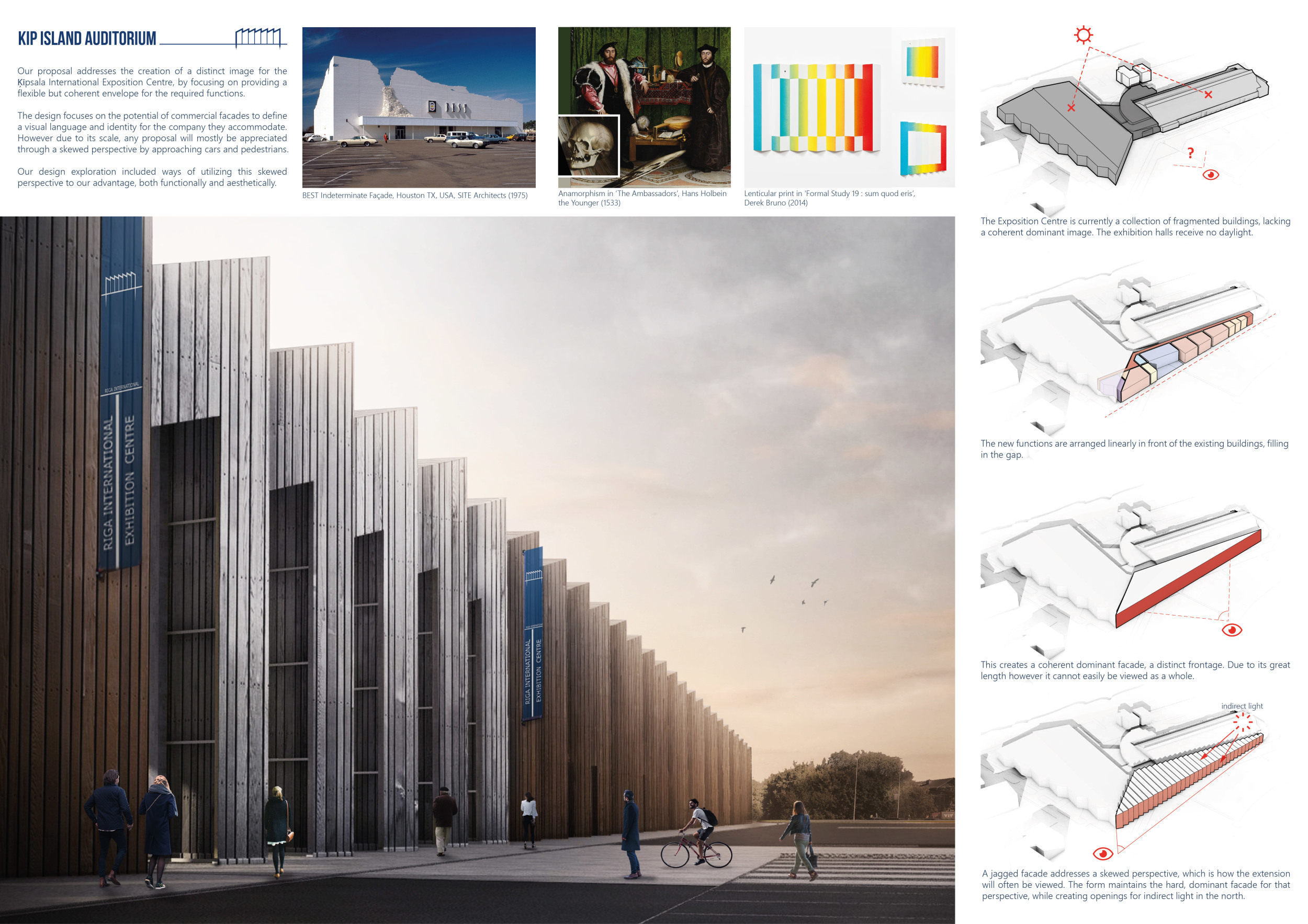
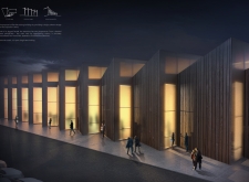
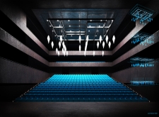
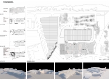
The success of the second place entry for the Kip Island Auditorium competition lies in its simple solution to the existing conditions, using an economy of form and material to create a flexible building characterized by tactful iconicity. The project parti stitches the site, unifying the shed buildings of the exhibition centre, by infilling the triangular space between with a repeating, extruded sawtooth bay.
3rd Prize Winner
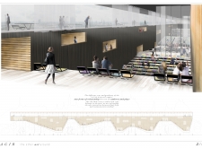
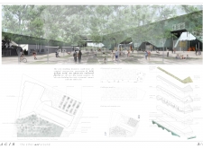
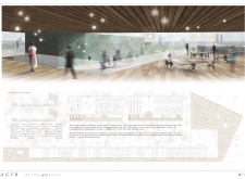
Agir

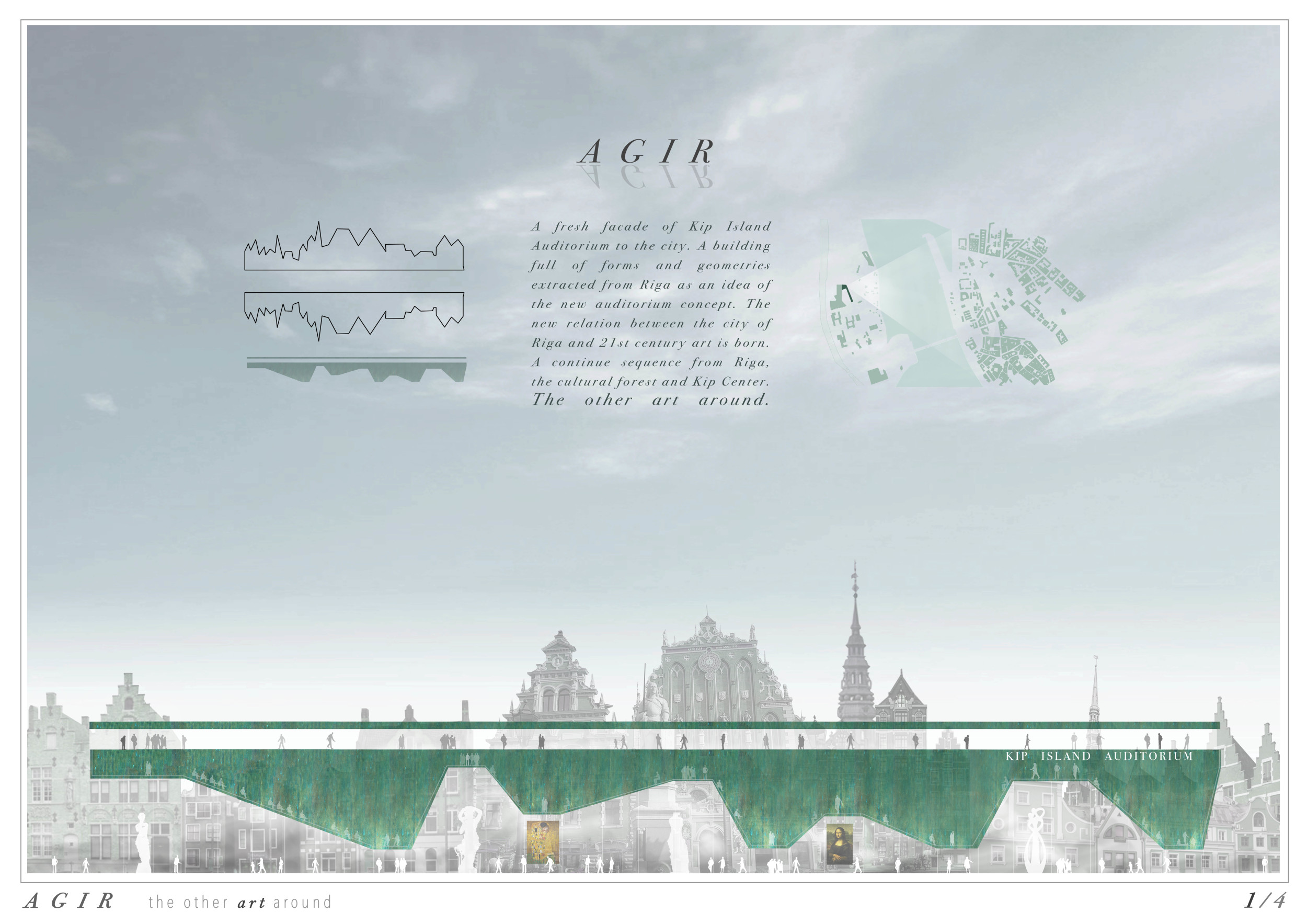
This kind of competitions allows us to concentrate on the new design methods and relationships that could offer new form-type buildings with new uses and promote rapid change in our society. In the case of Kip Island Auditorium, we wanted to study how plans, sections and the building-type-form of a concert hall or an auditorium from the past century have changed to a new direction. Architecture vision competitions are the right place to explore the question of how to combine urban context, program solutions and the way users will interact with the building.
Read full interview Spain
Spain
Jury feedback summary
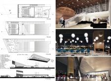
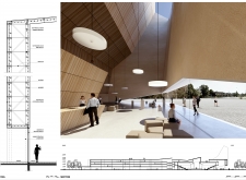
The strength of the third place entry arises from its urban engagement and social inclusion. The project takes a stance on the nature of large exhibition centers, making a case for the public. Expo and convention center typologies, due to their scale often create a barrier within the city, isolating the pedestrian rather than including.


