Buildner is a global leader in organizing architecture competitions of all scales — from furniture, cottages, and guesthouses to full city rebranding. With prize budgets ranging from €5,000 to €500,000, Buildner brings proven global experience to every competition.
Launch a competitionLaunch a competition
Introduction
Buildner is pleased to announce the results of its Gaudi La Coma Artists’ Residences International Competition!
This is the first in a series of design competitions to be run in partnership with the Gaudi Knowledge Association and Inngenium Lab to celebrate Gaudi’s intellectual heritage. For this competition, participants were asked to submit proposals for a sustainable artists’ residence and education complex to be located in Huesca, Spain, designed in alignment with Antoni Gaudi’s principles of sustainability, functionality, aesthetics and innovation. Buildner and its jury sought designs that have the potential to become iconic landmarks while still remaining sensitive to the site’s natural surroundings.
Buildner worked with an outstanding jury consisting of a mix of Spanish and international architects to evaluate and select the winning entries: Bárbara Bardin and Julio Cano are co-founders of Madrid-based studio Canobardin; Julien De Smedt is the founder and director of JDS Architects based in Copenhagen and Brussels; Arturo Mc Clean is Communications Manager and Architect at Barcelona-based Miralles Tagliabue EMBT; Inés Olavarrieta is an architect and designer at Madrid-based selgascano; Anna Maria Orrù is an Affiliated Senior Lecturer at Konstfack – University of Arts, Crafts and Design with a focus on sustainability, and co-founder and co-director of Nordic Biomimicry; and Patricia Grande is Project Manager and Partner at Nieto Sobejano Arquitectos
Buildner and its jury panel would like to thank each of the participants and teams from around the globe who submitted proposals for this event.
We sincerely thank our jury panel
for their time and expertise
Ben Van Berkel
Founder and Principle, UNStudio
Netherlands

Julien De Smedt
JDS Architects
Denmark

Anna Maria Orrù
Co-founder/director, Nordic Biomimicry and Affiliated Senior Lecturer in design ecology, Konstfack
Sweden

Julio Cano
founder of canobardin
Spain

Arturo Mc Clean
Architect at Barcelona based Miralles Tagliabue EMBT
Spain

Inés Olavarrieta
Architect and designer at selgascano
Spain

Miguel Rusca Mestre
Co-founders, Nordest architecture SLP
Spain

Jordi Riembau Ribot
Co-founders, Nordest architecture SLP
Spain

Bárbara Bardin
Co-Founder of Madrid-based studio Canobardin
Spain

1st Prize Winner
Opus Loci
We are extremely glad about this result, and we hope that this success will enable us to develop our collective. At the very least, the competition will help us create common basis for our urban and architectural approach, and debate about the shared values that we want to express across our architectural practice.
Read full interview France
Jury feedback summary
‘Opus Loci’ maps local resources within a 100km radius to serve the design and construction of this project. Programs are organized to prioritize interactions between artist production and living spaces, visitor’s reception and sleeping areas and interactive spaces. The project is modular and follows three templates, sized small, medium and large, which are located across the site in consideration of the existing landscape.
Buildner's commentary, recommendations and techniques review
Order your review here
The project is remarkable for its unique drawings and its level of detail and complexity. Such complexity communicates the author’s extensive analysis of the project, its site and the design. There is a level of graphic strength here that certainly goes above and beyond the typical competition submission. There are a number of presentation considerations, however, that the author might make. Text is located only on the first sheet - it is lengthy and far too small for easy comprehension.
2nd Prize Winner
Parc Modernisme'
Architectural competitions allow a sense of freedom to test my own ideas and inventions, free from client constraints and agendas of office life. To me, they provide the perfect training and challenge of my own architectural ability and provide a welcome break for architectural self-reflection.
Read full interview United Kingdom
Jury feedback summary
Park Modernisme explores Gaudi’s architectural, structural and philosophical works and attempts to test these in a contemporary context. The project avoids a single architectural expression and instead creates a taxonomy of various forms and designs to explore variety in Gaud’s own works. The forms retain recurring themes to aid in achieving compositional cohesion.
Buildner's commentary, recommendations and techniques review
Order your review here
The project makes good use of a primary rendered image on each sheet supported by various diagrams and ancillary images in support of the key ideas. The texts are short and adequate for describing a range of topics and so these lend to an overall clarity. Small reference photographs help to communicate the project's strong analysis of precedents.
3rd Prize Winner
THE METABOLISM OF RAW EARTH
Our team members include professional architect, young scholars, and students, and we are consistently exploring what design is and what architecture is. Participating in competitions helps us make these discoveries. We exchanged existing design principles during these processes, discovered new design methodologies, and disputed new techniques and materials. Regarding architecture as a living organism, and giving each part of the building a definition in biology is the new methodology we found, and is effective for connecting each part.
Read full interview China
China
Jury feedback summary
This proposal analyzes cell structure growth patterns to generate forms for the architecture and landscape design, considering these both as living systems that are constantly metabolizing. It responds to the site contours for the placement of many amorphous and free-form buildings that make use of raw earth construction. The project is designed on a flexible module to permit long-term growth with future new construction and expansion.
Buildner's commentary, recommendations and techniques review
Order your review here
The submission is commendable for the strength of its drawings which communicate well a complex idea that is unique and carried through all aspects of the project. The sheet presentation is, however, overly dense and could be construed as confusing or lacking cohesion due to its wide range of drawing types, graphic styles and layout choices. The sheets vary so dramatically from one to the next it might even appear as if completed by several different designers.
BUILDNER STUDENT AWARD
Vine Art District
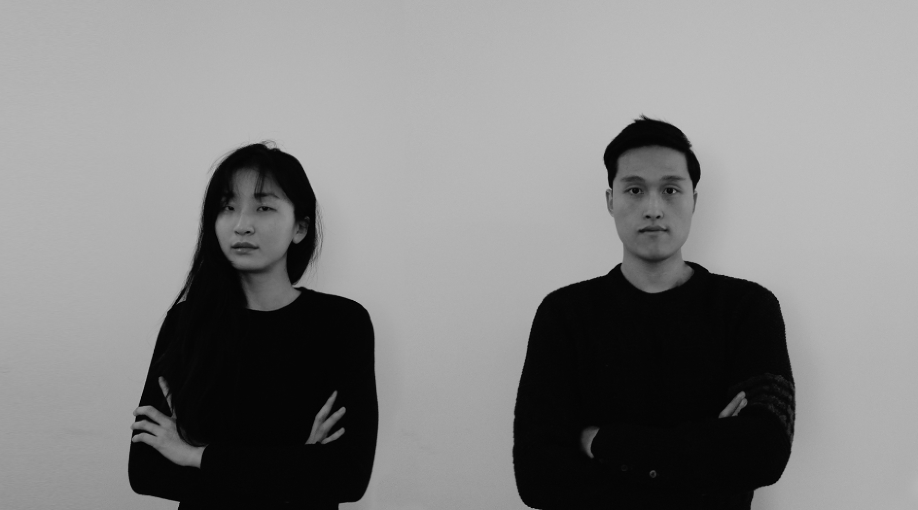
Architecture competition is field of opportunity to testify your architectural knowledge and aesthetic perception through out rapid pace of design process. From this process, you can strengthen your design ability by exploring yourself to the ocean of idea that you have never experienced. Also, it is the best resource for us to express our design capability to the public. Exposing our work throughout renowned medium can give us opportunity to develop ourselves as young architects.
Read full interviewJury feedback summary
Vine Art District is a project which draws principally from Gaudi’s focus on gravity and nature. It poses two gravity-response systems, one being that ‘mankind’ in the form of a CLT and steel truss structure; the other being that of ‘nature’ in the form of suspended elements, as if planted vines on a tree.
Buildner's commentary, recommendations and techniques review
Order your review here
This is an outstanding presentation with clear, crafted imagery and simple text; supportive diagrams correspond with both. Regarding the diagrams on the introductory page which depict vine growth: it is not immediately clear how this translates into the project structural design. This diagram series would benefit from a fourth and final image which directly links the vine concept with the structural concept.
BUILDNER SUSTAINABILITY AWARD
Canopy
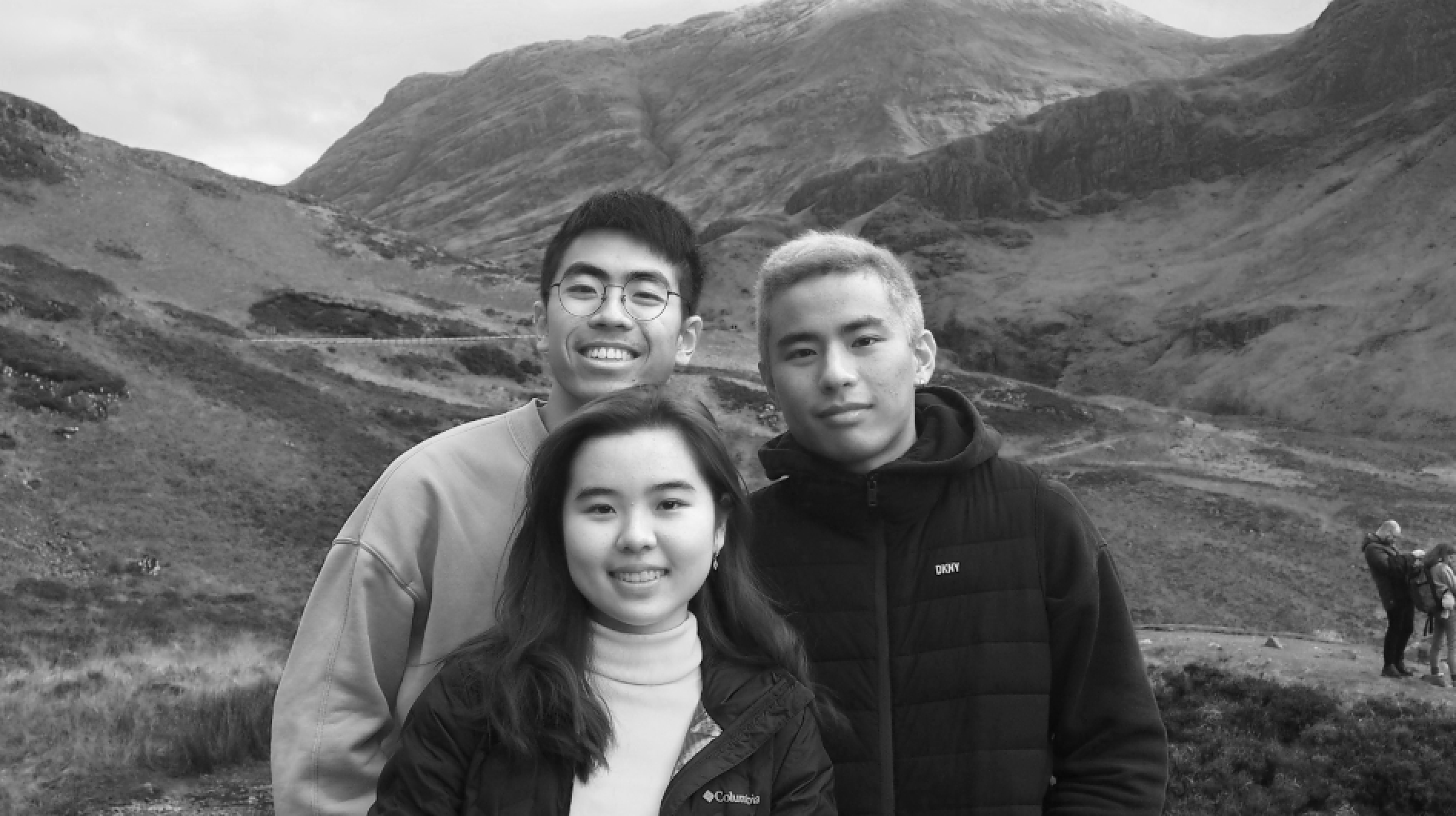
We think that architecture competition is a really productive way for students to experience the architectural design workflow in the real world. The brief requirement is very detailed yet imaginative enough for us to propose progressive solutions that can best suit the social and cultural context. This is very similar to how professional architects are encountered in everyday scenarios. Given the immense time limitation, it also encourages us to work collaboratively and think outside of the box, while compiling it in a professional manner. The process of design also helps to strengthen our graphic and digital skills in a short time, such learning progress is very important in our education in the future.
Read full interviewJury feedback summary
‘Canopy’ references the natural forest, where a tree can both shelter and draw water from its environment. The project’s canopy and its relationship to the forest parallels Gaudi’s work and fascination with structure and the natural world. A canopy is employed to shelter the various programmatic parts of the project and it employs a structural grid that permits flexibility.
Buildner's commentary, recommendations and techniques review
Order your review here
The submission is evidence of the capacity for a strong and clean layout to communicate with a jury. Its use of clear headlines, concise but sufficient text and ample annotation all lend to its easy comprehension. The text could be given slightly more strength with the use of a darker color or bolder font to facilitate readability. This applies both to the introductory text on the first sheet as well as annotation on the site plan, which becomes lost in the colored graphics beyond.
Client Favorite
The Common Ground

Working in competitions challenge me to jump out of my comfort zone. To work on projects that are in a different context than my usual work. It is also a great way to test out my skills in problem-solving and graphic communication.
Read full interviewHonorable mentions
Shortlisted projects


