Buildner is a global leader in organizing architecture competitions of all scales — from furniture, cottages, and guesthouses to full city rebranding. With prize budgets ranging from €5,000 to €500,000, Buildner brings proven global experience to every competition.
Launch a competitionLaunch a competition
Introduction
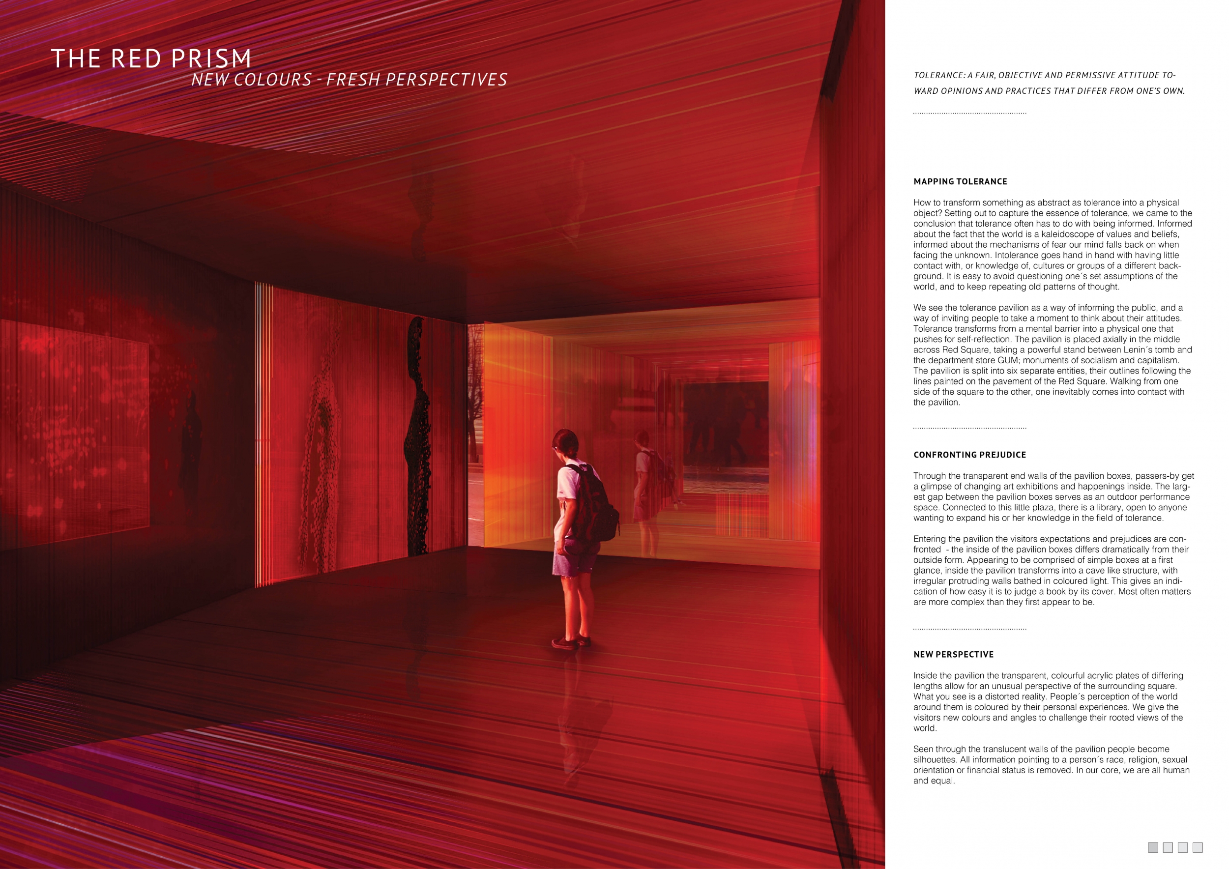
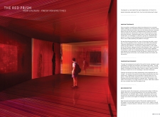
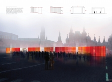
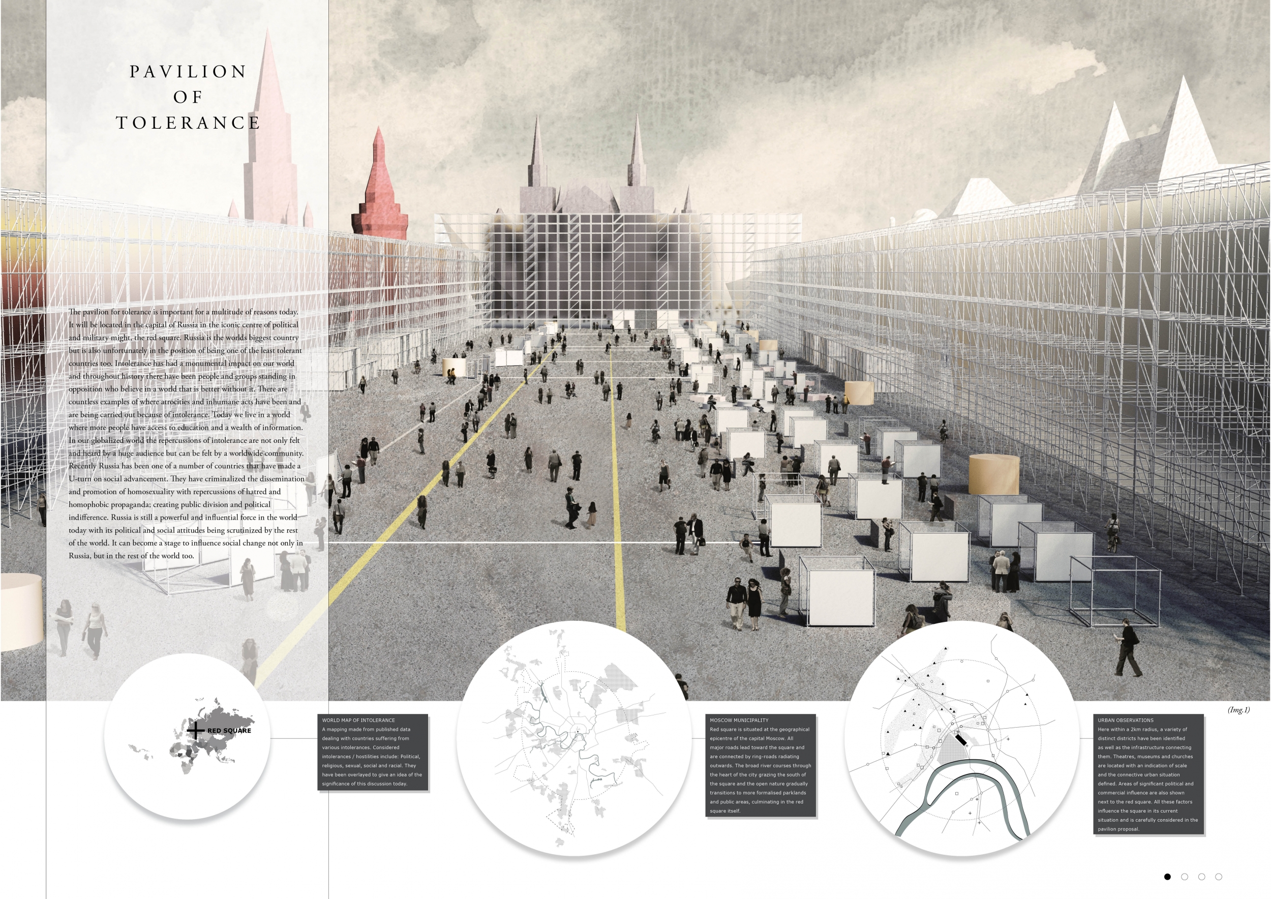
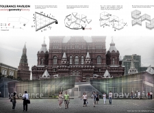
The winners of Bee Breeders architecture competition organisers’ latest architecture competition have been selected from over 120 submissions from architecture enthusiasts from around the world. The competition challenged participants to design a temporary pavilion for the education of social, political and religious tolerance, to be erected in Russia’s Red Square, Moscow.
The quality of the submissions was extremely high and the winners were chosen for the strength of their concept, originality, quality of their presentation and, most importantly, political and social influence of their design. The judges placed a particular focus on each project's concept and its respective ability to manifest the idea of tolerance and leave a strong impact on this politically-charged site. Bee Breeders would like to thank all the entrants who took part and are extremely proud of the winning designs.
The three winning concepts came from design teams based in Italy, Norway and France respectively, showing how the theme of tolerance is important and relevant in countries spanning the globe and that world-class design is universal.
Competition results in media publications
1st Prize Winner
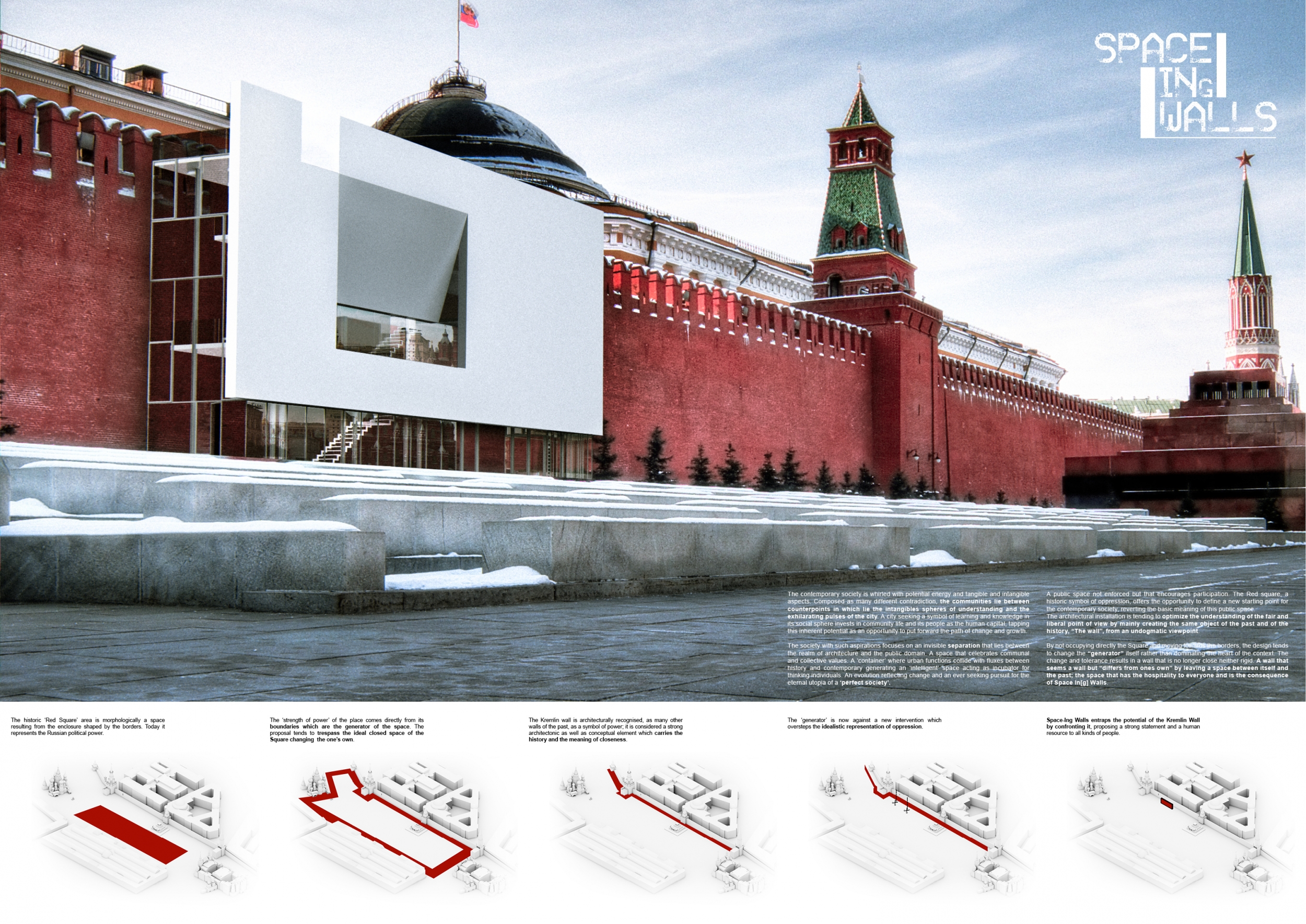
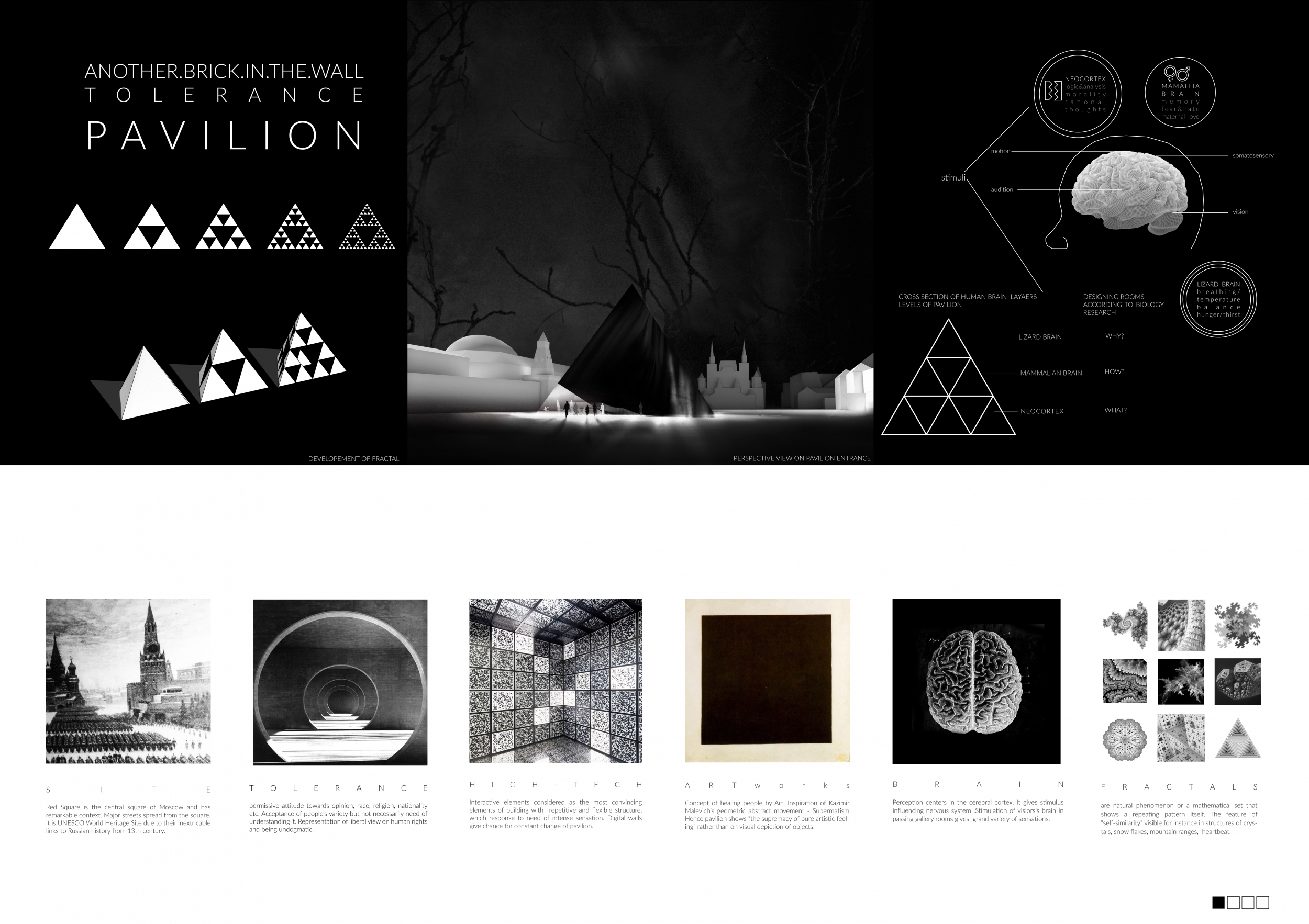
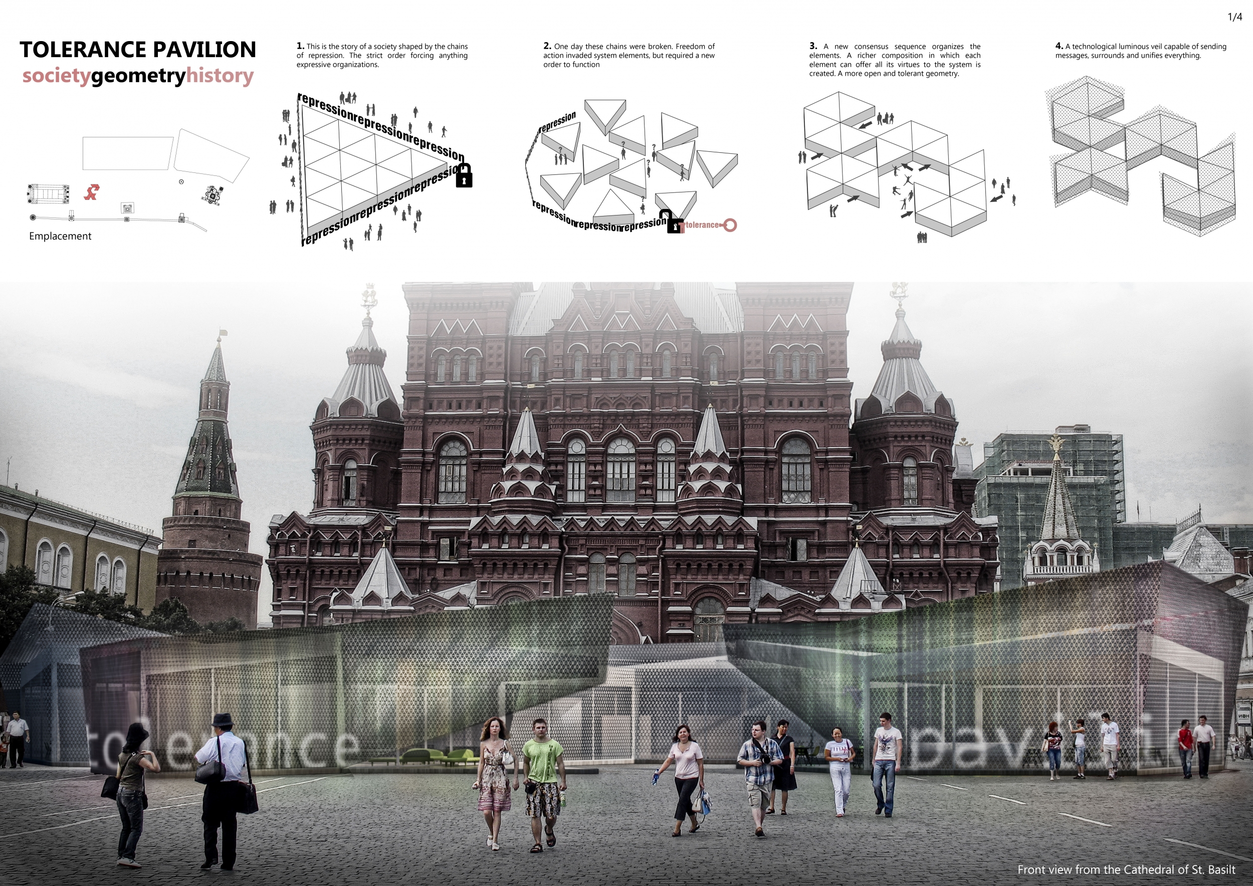
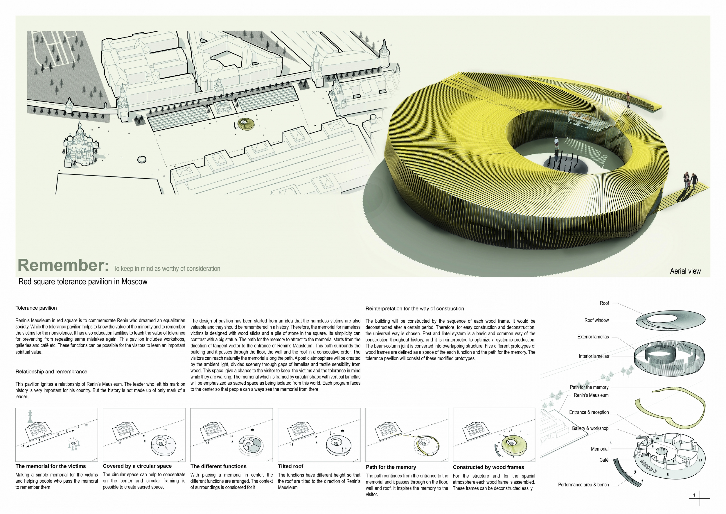
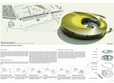
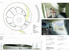
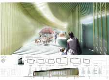
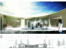
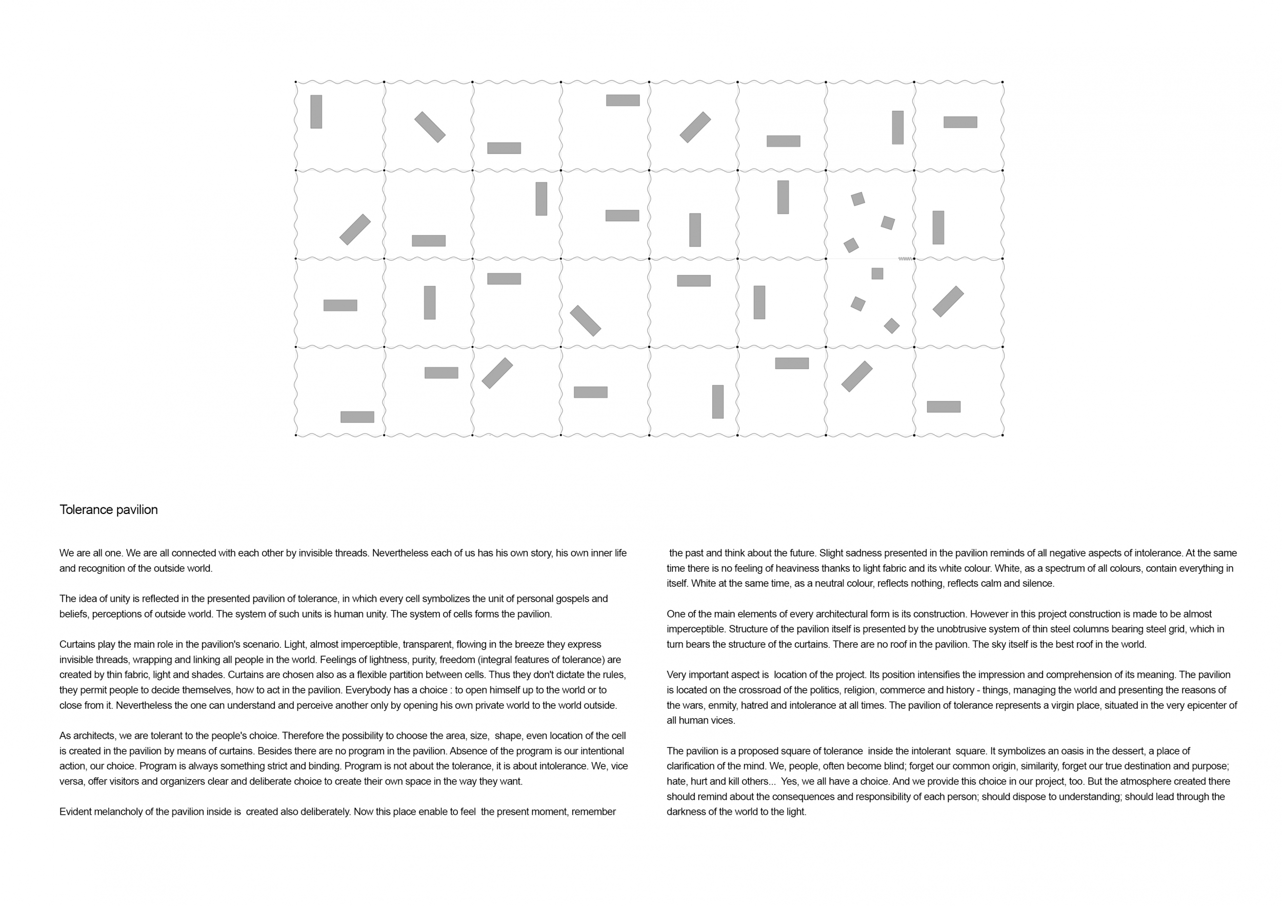
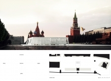
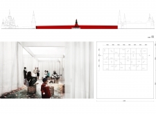
Red Square Tolerance Pavilion
Honestly we call it an opportunity to grow up. As young architects/designers we can not let the crisis or any other “negativity” stop our brain, can we? We have to move forward, right? Simply we saw that no more the architectural studios have architectural works on the table and no more we have the opportunity to start a project from the scratch, more we go forward more we become coordinators, we can't let the “vogue” architecture lead even our personality, can we? Today the world is full of “smart” clients who just chose a paper of a magazine (from vogue to playboy) and want us to realize it for them,so we started architecture vision competitions to stop staying still.
Read full interview Italy
Italy
Jury feedback summary
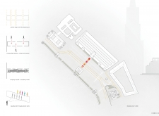
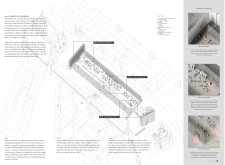
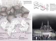
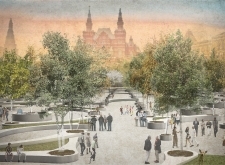
This project, although seemingly quite simple, carries great potential to spread the message of tolerance. The choice to move the structure away from the center of the square is a strong one, and its location against the Kremlin Wall speaks powerfully. In the space created by this project, visitors are forced to confront the wall's darker past as they are educated about a tolerant future, thus creating a powerful dichotomy.
2nd Prize Winner
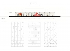
Red Square Tolerance Pavilion
We did the competition to stay fresh and for the fun of it.
Read full interview Norway
Jury feedback summary
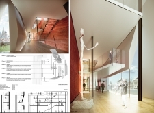
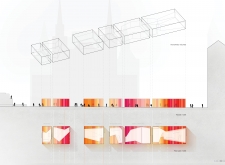
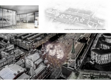
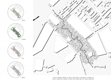
This project features a series of clever solutions to engaging and sharing the subject of tolerance. The choice to position the pavilion so that it crosses the entire width of the square is successful in its utilitarian nature of intercepting all visitors crossing the square. In this same position it is also forming a metaphorical blockade against the military routes outlined in the paving of the square.
3rd Prize Winner
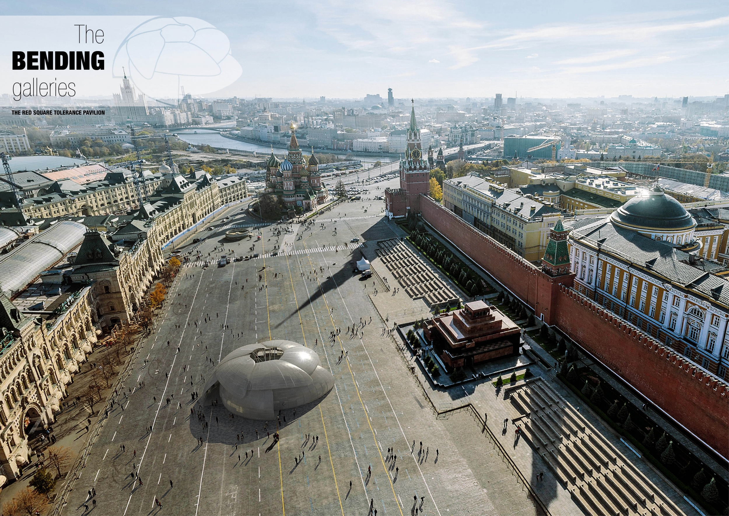
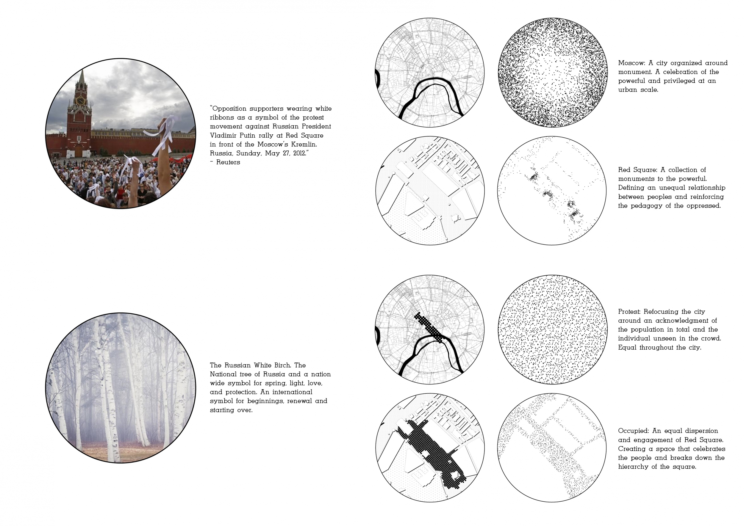
Red Square Tolerance Pavilion
As an architect, when you work as an employee for an agency, frustration is slowly building. Your ideas are filtered, sometimes saved, sometimes not. To take part in architecture vision competitions allows one to bring its architectural ambition face to face with various diversified projects, inviting one to explore ideas more freely and deeper than for usual agencies projects. The other goal behind taking part in these competitions is to build a base of architecture projects that will promote and stand for my agency.
Read full interview France
Jury feedback summary
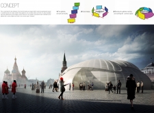
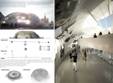
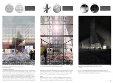
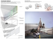
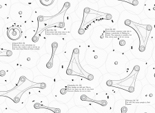
This project exhibits a straightforward concept that is presented very clearly and represented beautifully. The idea of folding or twisting together various minority groups is quite unique and manifests itself well architecturally. Additionally, the programmatic planning of the pavilion has a refreshing clarity - showing a somewhat religious ascension towards a tolerant enlightenment.


