Buildner is a global leader in organizing architecture competitions of all scales — from furniture, cottages, and guesthouses to full city rebranding. With prize budgets ranging from €5,000 to €500,000, Buildner brings proven global experience to every competition.
Launch a competitionLaunch a competition
Introduction
Buildner is pleased to announce the results of its Iceland Beer Spa international competition!
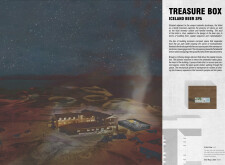
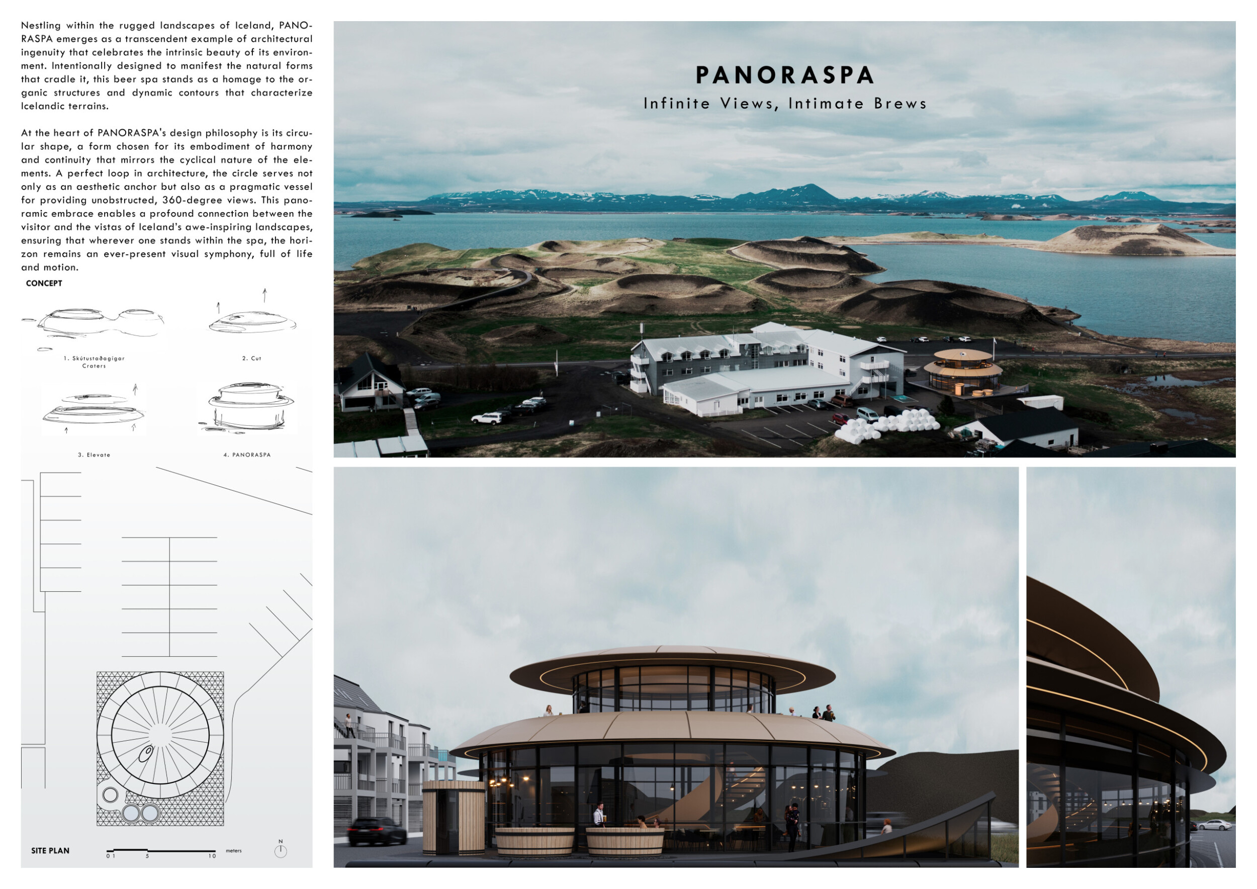
The Iceland Beer Spa architecture competition tasked architects and designers to showcase their creativity and innovation by proposing a new facility that combines the functions of a brewery, cafe snack bar, souvenir shop, and Beer Spa on the grounds of the Sel Hotel, a family-run establishment situated next to the legendary Skútustaðagígar craters in the Myvatn lake region of Iceland. The competition seeks to create a landmark destination that reflects the spirit of the region and provides an unforgettable experience for both tourists and locals.
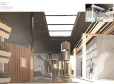
Buildner and its partner the Sel Hotel recommended the following program elements: a brewery with brewing equipment visible to and engaging for visitors; a comfortable cafe snack bar and seating area for guests to relax and socialize; a souvenir shop that reflects the spirit of the region and offers unique, locally-sourced products that appeal to tourists; a beer spa incorporating the therapeutic qualities of beer and the natural beauty of the surrounding environment to create a relaxing and rejuvenating experience for guests; and terraces at ground level and rooftops that offer extra seating and relaxation areas, taking advantage of the stunning Myvatn lake area scenery and providing opportunities for outdoor leisure activities.
Buildner worked with an experienced jury with panelists from Iceland and abroad: Marshall Blecher is a co founder of MAST, a maritime architecture studio based in Copenhagen; Francisco Garcia de Freitas is a founder of Lisbon-based Atelier RUA - Arquitectos; Ricardo Gomes is partner and a founder of KWY.studio, based in Lisbon; Borghildur Indriðadóttir is an artist that lives and works in Reykjavík, Iceland; Hildur Ísdal is an architect and interior designer, working at Plusark based in Reykjavík, Iceland; Søren Leth is a partner and co-founder of SLETH in Aarhus, Denmark; Inés Olavarrieta is an architect and designer at Madrid-based selgascano; Sigrún Sumarliðadóttir is a co founder and Principal of Studio Bua, an architectural practice with offices in London and Oslo; and Willem van Bolderen, Founding Partner of Studio Puisto Architects.
Buildner and its jury panel would like to thank all participants for their work and to congratulate the winners and shortlisted participants for their outstanding ideas.
We sincerely thank our jury panel
for their time and expertise
Marshall Blecher
Founder at Studio Marshall Blecher & Co-founder at MAST
Denmark

Pip Cheshire
Director, Cheshire Architects
New Zealand

Francisco Garcia de Freitas
Atelier RUA - Arquitectos
Portugal

Ricardo Gomes
Partner, KWY.studio
Portugal

Borghildur Indriðadóttir
Teiknistofan Óðinstorgi
Iceland

Hildur Isdal
Ísdal Arkitektúr
Iceland

Søren Leth
Partner and Co-founder, SLETH
Denmark

Judson Moore
Design Director at Waechter Architecture
USA

Inés Olavarrieta
Architect and designer at selgascano
Spain

Willem van Bolderen
Founding Partner, Studio Puisto Architects Ltd
Finland

Sigrún Sumarliðadóttir
Studio BUA
UK

1st Prize Winner
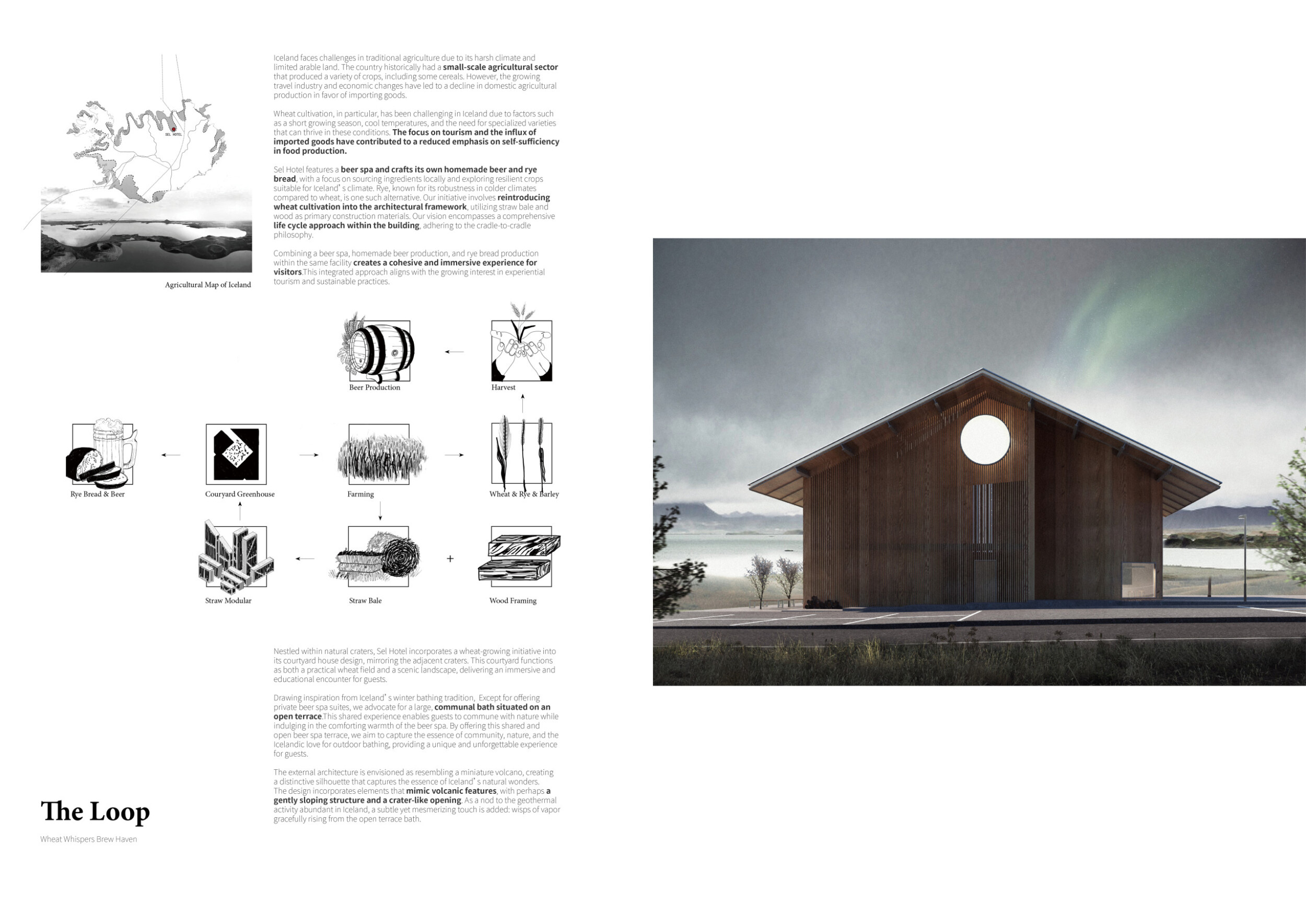
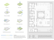
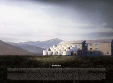
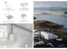
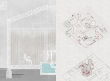
The Loop - Wheat Whispers Brew Haven

While larger firms may prioritize commercial projects, we aim to maintain a sharp focus on pushing the boundaries of design creativity.
Read full interview United States
Jury feedback summary
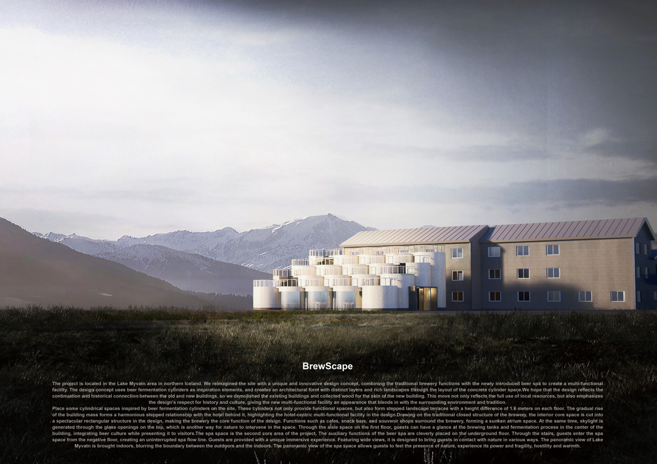
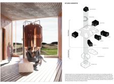
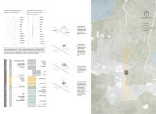
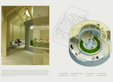
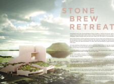
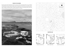
The proposal for The Loop: Wheat Whispers Brew Haven incorporates a wheat-growing initiative into its courtyard house design, mirroring the adjacent craters. This courtyard functions as both a practical wheat field and a scenic landscape, delivering an immersive and educational encounter for guests. Drawing inspiration from Iceland's winter bathing tradition, the design advocates for a large, communal bath situated on an open terrace.
Buildner's commentary, recommendations and techniques review
Order your review here
The project makes use of advanced imagery and line drawings to tell a compelling story and which make the project a true architectural proposal.
2nd Prize Winner
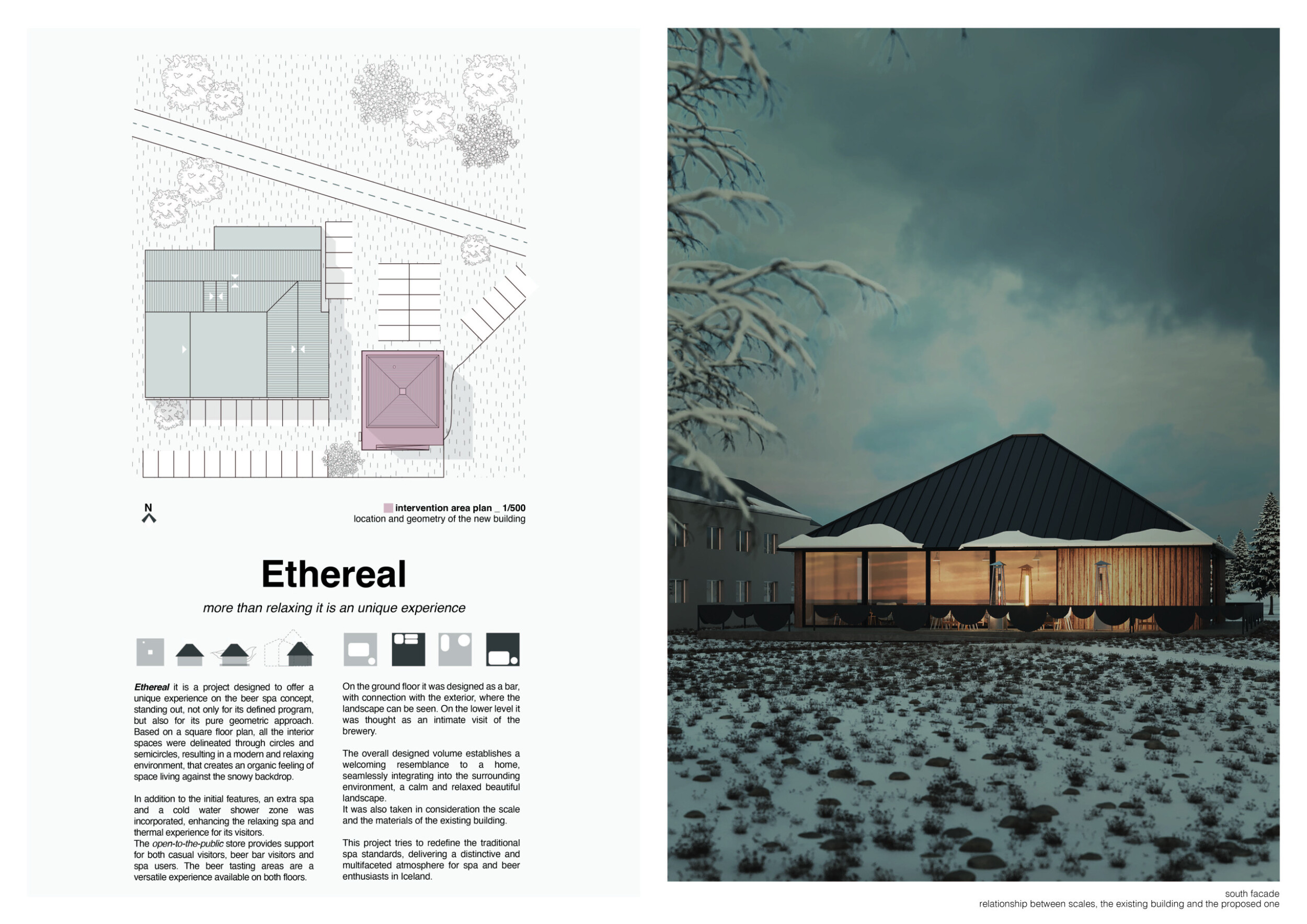
Ethereal

Competitions are a way to escape from so many rules you have to follow, when you are really designing a client's project. It gives you freedom and also this idea of ' is this allowed?´ or ´should I take this path instead of this one?´. It makes you search for new and different approaches. It is more than having a bigger portfolio. It is a way to exercise your brain and have fun.
Read full interview Portugal
Jury feedback summary
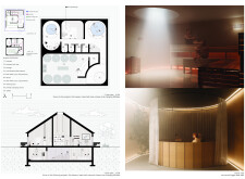
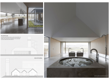
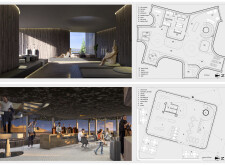
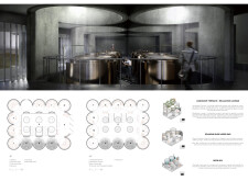
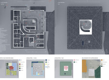
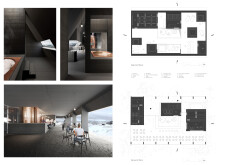
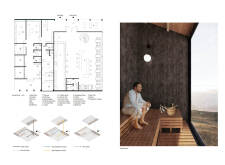
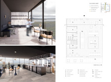
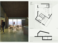
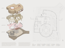
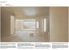
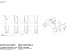
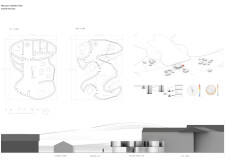
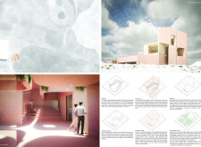
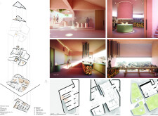
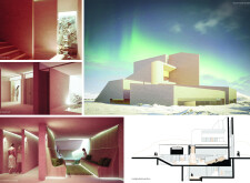
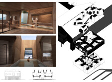
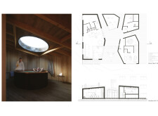
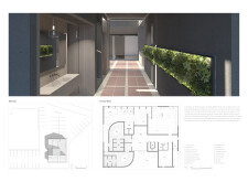
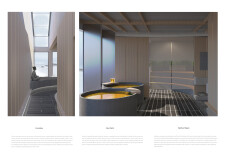
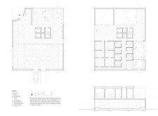
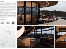
Ethereal is designed to offer a unique experience, standing out, not only for its defined program but also for its pure geometric approach. Based on a square floor plan, all the interior spaces are delineated through circles and semicircles, resulting in a modern and relaxing environment that creates an organic set of spaces. The ground floor is designed as a bar, with connections to the exterior, where the landscape can be seen.
Buildner's commentary, recommendations and techniques review
Order your review here
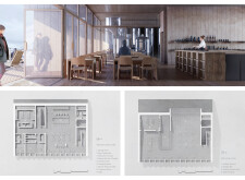
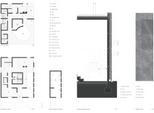
The project successfully uses a mix of visuals to describe a very believable project. The line drawings carry a unique aesthetic that places emphasis on the massiveness of walls and floors, and which very clearly describe the spaces the building contains. The renderings are clear and crisp and communicate well the various experiences within the project.
3rd Prize Winner
Beerd's eye view

Architectural competitions give you the freedom to create projects with your own vision. Rules give direction to the movement of thought, but do not tie hands. This allows you to bring all your creative potential and design perspective to the project. Our main goal with competitions is to refine our creative voice and fill out our portfolio with diverse projects. We think that this experience would help us to engage with the design process on a more deep level.
Read full interview Georgia
Jury feedback summary
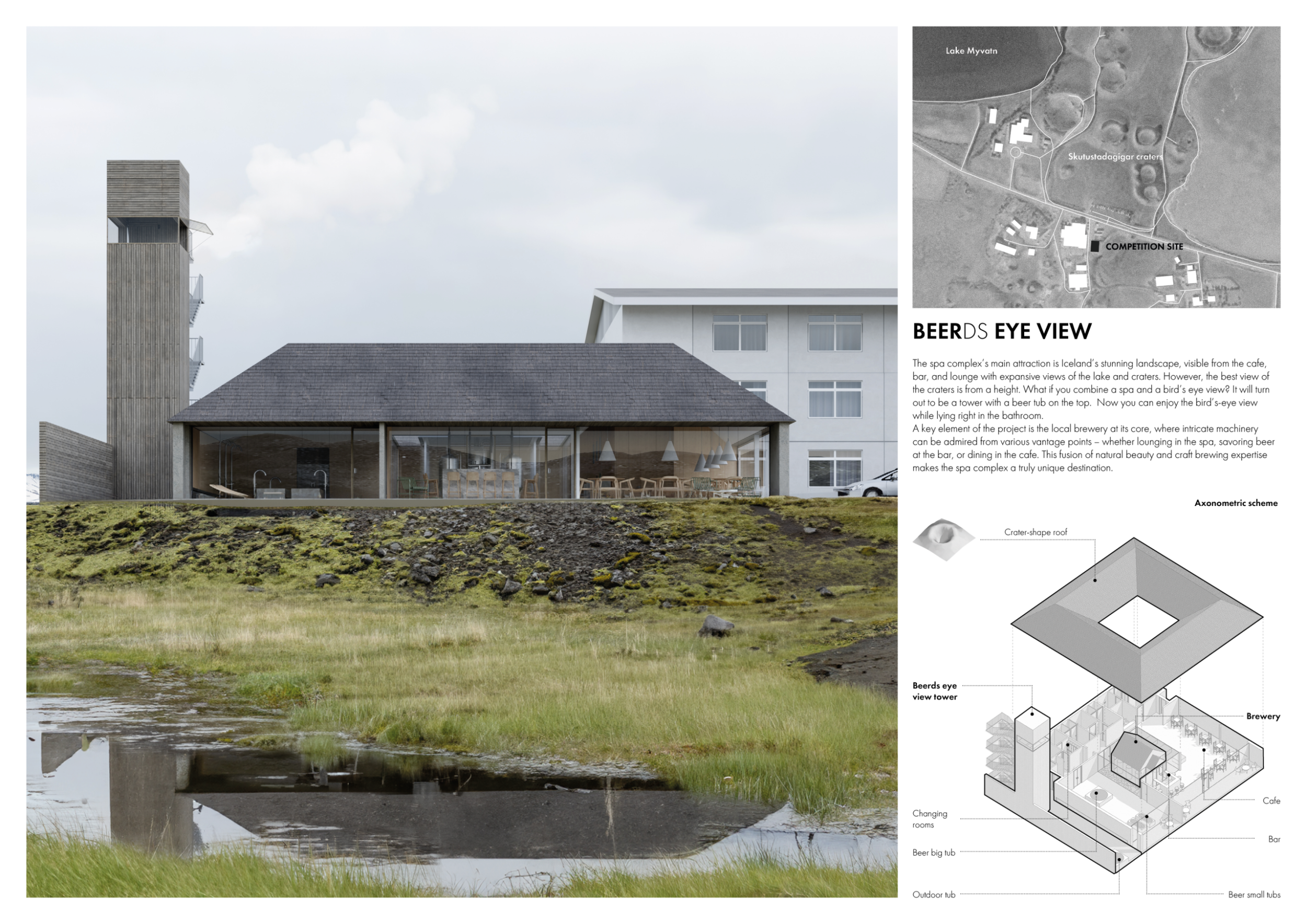
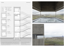
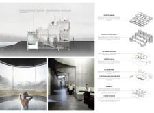
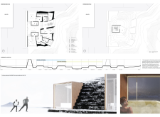
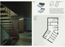
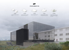
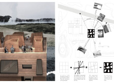
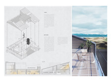
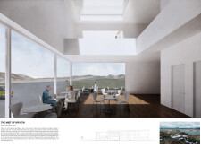
Beerds Eye View places focus on the surrounding Icelandic landscape, visible from the cafe, bar, and lounge with expansive views of the lake and craters. It posits that the best view of the nearby craters is from a height, and includes a tower with a beer tub on the top for visitors to enjoy a bird's-eye view.
Buildner's commentary, recommendations and techniques review
Order your review here
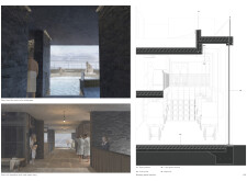
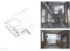
The project makes use of sophisticated, photorealistic images and advanced line drawings. The imagery would be strengthened with some human scale figures to give a sense that this public building is well designed to accommodate dynamic activities and uses. As shown, the spaces are empty and without life, albeit greatly detailed with excellent material textures and spaces which are clean and airy. The text would benefit from being increased in size for legibility.
Buildner Student Award
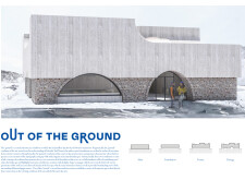
Out of the Ground
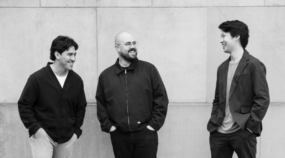
As a collective, this is the first time we have all individually collaborated on a project together. Being relatively new to the field of architecture, we are eager to understand and analyze the current conditions of our built environment. Architectural competitions provide us with the platform to establish our voice and explore our interests through the act of creation. In academia and the professional world, the design and construction of a building can be a lengthy process, whereas competitions allow us to work swiftly based on our instincts and intuition.
Read full interviewJury feedback summary
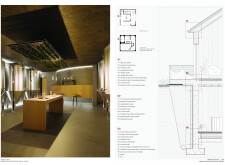
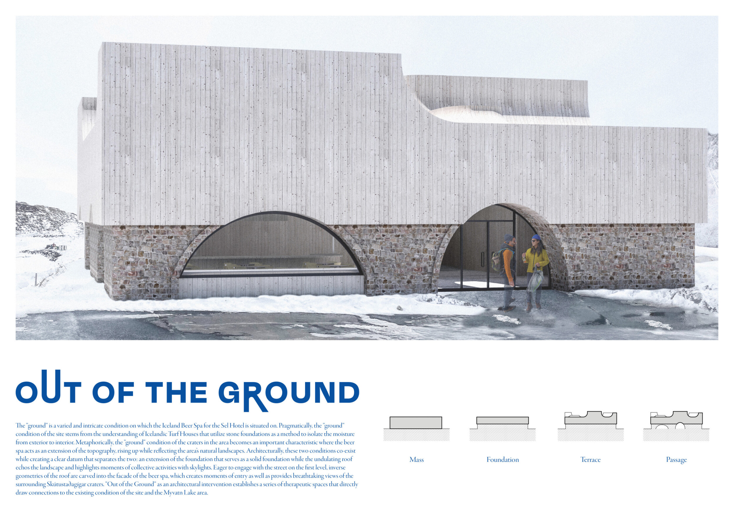
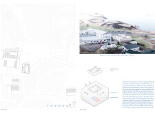
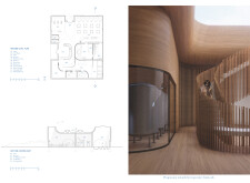
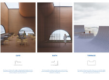
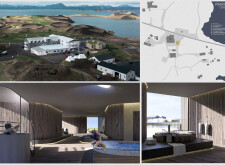
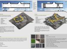
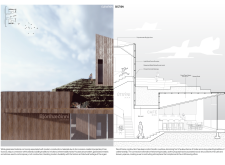
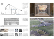
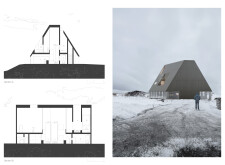
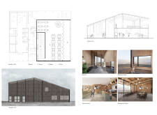
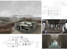
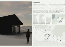
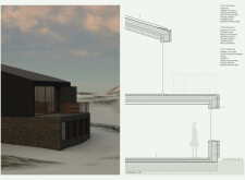
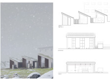
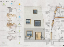
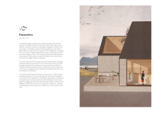
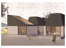
Out of the Ground states that “the ‘ground’ is a varied and intricate condition.” The design draws from local house construction that utilizes stone foundations as a method to isolate the moisture from the exterior. It also proposes the beer spa as an extension of the site’s cratered topography. An undulating roof echoes the landscape and highlights moments of collective activities with skylights.
Buildner's commentary, recommendations and techniques review
Order your review here
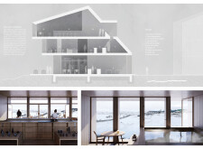
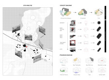
The presentation has excellent visuals paired with simple diagrams to communicate its various design decisions. The overall plans and sections, while interesting, are unfortunately small - doubling their size on the sheets would greatly increase their impact and more clearly describe the information they convey. The site plan takes up half a sheet yet does not include a great amount of detail and appears rather unfinished and empty.
Buildner Sustainability Award
Beer Spa
I participate in architecture competitions because they allow me to explore innovative design concepts, push the boundaries of my creativity, and refine my technical skills. They provide an opportunity to explore design challenges I might not encounter in my day-to-day work.
Read full interview Spain
Spain
Jury feedback summary
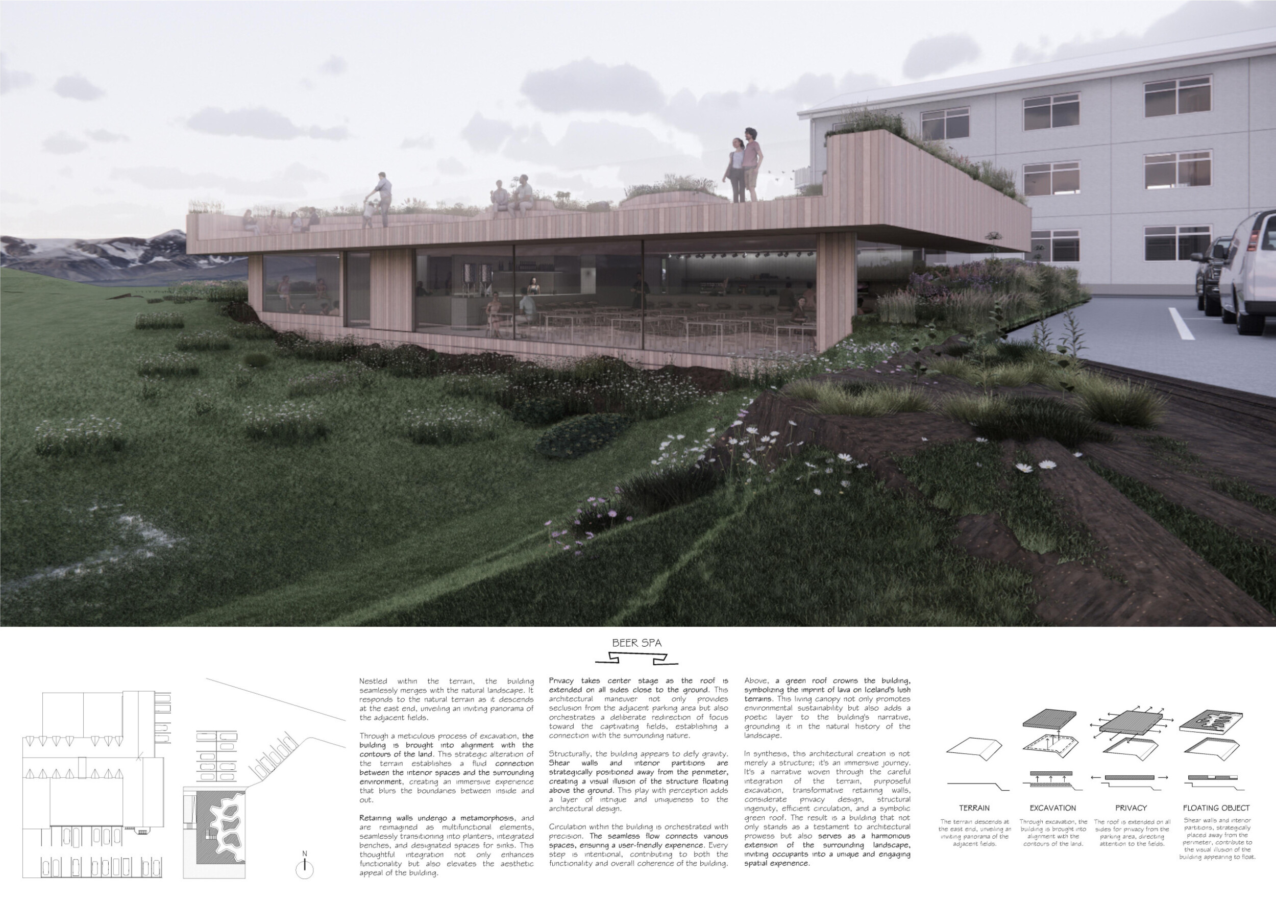
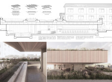
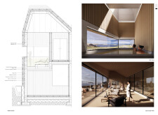
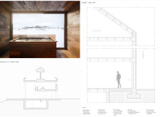
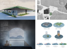
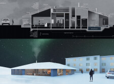
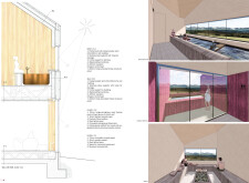
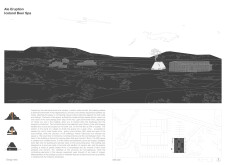
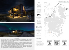
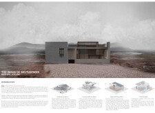
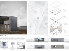
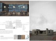
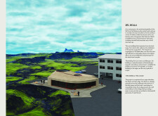
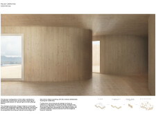
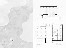
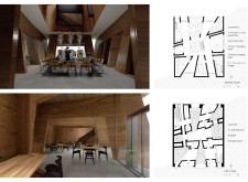
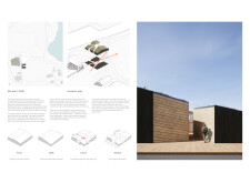
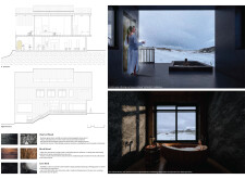
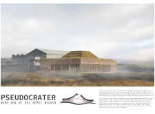
The building here merges with the natural landscape. It responds to the natural terrain as it descends at the east end, unveiling an inviting panorama of the adjacent fields. Through a “meticulous process of excavation”, the building is brought into alignment with the contours of the land.
Buildner's commentary, recommendations and techniques review
Order your review here
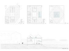
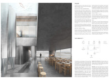
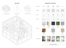
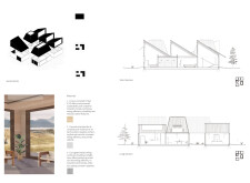
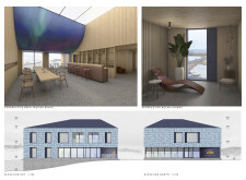
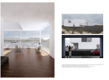
The primary critique of this presentation is that there is an overall lack of hierarchy, both within the line drawings which consist of lines all very similar in weight, as well as with the overall layout and size of images which are also quite consistent. The two interior images of the cafeteria space for instance do not describe significantly different information and could be reduced to a single more impactful image.
Client Favorite
Jury feedback summary
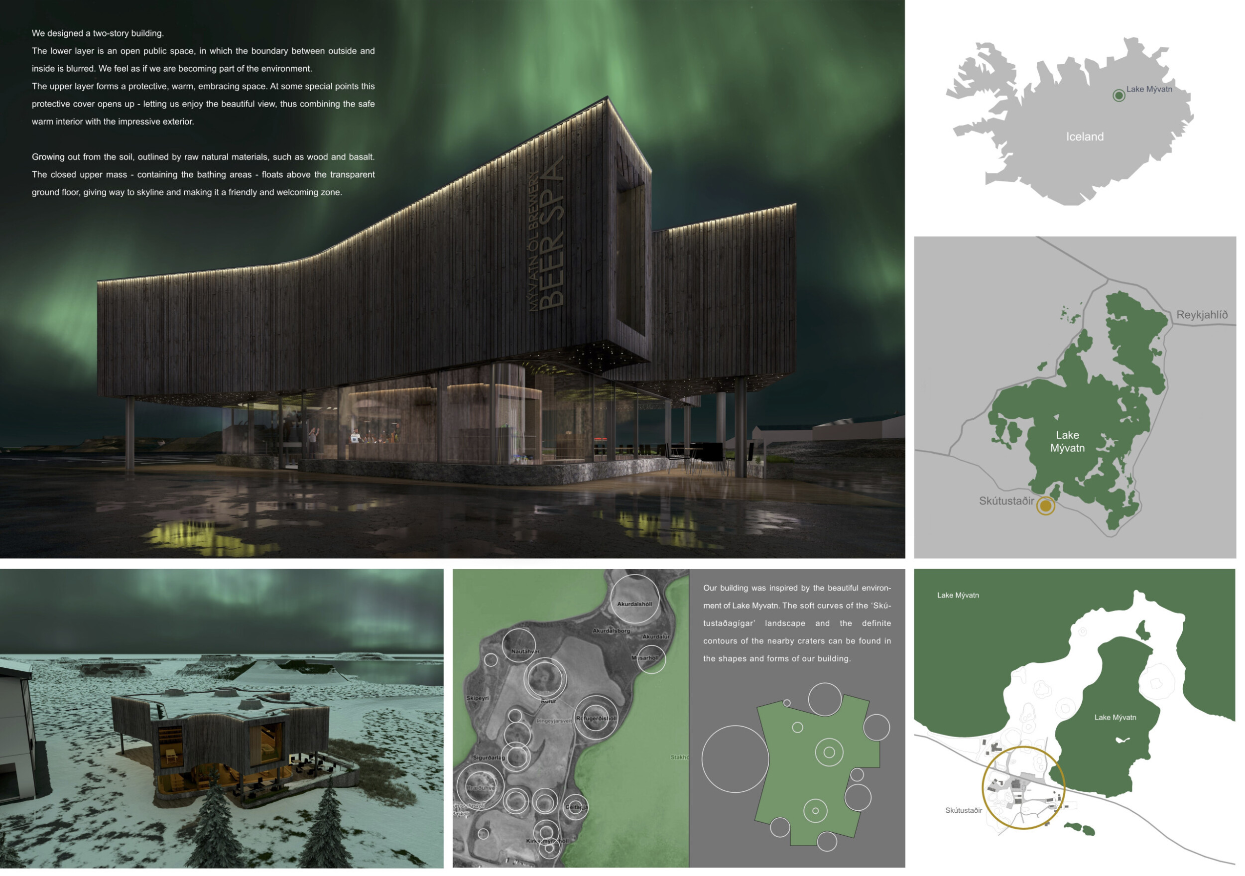
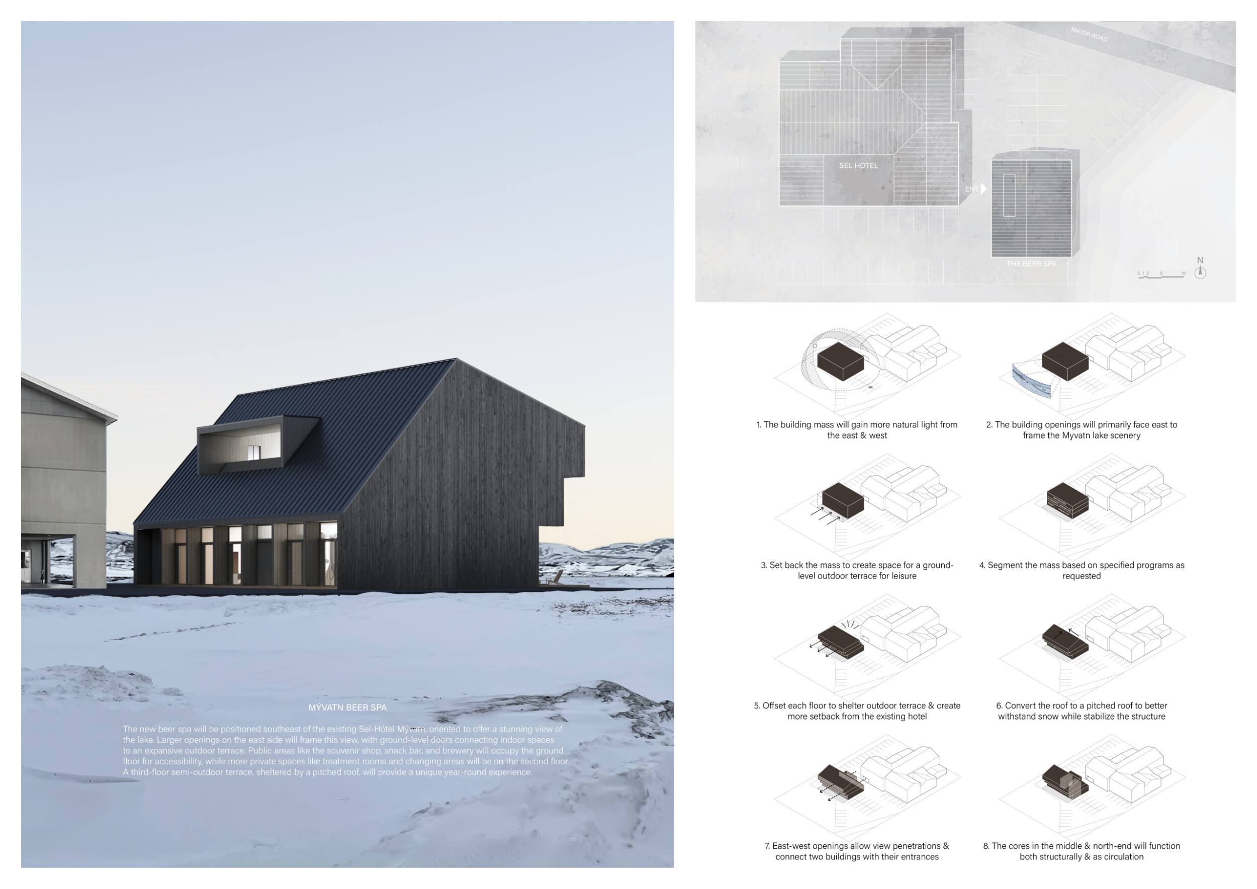
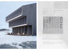
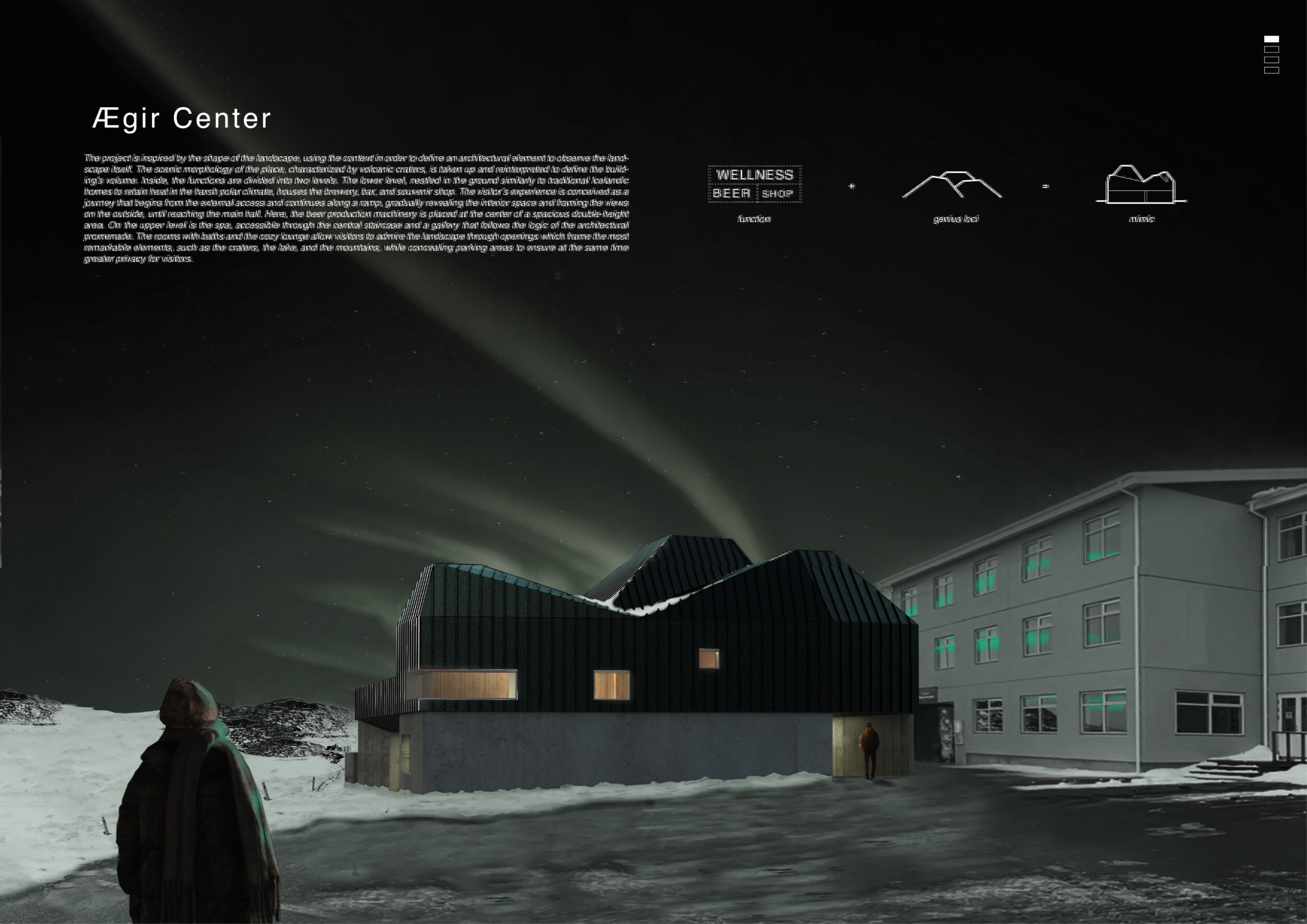
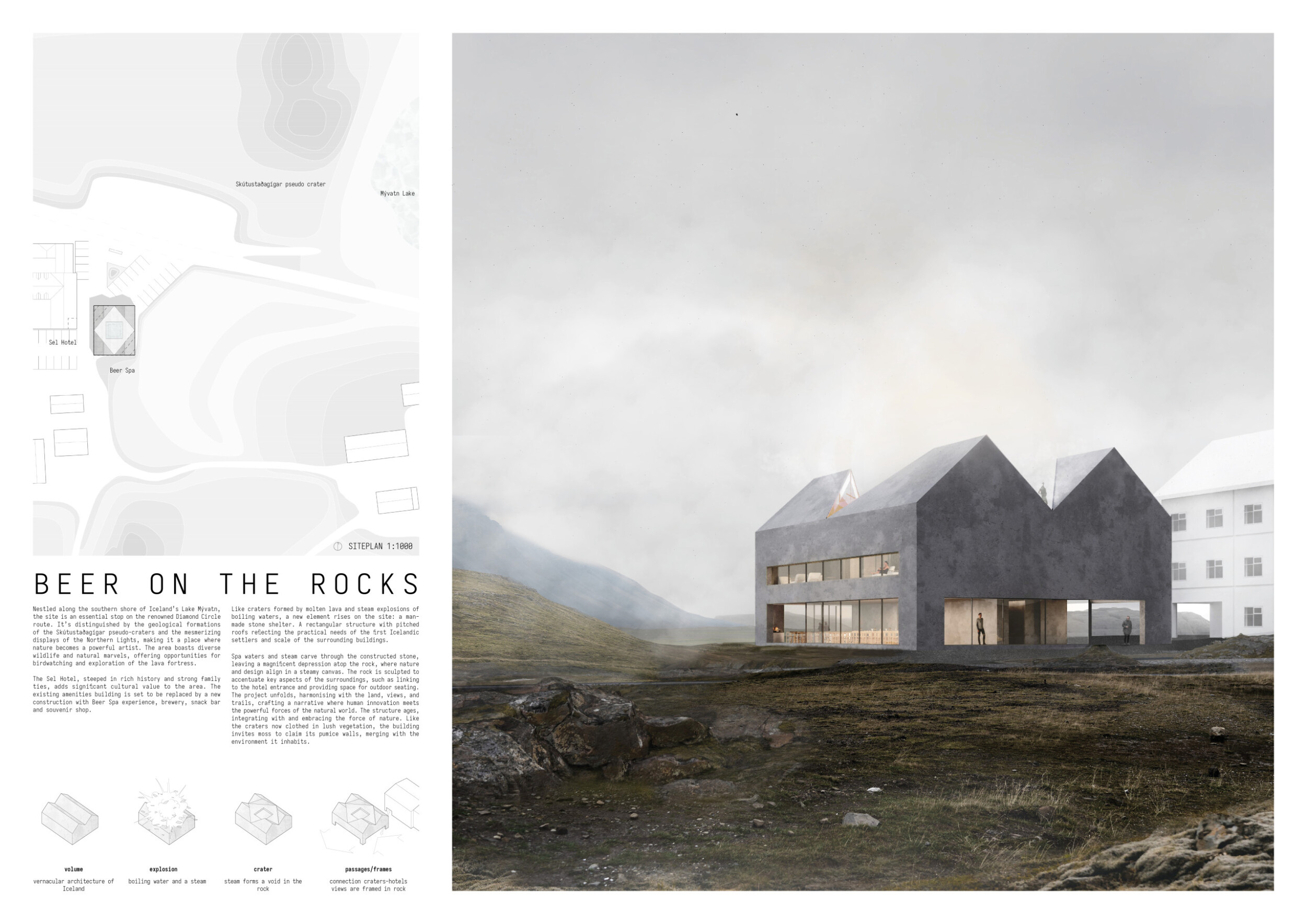
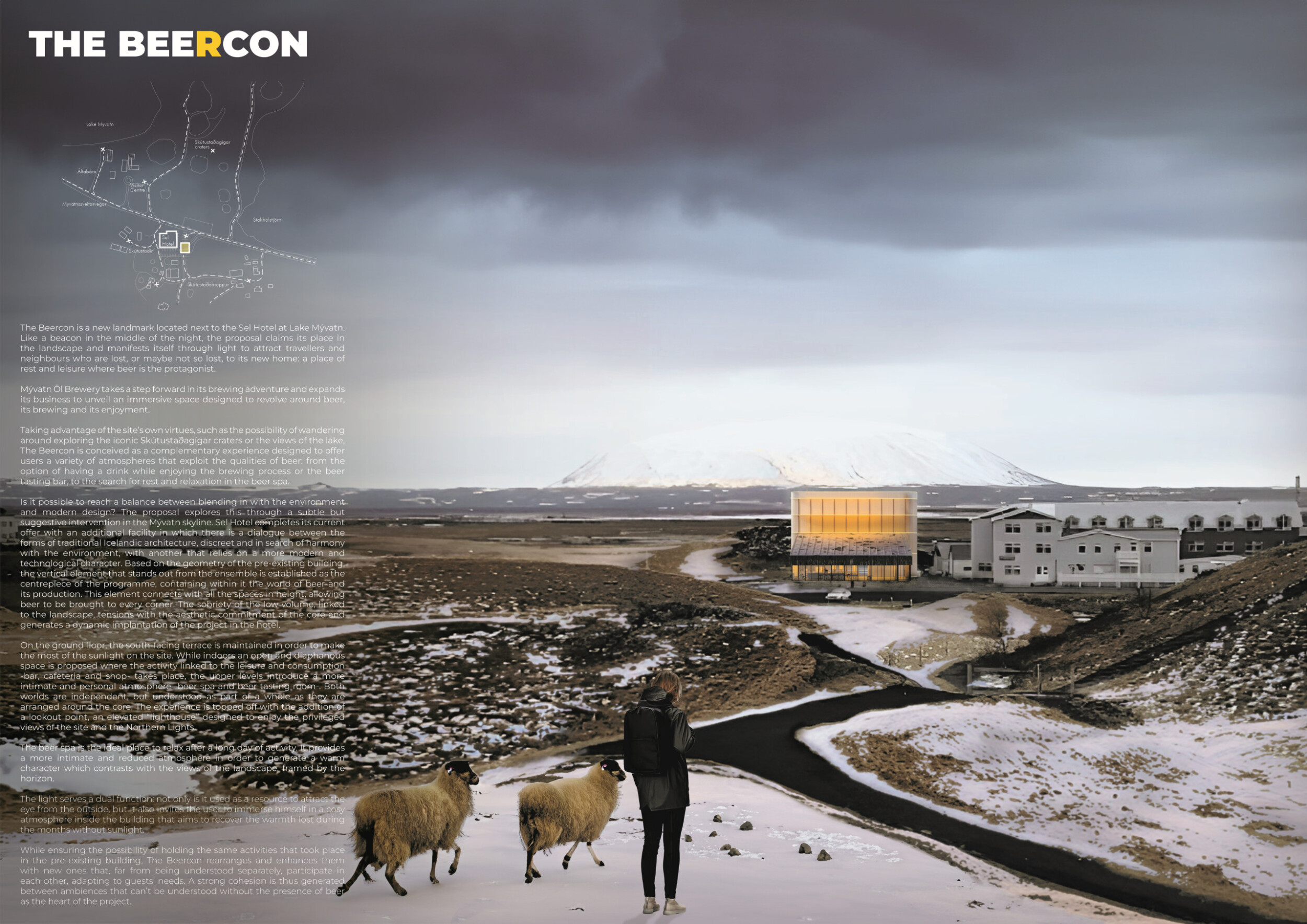
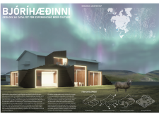
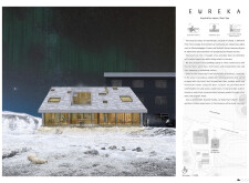
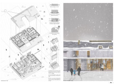
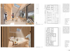
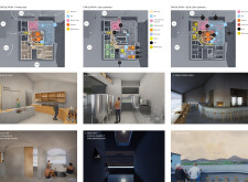
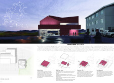
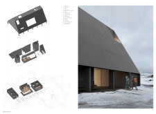
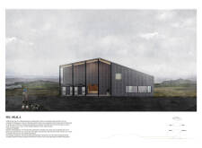
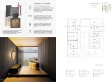
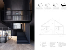
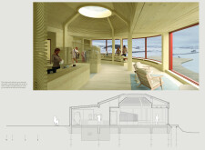
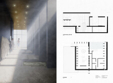
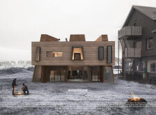
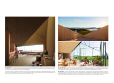
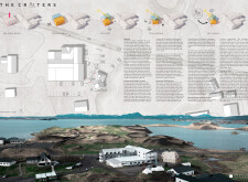
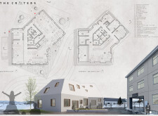
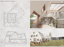
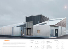
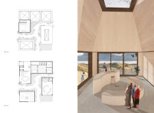
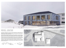
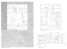
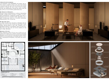
This two-story building features a lower layer that is an open public space, transparent and whereby the boundary between outside and inside is blurred. The upper layer forms, according to the authors, a “ a protective, warm, embracing space.” At select points this protective cover opens up letting users enjoy the beautiful views, merging the warm interior with the impressive exteriors.
Buildner's commentary, recommendations and techniques review
Order your review here
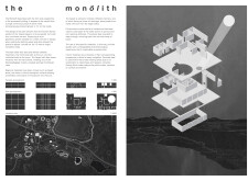
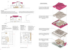
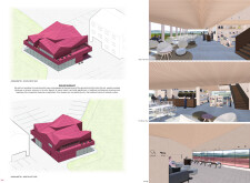
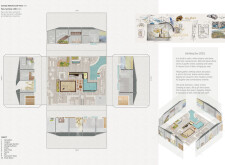
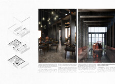
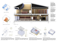
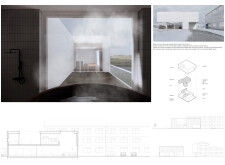
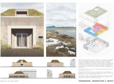
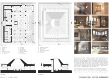
This project uses a crisp and simple layout with an intelligent selection of key images on each sheet, varying in size to provide clear hierarchy, and carrying consistent colors that are specific to each sheet. The use of multiple rendered perspectives interior and exterior, as well as advanced cut-away axonometries, communicate well the building’s interior spatial experience and its means of circulation.
Honorable mentions
Shortlisted projects
